How to use the flow analytics dashboard
You will learn
Klaviyo's flow analytics dashboard gives you a unified view of how your flows are performing across channels in one place. This article explains what the dashboard shows, how each metric is calculated, and how to use the available filters, comparisons, and exports.
This article helps you answer questions like:
- How are my flows performing across all channels this month compared to last month?
- Which flow is driving the most revenue?
- How does this period's performance compare to the same period last year?
- How do I export flow performance data for reporting?
Opening flow analytics
To open the dashboard, navigate to Flows in the left sidebar, then click the Analytics tab at the top of the page.
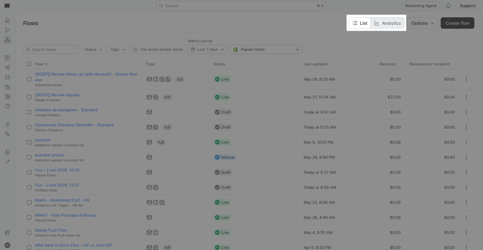
The dashboard shows flow performance for the last 7 days by default. If you've previously selected a different date range, your saved selection may appear instead.
Choosing a view
Flow analytics has two views, controlled by a toggle at the top right of the page.
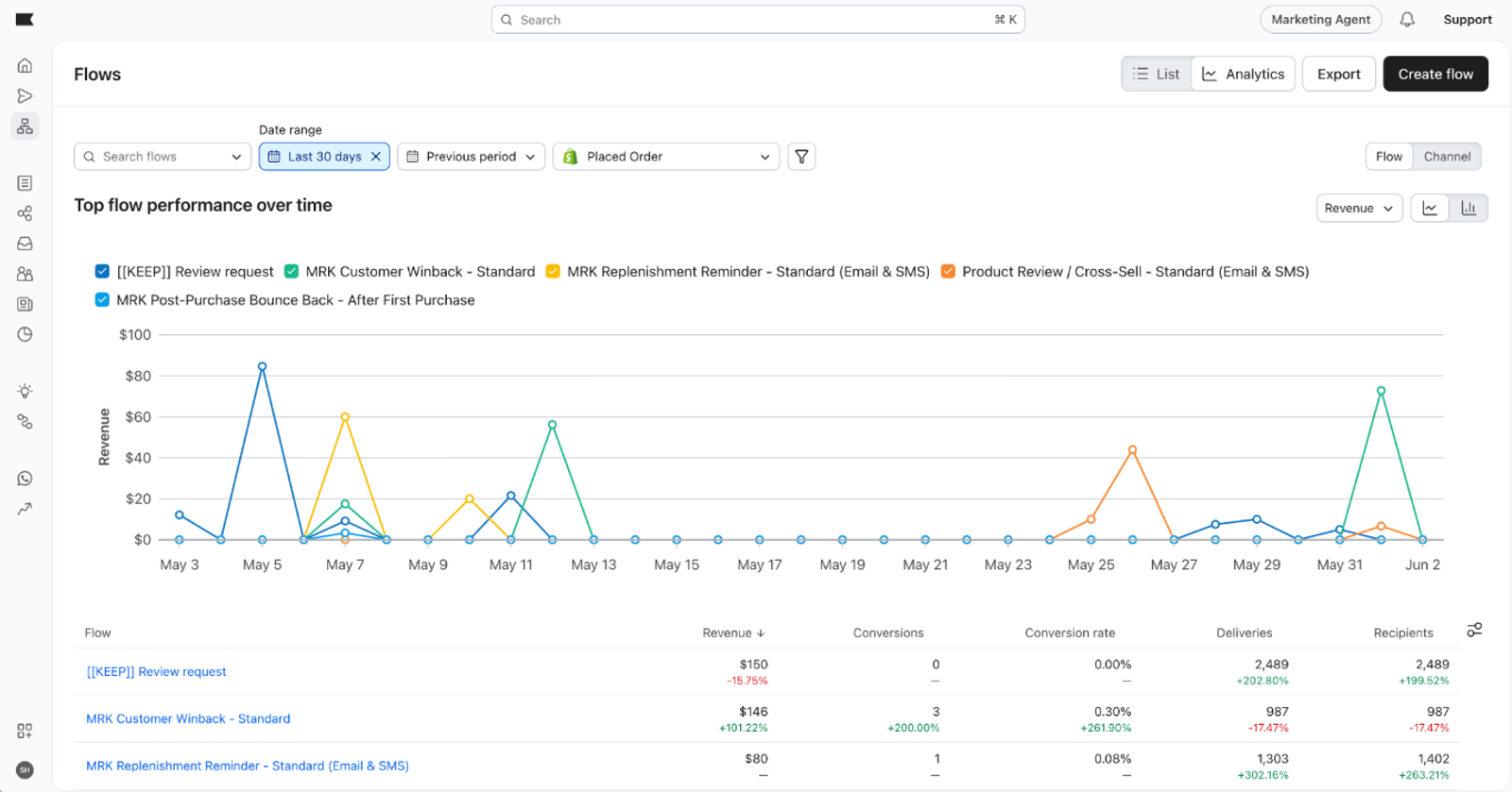
Channel view
Channel view groups your data by channel. Use it to compare channel performance across your flows in the selected date range or see the channel mix driving your flow program.
Flow view
Flow view lists individual flows. Use it to compare flows against each other; click a flow name to open that flow and review its messages.
Note that the toggle changes how data is organized, not which data is shown. The metrics and filters apply the same way in both views.
Metrics
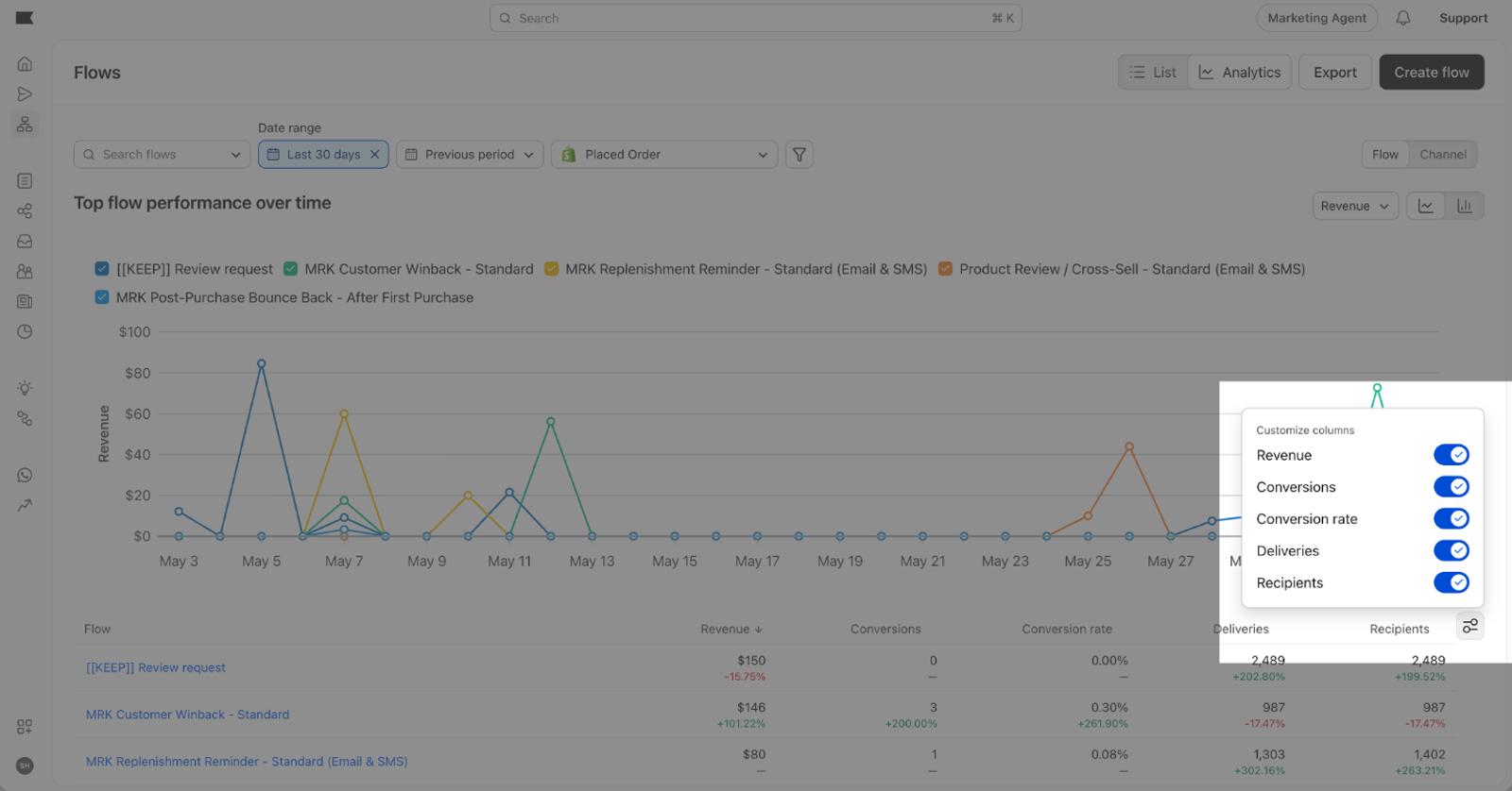
Flow analytics tracks 5 metrics:
- Revenue — the total value of conversions attributed to your flow messages during the selected timeframe. Revenue is unavailable if the selected conversion metric doesn't have a value.
- Conversions — the count of conversions attributed to your flow messages, based on your account's conversion metric.
- Conversion rate — conversions divided by unique recipients, expressed as a percentage.
- Deliveries — the number of messages successfully delivered.
- Unique recipients — the number of unique profiles that received at least one message from the flows in the selected timeframe.
Showing and hiding metrics
To choose which metric columns appear in the table, click the Customize columns icon to the right of the table and toggle metrics on or off. Your column selection is saved and will persist the next time you open the dashboard.
Filtering by timeframe
To change the date range, click the Date range selector above the chart. Options include:
- Last 7 days
- Last 30 days
- Last 90 days
- Last 12 months
- Custom range (up to 366 days)
The chart and table both update to reflect your selected timeframe.
Comparing performance
The dashboard compares your selected date range with the previous period by default. To change or remove the comparison, click the Comparison period selector and choose:
- Previous period — compares against the period immediately before your selected range (for example, the prior 30 days)
- Same period last year — compares against the same dates one year ago
When a comparison is active, the table shows a delta column with the percent change for each metric. Green indicates improvement; red indicates a decline.
Very large percent changes display as greater than +999% or less than -999%, rather than showing an exact percentage.
Filtering by flow
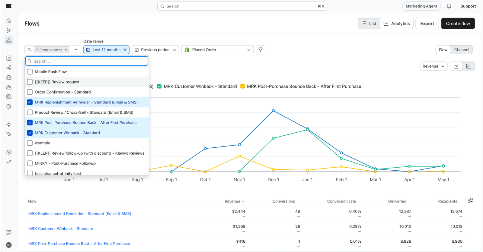
To narrow the dashboard to specific flows, click the Flows filter and select the flows you want to include. The chart, table, and any active comparison all recalculate based on your selection.
Using the chart
The chart above the table visualizes the metric you have selected over your chosen timeframe. To change the metric, click the metric label above the chart.
You can switch the chart between Line Chart and Area Chart. The chart-type control is hidden when Conversion rate is selected.
The chart shows up to 5 channels or flows ranked by your selected chart metric over the date range. The table can contain more rows and can be sorted independently, so its first rows may not match the chart.
Sharing a view
Filter and comparison state is saved to the URL. To share a specific view of flow analytics with a teammate, copy the URL from your browser and send it to them. When they open it, they'll see the same view you configured.
Exporting flow analytics
To download the displayed flow analytics data as a CSV, click Export in the page header. This button is disabled if you don't have export permission.
The CSV includes:
- The columns currently visible in the table
- One row per channel in Channel view, or one row per flow in Flow view
Exporting requires the Exports permission on your role.
Additional resources
- Understanding flow analytics (per-flow view) Learn how to read the analytics view inside an individual flow. How to build a flows performance report Learn how to build a report of flow engagement and conversion metrics.
- Getting started with reporting An overview of the reporting options available in Klaviyo.
- Analytics glossary Definitions for the metrics used across Klaviyo analytics.