How to customize benchmark pages
You will learn
Learn how to customize benchmarks pages to best serve your business needs and find data that is most useful to your brand. Klaviyo’s benchmarking tool hosts four pages of data that you can customize to compare your performance in relation to peers and industry trends. These pages include: overview, business performance, campaign performance, and flow performance.
Note that Klaviyo Benchmarks currently account for email data and do not include SMS data.
Customize your overview page
The benchmarks overview page displays a summary of your account metrics that are performing well and performing poorly.
1. You can adjust what date range you view for this set of data to hone in on a specific period of time and track trends. To do so, click the dropdown next to Show.
2. Select any of the following ranges:
- Last Month
- Last Three Months
- Quarter to Date
- Last Quarter
- Last 12 Months
- Year to Date
- Last Year
- All Time
- Custom Date Range
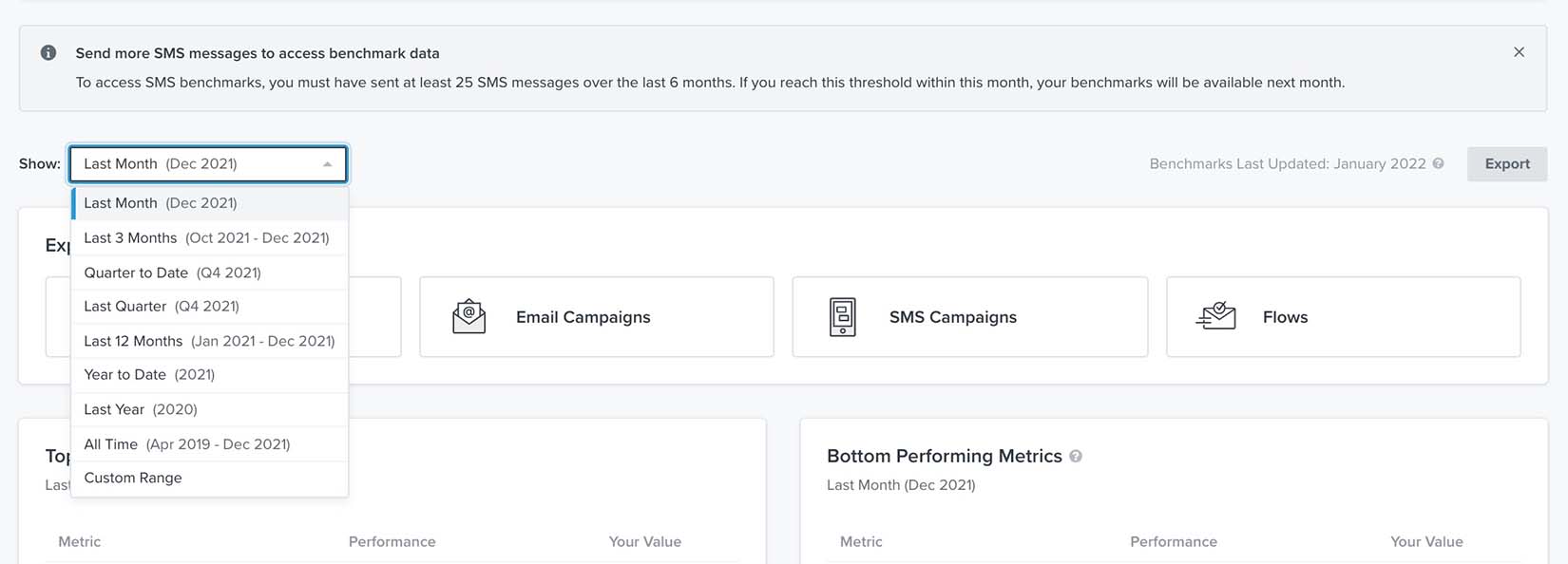
In this range, months are based on calendar months while every quarter neatly maps to three months. Quarters are defined based on North American Q1 / Q2 / Q3 / Q4 format with Q1 corresponding to January through March.
Customize your business performance page
The business performance page provides a breakdown of key performance indicators pertaining to overall business health. You can customize which graph you view, the performance indicator for your graph, and the timeframe for your data in both graph and table formats.
1. In the upper left of the graph card, select a desired timeframe for your data in the dropdown next to Show.
2. Then, directly below the timeframe dropdown, select the performance indicator (i.e., average cart size, average order count, average order value, or % of orders returned) you want to analyze.
Unlike other Klaviyo reports, in benchmark reports, Average Order Count numbers are totaled until whatever end date you choose. For example, if you are looking at Average Order Count from last month, it will be the total number until last month.
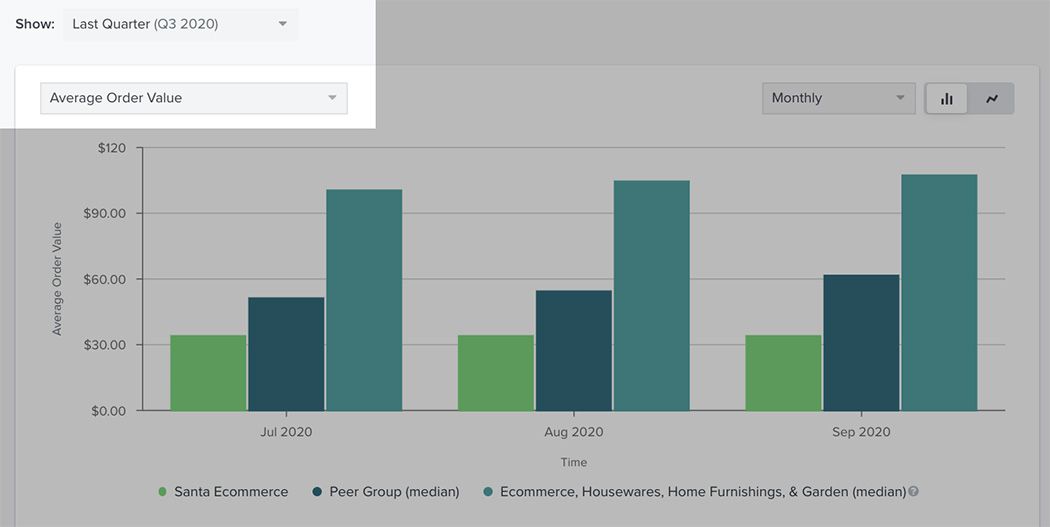
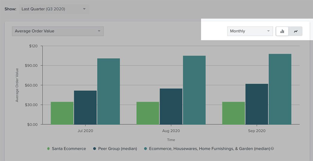
3. Next, select a timeframe breakdown (i.e., monthly, quarterly, yearly) and choose one of the two graph icons to choose a new graph format. The two icon options in the order they appear are: bar graph and line graph.
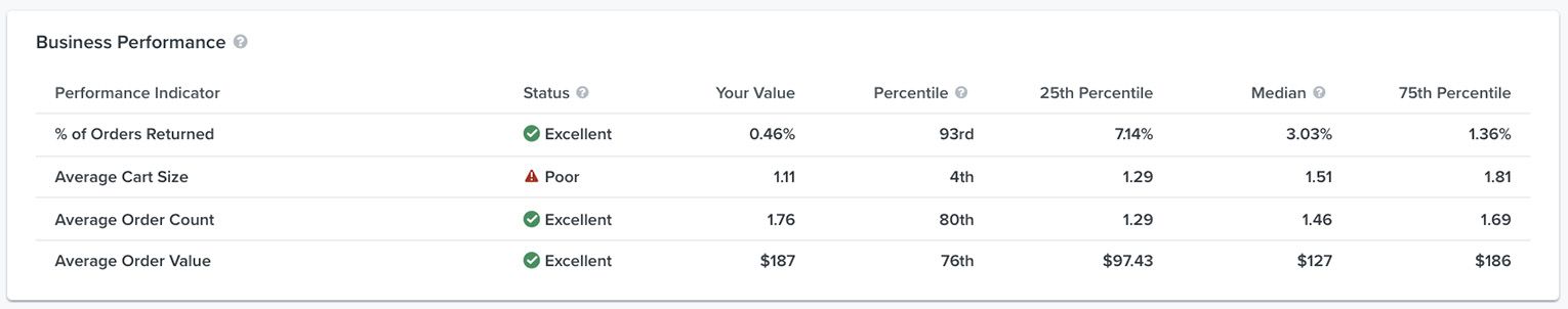
Below the graph, you will see a table outlining what areas of the business you excel in and which need improvement. This will update according to the timeframe you establish for your graph. Note that you will see only your own data and information from peer groups here; industry benchmarks are present only in graphs.
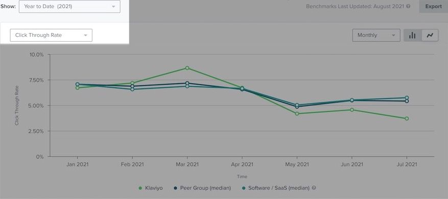
Customize your email and SMS campaign performance page
The email campaign performance and SMS campaign performance pages break down key performance indicators as they relate to email and SMS marketing and deliverability. You can customize which graph you view, the performance indicator to focus on in this graph, and the timeframe of your data.
1. To customize your view, in the upper left of the graph card, select the desired timeframe for your data in the dropdown next to Show.
2. In the dropdown below, you also have the additional option to select the performance indicator (i.e., Open Rate, Click Rate, Click Through Rate, Conversion Rate, Email Revenue per Recipient, Bounce Rate, Spam Report Rate, or Unsubscribe Rate) you want to analyze.
Unlike other Klaviyo reports, in benchmark reports, Average Order Count numbers are totaled until whatever end date you choose. For example, if you are looking at Average Order Count from last month, it will be the total number until last month.
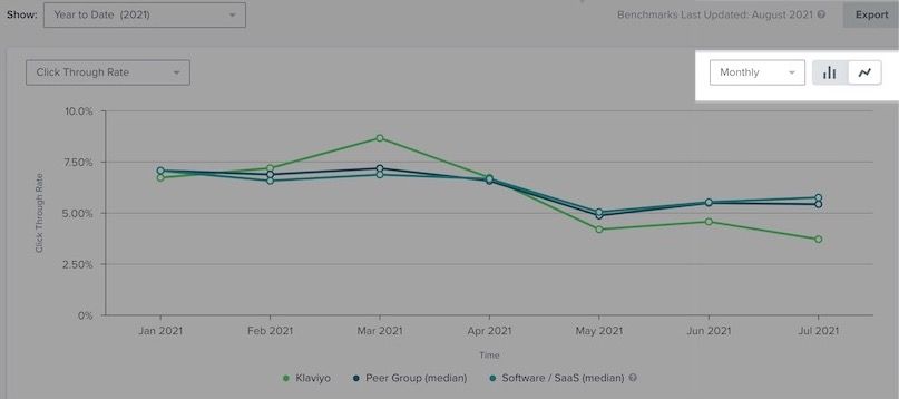
3. In the upper-right corner of this page, select a timeframe breakdown (i.e., monthly, , or yearly).
4. Choose one of the two graph icons to choose a new graph format. The two icon options in the order they appear are: bar graph and line graph.
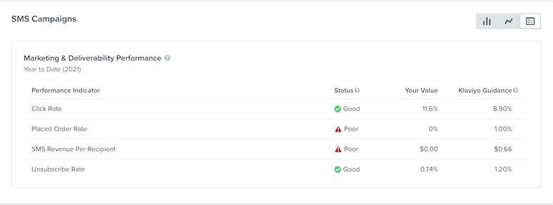
Below the graph, you will see two tables; one outlines your marketing performance, and the other shows deliverability performance. This will update according to the timeframe you establish for your graph. Note that you will see only your own data and information from peer groups here; industry benchmarks are present only in graphs.
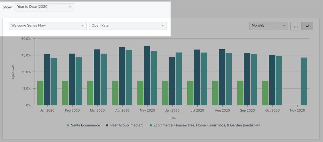
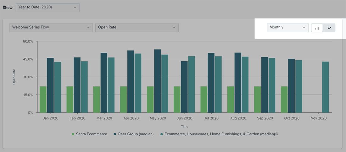
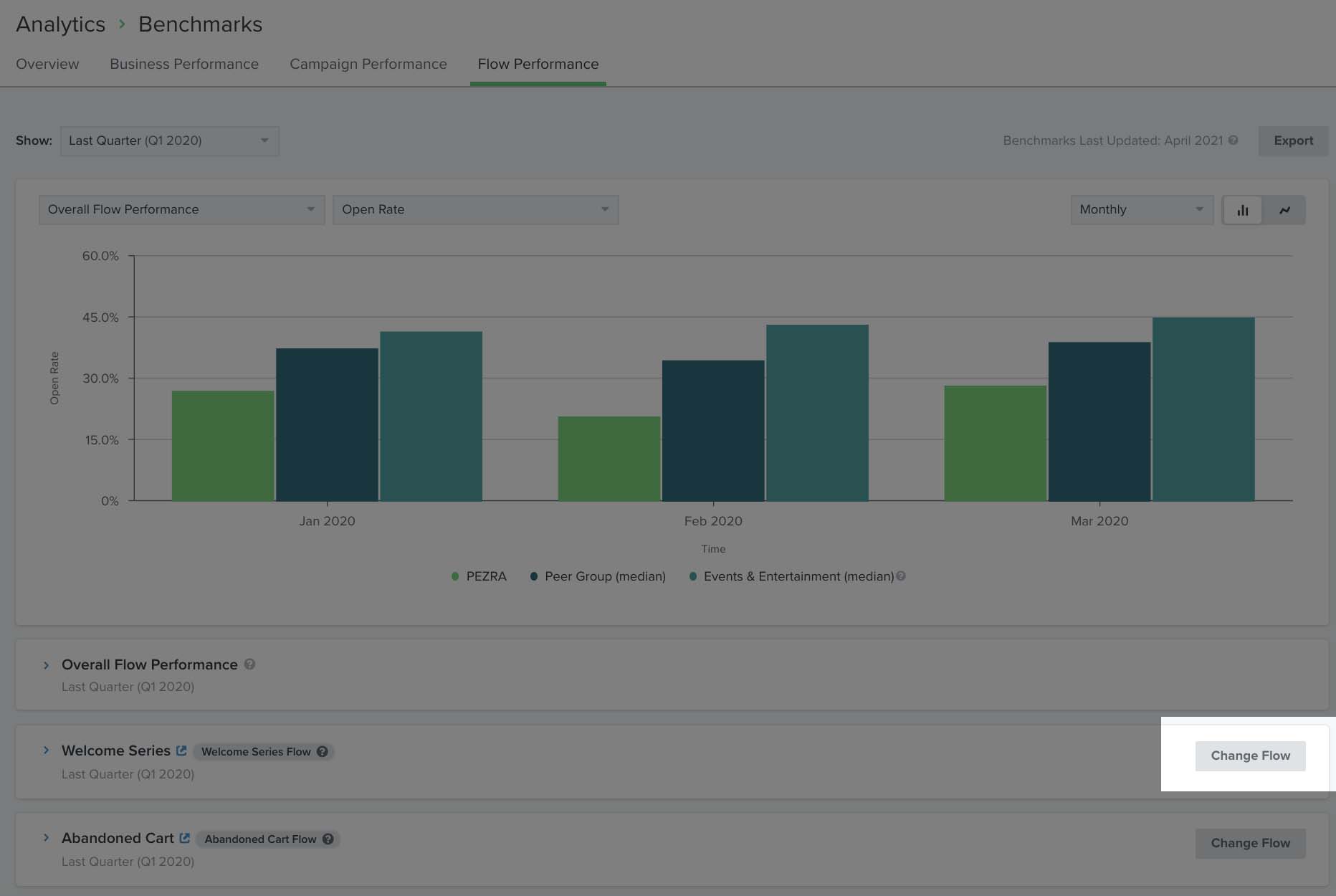
Customize your flow performance page
The Flow Performance page hones in on your flow data, showcasing your performance trends over time in relation to companies similar to your own. You can customize which graph you view, the performance indicator to focus on in this graph, the timeframe of your data, and the specific flow you are focusing on.
1. To start, select the timeframe for your data in the dropdown next to Show.
2. Below the timeframe dropdown, choose the flow and specific performance indicator (i.e., Open Rate, Click Rate, Click Through Rate, Placed Order Rate, Revenue Per Recipient, Spam Report Rate, Unsubscribe Rate, or Bounce Rate) you want to focus on in your graph.
Unlike other Klaviyo reports, in benchmark reports, Average Order Count numbers are totaled until whatever end date you choose. For example, if you are looking at Average Order Count from last month, it will be the total number until last month.
3. Select a timeframe breakdown (i.e. daily, weekly, or monthly).
4. Choose one of the two graph icons to choose a new graph format. The two icon options in the order they appear are: bar graph and line graph.
Below the graph, you will see four tables. These will update according to the timeframe you establish for your graph. The table options are for each of the following key flows:
- Welcome series
- Abandoned cart
- Browse abandonment
- Customer thank you
You can hide or expand these tables depending on what flows you want to analyze. Note that you will only see data from peer groups here; whereas, industry benchmarks appear solely in graphs.
Change your flow
1. To update the selected flow for any of these categories within the Flow Performance page, select Change Flow to the right of the flow’s card.
2. In the resulting popup, choose a different flow from the dropdown menu and click Change Flow Selection.
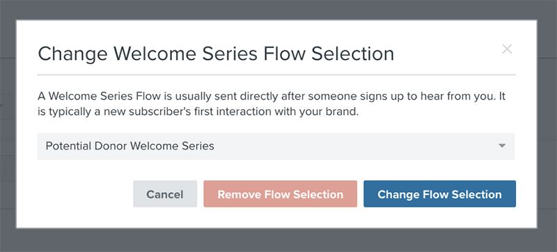
Your flow will then update and you’ll receive a notification when the new data has finished populating. Note that you will see only your data and information from peer groups here; industry benchmarks are present only in graphs.
Additional resources
- Getting started with benchmarks reports
Learn how benchmarks allow you to analyze your account data in relation to Klaviyo best practices, industry trends, and companies similar to your own. By seeing how different aspects of your account perform, you can prioritize efforts in areas that need improvement in order to use Klaviyo to its maximum potential.
- Getting started with reporting
Learn about the different robust Klaviyo reporting tools available in your account. Klaviyo is built to help your business grow and strengthen your relationships with your audience by putting data to work. Segmentation and automation tools allow you to personalize and target your communication efforts across channels to boost engagement and drive business growth. However, in order to understand how well your business strategies and marketing efforts are working, you need proper reporting to measure and analyze performance trends over time.
- Getting started with custom reports in Klaviyo
Learn how to use Klaviyo custom reports to monitor your business' health across each of your marketing channels and individual products or services. By using these reports, you can leverage your data to uncover trends in customer behavior, align your team around a cohesive marketing strategy, and grow your business as you act upon new insights.Just starting out with Klaviyo reporting? Learn more about feature-specific reports and get a general overview of Klaviyo’s analytics tools.