Understanding cohort analysis in the metrics tab
You will learn
Learn about Klaviyo’s cohort report. The cohort report allows you to analyze behavior related to conversion metrics for groups of profiles over time.
Before you begin
The cohort report demonstrated in this guide is included in Klaviyo’s base marketing application. For more advanced cohort reporting functionality, including the ability to define your own cohorts and measure any event over time, purchase Advanced KDP or Marketing Analytics. Head to our billing guide to learn more about these plans.
What is a cohort report?
A cohort report is a type of analysis that allows you to take a group of profiles with common characteristics (i.e., a cohort ) and analyze their behavior over time. This allows you to identify trends and patterns in engagement, conversions, and other key metrics across their lifecycle.
View cohort reports for metrics in Klaviyo
To access cohort reports in Klaviyo, navigate to Analytics > Metrics. You’ll see the Cohorts tab after selecting a conversion metric.
Cohort reports are only available for conversion metrics (i.e., Placed Order, Checkout started, etc.).
Using Klaviyo’s cohort report
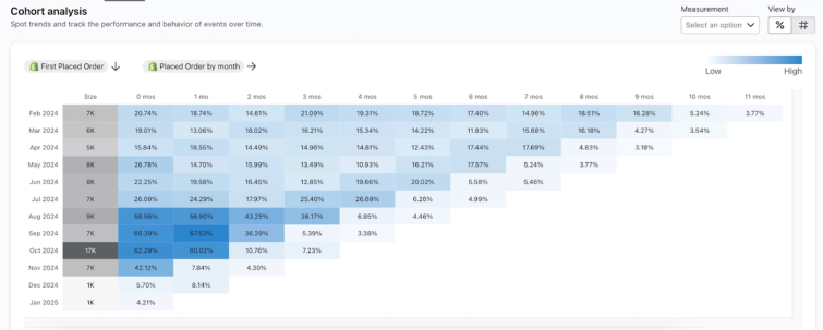
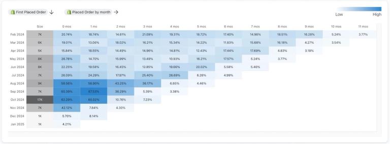
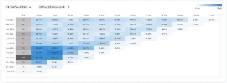
The first column of your graph shows the dates for each cohort. Klaviyo will always display the last 12 calendar months (in this case February 2024 - January 2025).
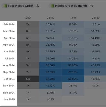
The second column, titled Size, displays the total number of profiles that engaged in this specific metric activity. In the example above, this cohort report shows the total number of profiles that performed a Placed Order event. You’ll notice that the report has blue highlights. The higher the value of each cohort, the darker the color will be. This helps you quickly identify the strongest and weakest performance of these cohorts over time for your given metric.
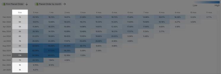
The third column, titled 0 mos lists the percentage of profiles from the cohort (or count of profiles) that engaged in the activity for the month listed in the adjacent row. The subsequent numbered columns (labeled 1 mos - 11 mos) show the total number of profiles that continued to engage in that activity in each subsequent month.
Additionally, select the following information on the configure the report based on the data you’d like to analyze:
- Measurement
The measurement for the reporting event being measured over time. This can be:- Conversions
The count of conversions based on the reporting event. You can view this as an average per profile, or as a total count. - Profiles
The number of profiles that performed the reporting event. You can view this number as a count, or as a percent of the original cohort. - Conversion value
The value of the conversions that occurred due to the reporting event. You can view this as the average value per profile, or as a total sum of all conversions.
- Conversions
- View by
Define whether you’d like to view the measurement as a percent value, count, average, or total. Note that the options available for the View by field vary based on your select for Measurement.
Information on a cohort report
Vertical axis
The vertical axis on the cohort report represents groups of customers for the last 12 months by month. Each row represents a group of customers that entered their respective cohort in the associated month. For example, February 2024 on the vertical axis represents the group of profiles that performed the cohorting action (i.e., the action that caused them to enter the cohort) in February 2024.
Horizontal axis
The horizontal axis on the cohort represents change over time. Each sequential column represents an additional month from when profiles originally entered their cohort. For example, 2 mos on the horizontal axis would represent 2 months after when profiles entered their cohort.
Hovering over a cell in the cohort report will highlight the row it is in.
Color
Klaviyo uses color to represent the value of the measurement. Higher values have darker colors, while smaller values have lighter colors. This helps to make trends and changes in measured values easily identifiable.
Understanding cohort report data
Cohort reports can provide a number of different insights based on how you read them.
To demonstrate how to read the data in a cohort report, we’ll use the following report as an example. This cohort report is for the Placed Order event, and tracks how many people place an additional order per month. Profiles enter a cohort when they place their first order, and the report shows what percentage of the profiles in the cohort made a repeat purchase each month.
Reading the cohort report horizontally
By reading a cohort report horizontally, you can gain insights about behavior patterns over time for specific cohorts.
In the example, the first column in the cohort report (i.e., Size) shows the total number of customers that have made a first purchase in 2024. Each column after that shows the percentage of the original cohort that have made additional purchases over time for each calendar month. As you read the report horizontally, you gain insights about repeat purchase rate over time.
You can see that of the 7,000 profiles in the February 2024 cohort, 20.74% of them made an additional purchase in the same month. The next column shows that in March 2024, 18.74% of the original cohort made an additional purchase. At the 3 mos mark (i.e., May 2024) there is a slight spike in repeat purchases, with 21.09% of profiles from the original cohort making an additional purchase.
This shows that for the February 2024 cohort, the most common time for repeat purchases is 3 months after an initial purchase. You can begin to validate this across other cohorts of customers, and consider if there were any promotions or events that may have caused a bump in the repeat purchase rate at this time.
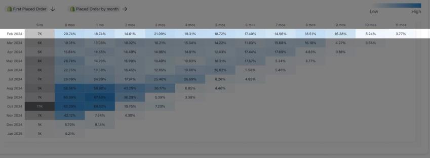
Reading the cohort report vertically
By reading a cohort report vertically, you can learn how different cohorts perform at the same relative point in time (e.g., the repeat purchase rate 3 months after a first purchase for each cohort). This allows you to learn whether profile behavior changes over time across different cohorts.
In the example cohort report, you can see that as you go down the column, conversions generally increase. Looking at the 1 mos (i.e., 1 month) column, you can see that the number of conversions increases for newer cohorts. This may indicate that towards the end of 2024, there may have been an event (e.g., new product launch or a marketing campaign) that drove this increase. Specifically, the August 2024 cohort saw a big spike in the number of profiles that made an additional purchase the month after their initial purchase (i.e., 56.9% of the initial cohort compared to 24.29% for the July 2024 cohort at the same relative point in their lifecycle.
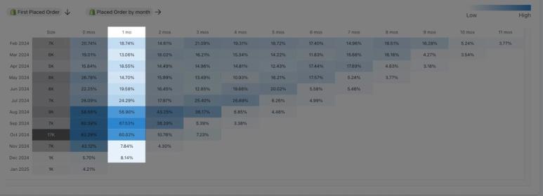
Reading the cohort report diagonally
By reading a cohort report diagonally, you can track performance across cohorts at the same absolute point in time, or at different lifecycle stages (e.g., the repeat purchase rate in a specific month).
Look at the example cohort report starting from the 0 mos column (i.e., the same month as the original cohorting event) for the October 2024 cohort. As you go up-right diagonally from this starting point, you can see the number of conversions in October 2024 for each cohort. During this time, each of the cohorts is at a different point in their lifecycle.
In this case, there is an increase in conversions for most cohorts compared to the previous month (i.e., September 2024). This indicates that there may have been an event in October 2024 that caused an increase in conversions for most cohorts. Perhaps October is when customers begin their holiday shopping. Conversely, if there was a consistent decrease in conversions for most cohorts compared to the previous month, this may indicate there are external factors (e.g., a downturn in the economy) that affected all profiles at the same time.
Additional resources
- Getting started with Advanced KDP
Learn more about using Advanced KDP (Klaviyo data platform) to gather robust customer insights across all your marketing initiatives. Advanced KDP enables more advanced data management, manipulation, and analysis. It also provides actionable strategies to employ across each of your individual audiences and your business as a whole.
- How Klaviyo billing works
Learn how Klaviyo bills customers for Profiles and Emails, Mobile Messaging, Reviews, Advanced Klaviyo Data Platform (formerly “CDP”), Marketing Analytics, Customer Hub, Helpdesk, and Customer Agent.