ベンチマークページをカスタマイズする方法
このページで学べること
ベンチマーク ページをカスタマイズしてビジネス ニーズに最適に対応し、ブランドにとって最も有用なデータを見つける方法を学びます。Klaviyo のベンチマーク ツールには、同業他社や業界トレンドと比較してパフォーマンスを確認できる、カスタマイズ可能な 4 つのデータページがあります。これらのページには、概要、ビジネス パフォーマンス、キャンペーン パフォーマンス、フロー パフォーマンスが含まれます。
Klaviyo のベンチマークは現在、メールデータを対象としており、SMS データは含まれていない点にご注意ください。
概要ページのカスタマイズ
ベンチマークの概要ページには、パフォーマンスが良いアカウントのメトリックと、パフォーマンスが悪いアカウントのメトリックの概要が表示されます。
1.このデータセットで表示する日付範囲を調整して特定の期間に絞り込み、トレンドを追跡できます。そのためには、[表示] の横にある ドロップダウン をクリックします。
2. 次のいずれかの範囲を選択します。
- 先月
- 過去 3 か月
- 今四半期の累計
- 前四半期
- 過去12か月
- 今年の累計
- 昨年
- 全期間
- カスタム日付範囲
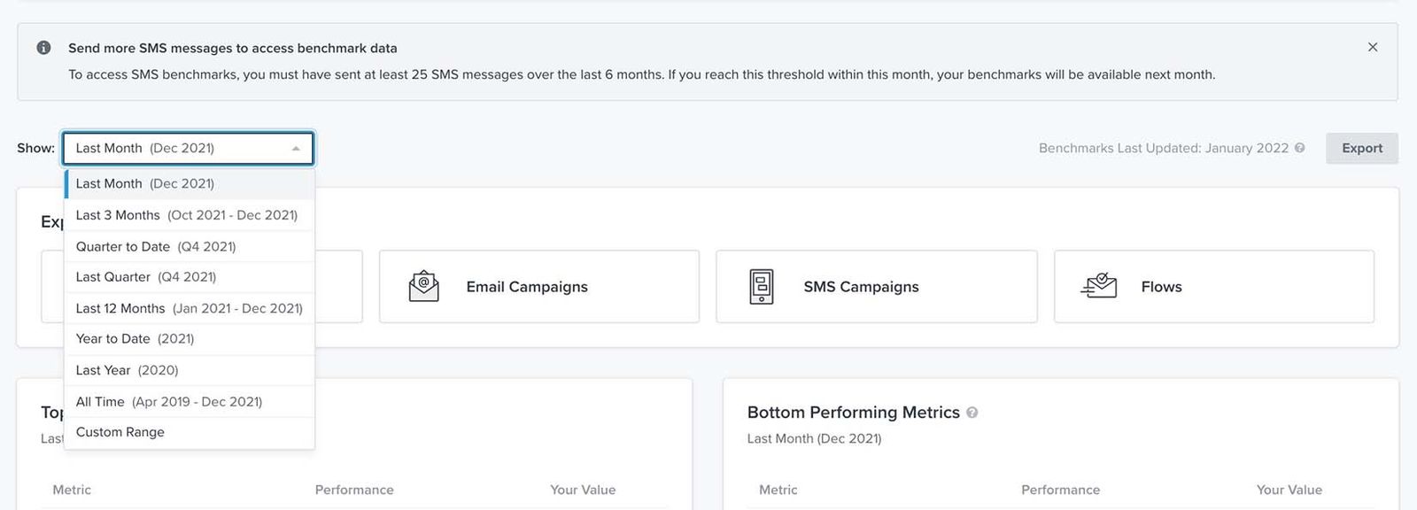
この範囲では、月は暦月に基づき、四半期は 3 か月にきれいに対応します。四半期は北米の Q1/Q2/Q3/Q4 形式に基づいて定義され、Q1 は 1 月から 3 月に相当します。
ビジネス パフォーマンスページをカスタマイズ
ビジネスパフォーマンスページでは、ビジネス全体の健全性に関する主要業績評価指標の内訳を確認できます。グラフと表の両方の形式で、表示するグラフ、グラフのパフォーマンス指標、データの期間をカスタマイズできます。
1.グラフカードの左上で、Show の横にあるドロップダウンから、データの希望する期間を選択してください。
2. 次に、期間のドロップダウンのすぐ下で、分析したいパフォーマンス指標(例: 平均カートサイズ、平均注文数、平均注文額、または返品された注文の割合(%))を選択します。
他の Klaviyo レポートとは異なり、ベンチマークレポートでは、Average Order Countの数値は、選択した終了日まで合計されます。たとえば、先月の Average Order Count を確認している場合、先月までの合計数になります。
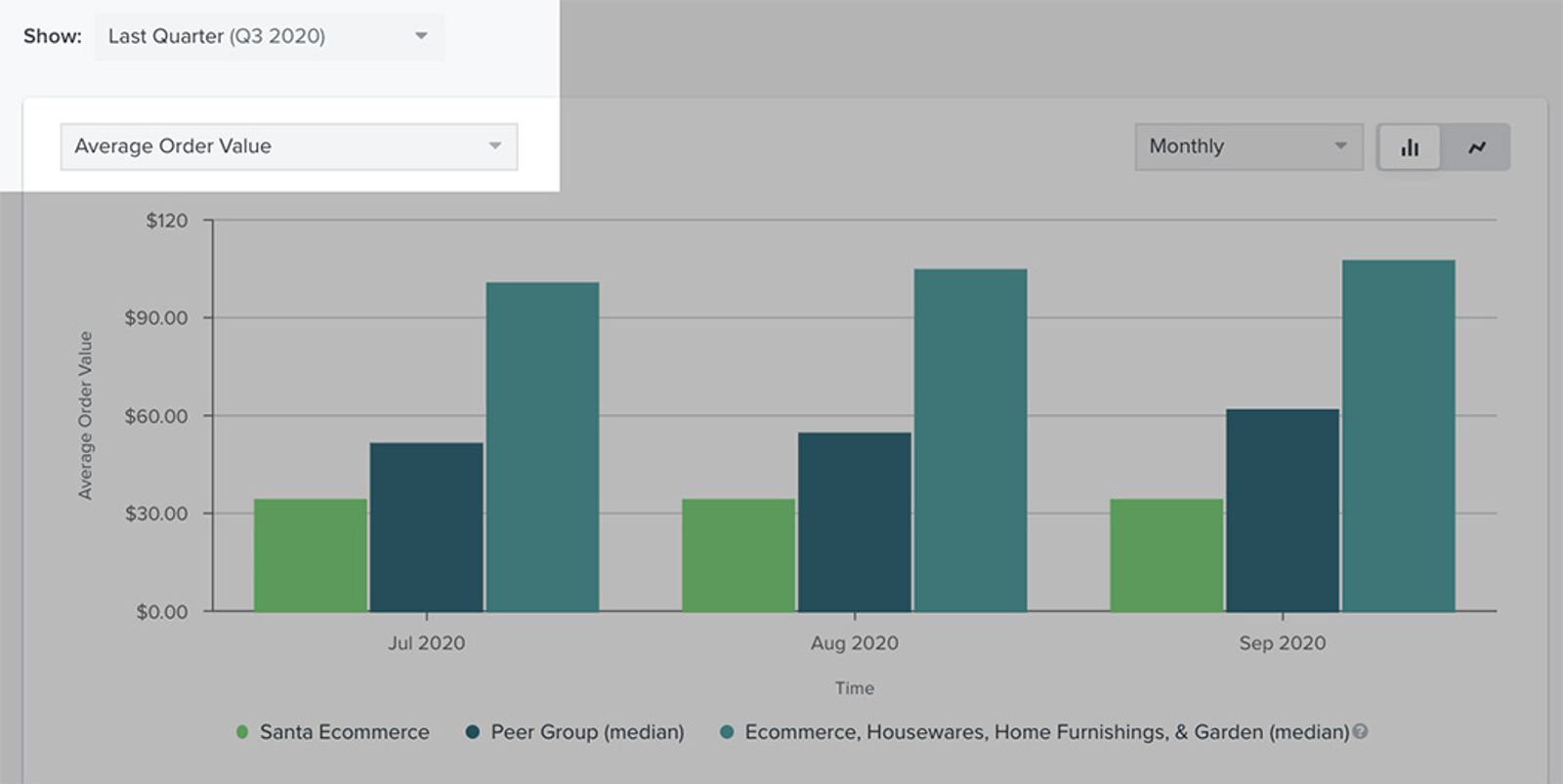
3. 次に、期間の内訳(例:月次、四半期、年次)を選択し、2 つのグラフアイコンのいずれかを選んで新しいグラフ形式を選択します。表示される順に、2 つのアイコン オプションは棒グラフと折れ線グラフです。
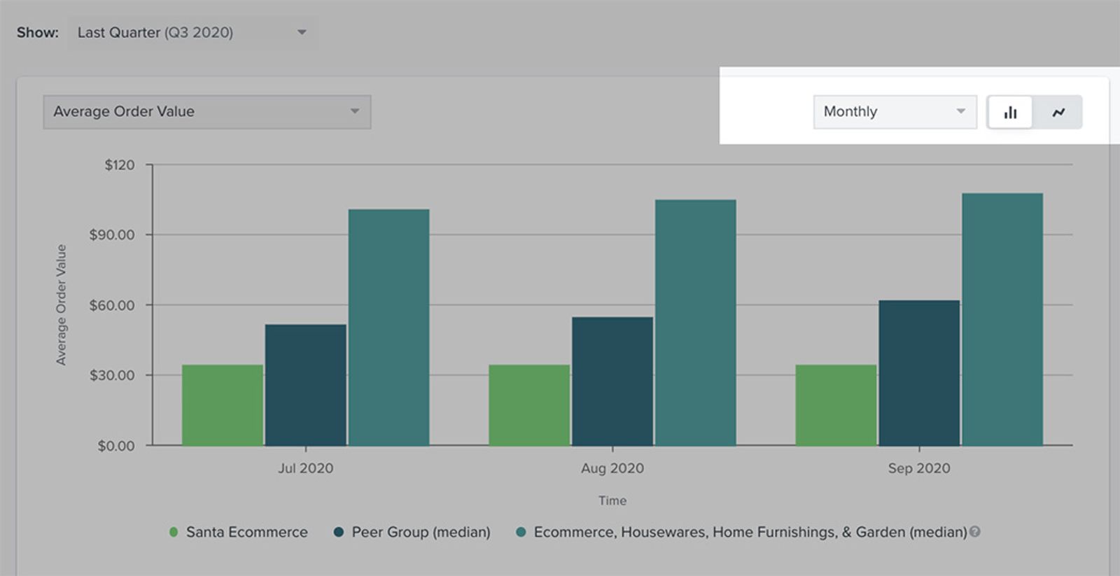
グラフの下には、ビジネスのどの領域が優れているか、またどの領域に改善が必要かを示す表が表示されます。これは、グラフに設定した期間に応じて更新されます。ここに表示されるのは自身のデータと同業他社グループの情報のみであり、業界ベンチマークはグラフにのみ表示される点に注意してください。

メールと SMS のキャンペーンの成果ページをカスタマイズする
メール キャンペーンのパフォーマンス ページと SMS キャンペーンのパフォーマンス ページでは、メールおよび SMS マーケティングと デリバビリティ に関連する主要業績評価指標を内訳表示します。表示するグラフ、このグラフで注目するパフォーマンス指標、データの期間をカスタマイズできます。
1.表示をカスタマイズするには、グラフ カードの左上で、Show の横にあるドロップダウンでデータの希望する期間を選択します。
2. 下のドロップダウンで、分析したいパフォーマンス指標(例: 「開封率」、「クリック率」、「クリックスルー率」、「コンバージョン率」、「受信者あたりのメール売上」、「バウンス率」、「スパム報告率」、または「購読解除率」)を追加で選択することもできます。
他の Klaviyo レポートとは異なり、ベンチマークレポートでは、Average Order Countの数値は、選択した終了日まで合計されます。たとえば、先月の Average Order Count を確認している場合、先月までの合計数になります。
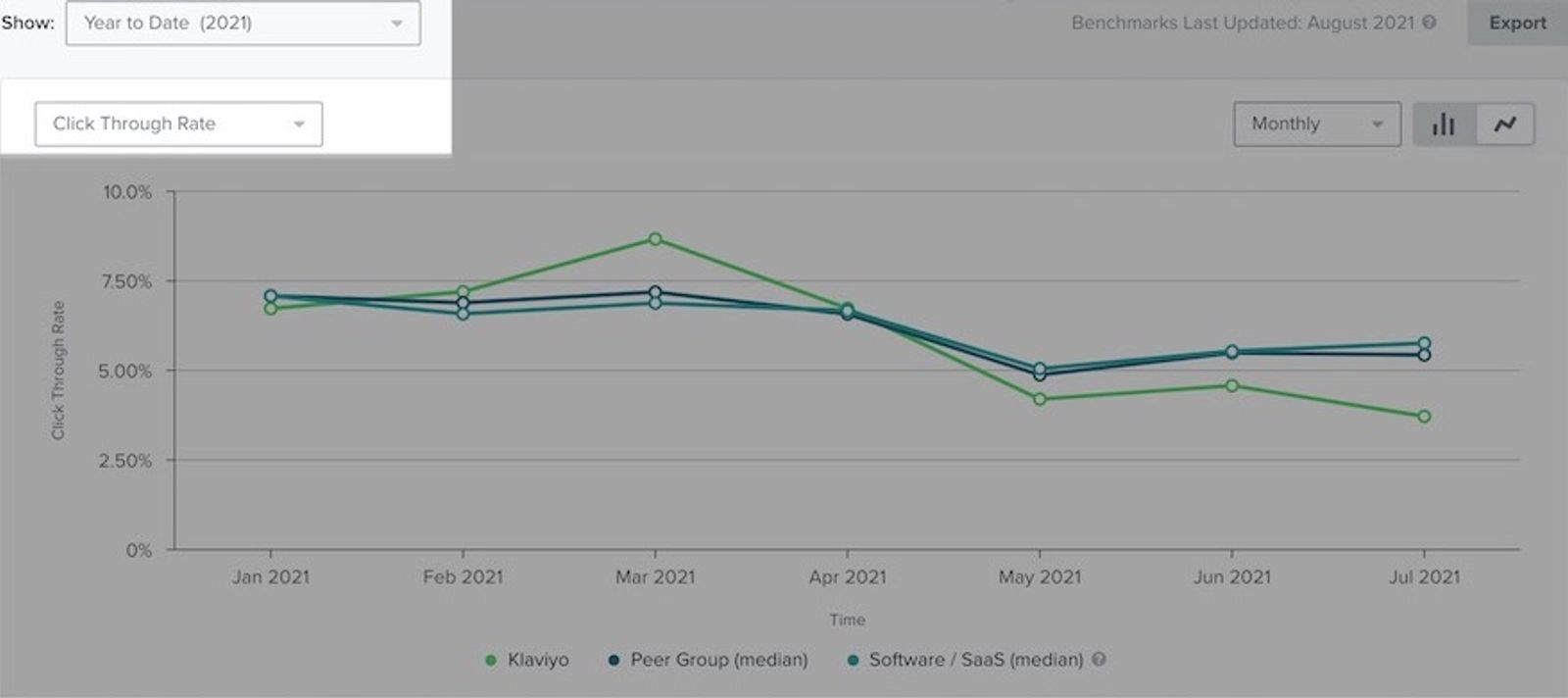
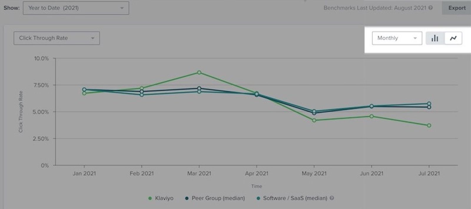
3. このページの右上隅で、期間の内訳(つまり、月次、、または 年次)を選択します。
4. 2 つのグラフ アイコンのいずれかを選択して、新しいグラフ形式を選択します。表示される順に、2 つのアイコン オプションは棒グラフと折れ線グラフです。
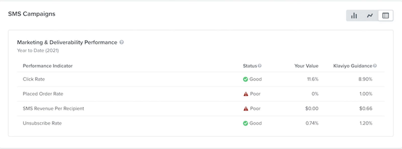
グラフの下には 2 つの表が表示されます。1 つはマーケティング パフォーマンスの概要、もう 1 つはデリバビリティ パフォーマンスを示します。これは、グラフに設定した期間に応じて更新されます。ここでは自身のデータと同業他社グループの情報のみが表示されます。業界ベンチマークはグラフにのみ表示されます。
フローのパフォーマンス ページをカスタマイズ
フローのパフォーマンスページではフローデータに焦点を当て、類似する企業と比較した場合の経時的なパフォーマンストレンドを表示します。表示するグラフ、このグラフで注目するパフォーマンス指標、データの期間、注目している特定のフローをカスタマイズできます。
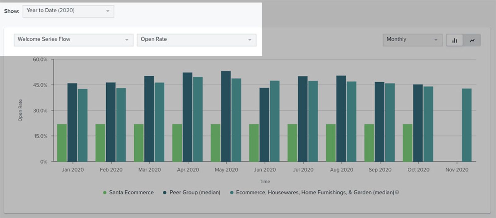
1.まず、 表示 の横にある ドロップダウン でデータの期間を選択します。
2. 期間のドロップダウンの下で、フローと、グラフで注目したい特定のパフォーマンス指標(例: 「開封率」、「クリック率」、「クリックスルー率」、「注文率」、「受信者あたりの売上」、「スパム報告率」、「購読解除率」、または「バウンス率」)を選択します。
他の Klaviyo レポートとは異なり、ベンチマークレポートでは、Average Order Countの数値は、選択した終了日まで合計されます。たとえば、先月の Average Order Count を確認している場合、先月までの合計数になります。
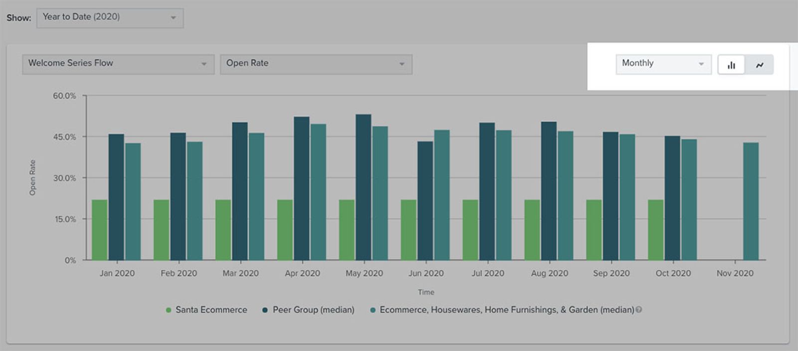
3. 期間の内訳を選択します(例:日次、週次、または 月次)。
4. 2 つのグラフ アイコンのいずれかを選択して、新しいグラフ形式を選択します。表示される順に、2 つのアイコン オプションは棒グラフと折れ線グラフです。
グラフの下に 4 つの表が表示されます。これらは、グラフの期間として設定した時間枠に応じて更新されます。テーブル オプションは、次の各主要フロー向けです:
- ウェルカムシリーズ
- カゴ落ち
- 閲覧放棄
- 顧客への感謝
分析したいフローに応じて、これらの表を非表示にしたり展開したりできます。ここでは同業他社グループのデータのみが表示され、業界ベンチマークはグラフにのみ表示される点に注意してください。
フローを変更する
1. フローパフォーマンスページ内でこれらのカテゴリのいずれかについて選択中のフローを更新するには、フローカードの右側にある [フローを変更] を選択します。
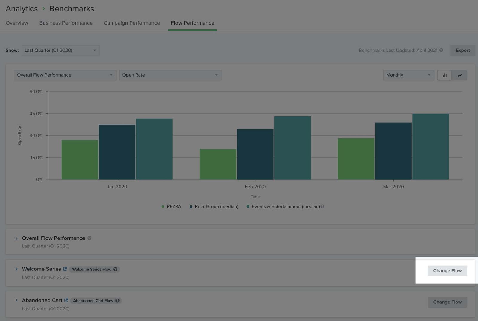
2. 表示されるポップアップで、ドロップダウン メニューから別のフローを選択し、[フロー選択を変更] をクリックします。
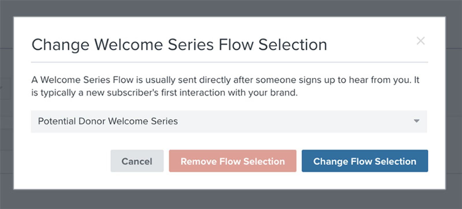
その後フローが更新され、新しいデータの反映が完了すると通知が届きます。ここでは同業他社グループのデータと情報のみが表示されます。業界ベンチマークはグラフにのみ表示されます。
その他のリソース
- Getting started with benchmarks reports
Learn how benchmarks allow you to analyze your account data in relation to Klaviyo best practices, industry trends, and companies similar to your own. By seeing how different aspects of your account perform, you can prioritize efforts in areas that need improvement in order to use Klaviyo to its maximum potential.
- Getting started with reporting
Learn about the different robust Klaviyo reporting tools available in your account. Klaviyo is built to help your business grow and strengthen your relationships with your audience by putting data to work. Segmentation and automation tools allow you to personalize and target your communication efforts across channels to boost engagement and drive business growth. However, in order to understand how well your business strategies and marketing efforts are working, you need proper reporting to measure and analyze performance trends over time.
- Getting started with custom reports in Klaviyo
Learn how to use Klaviyo custom reports to monitor your business' health across each of your marketing channels and individual products or services. By using these reports, you can leverage your data to uncover trends in customer behavior, align your team around a cohesive marketing strategy, and grow your business as you act upon new insights.Just starting out with Klaviyo reporting? Learn more about feature-specific reports and get a general overview of Klaviyo’s analytics tools.