Understanding the deliverability tab in campaigns and flows
You will learn
Learn about the deliverability tab in Klaviyo, that provides an overview of key deliverability performance metrics for your campaigns and flow emails. This can help you easily identify low-performing email domains and countries, so you can take action to protect your deliverability.
Deliverability tab
You can analyze the deliverability performance of each email campaign and flow email using the dedicated Deliverability tab.
To access this page for campaigns, navigate to a sent email campaign and select the tab called Deliverability.

For flows, navigate to your flow email and select Edit to see the Deliverability tab.

This page displays data around your email's performance for key deliverability metrics, and an indicator showing whether your performance in these areas is Healthy, Room for improvement, or Needs Attention.
These metrics include:

Deliverability performance targets
Metric | Needs attention | Room for Improvement | Healthy |
Bounce Rate | >2% | 1%-2% | < 1.0% |
Spam Complaint Rate | >0.05 | 0.01%-0.05% | < 0.01% |
Unsubscribe Rate | >1% | 0.3%-1% | < 0.3% |
Open Rate | <27% | 27%-33% | > 33.0% |
Click Rate | <0.8% | 0.8%-1.2% | > 1.2% |
If your performance is labeled as Room for improvement or Needs Attention in any of these areas, see our guide on troubleshooting declining performance.
Deliverability insights
The deliverability tab for campaigns and flow emails displays information regarding:
Performance by inbox provider
This chart helps you identify whether your deliverability issues are isolated to a specific inbox provider. It shows key deliverability metrics across the inbox providers your customers are using so you can easily identify differences in performance.
The five default inbox providers that will appear upon load are those with the most messages received. If a particular inbox provider has a health status of Needs Attention, it will appear on load for visibility.
This information is broken down into two categories:
Positive engagements
When chosen, the graph will display:
- Open rate
- Click rate
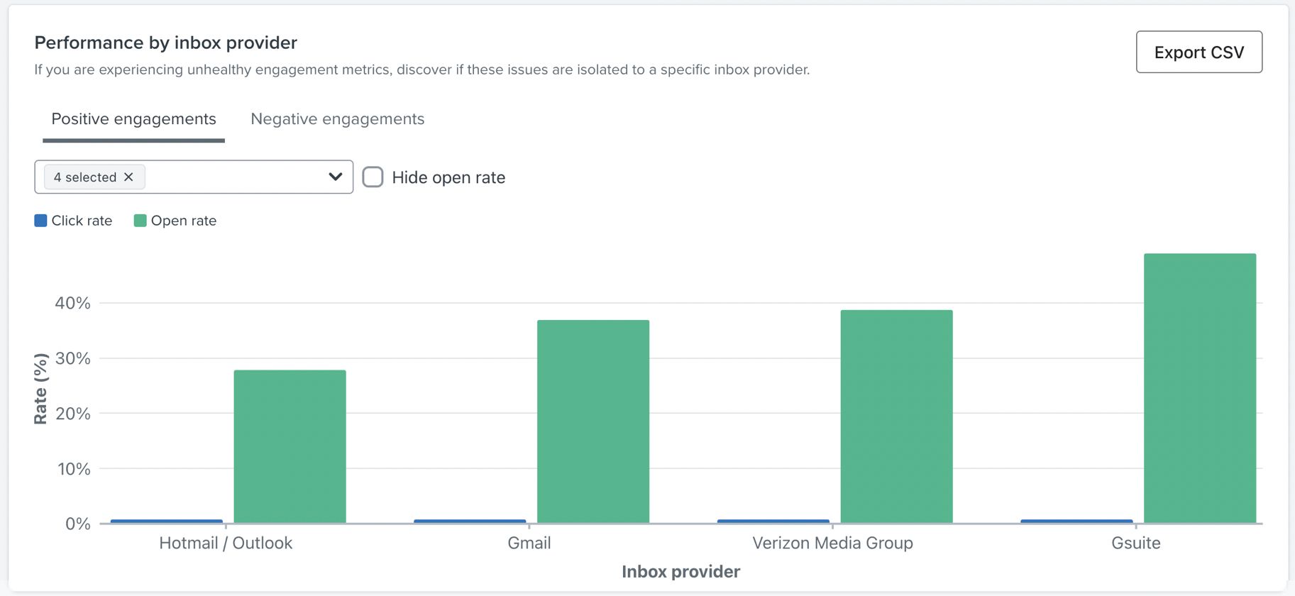
Negative engagements
When chosen, the graph will display:
- Bounce rate
- Unsubscribe rate
- Spam complaint rate
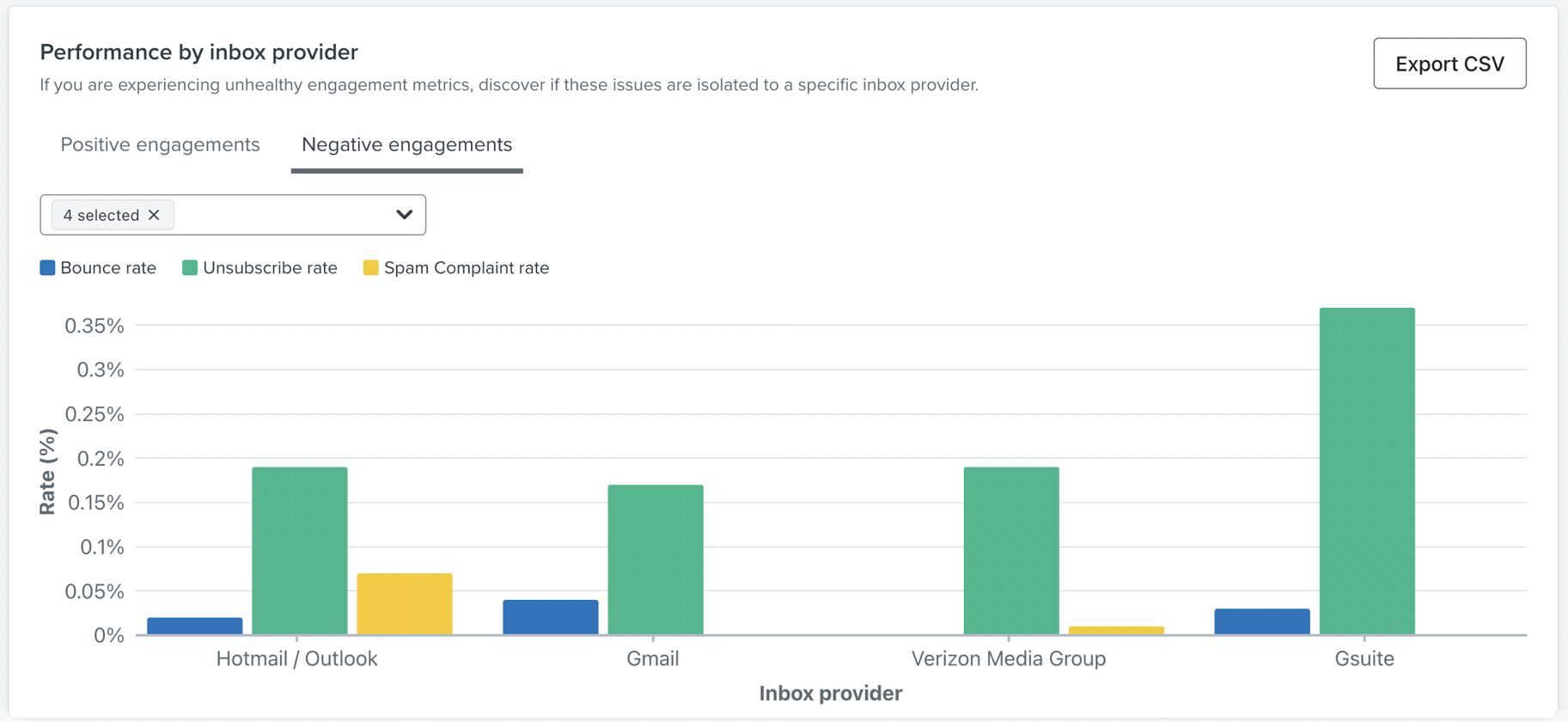
If you are seeing deliverability performance issues here, you can strengthen your sender reputation for an inbox provider.
Performance by email domain
This chart helps you identify whether your deliverability issues are isolated to a specific email domain. It shows key deliverability metrics across the different email domains your customers are using so you can easily identify differences in performance.
The five default domains that will appear upon load are those with the most messages received. If a particular domain has a health status of Needs Attention, it will appear on load for visibility.
This information is broken down into two categories:
Positive engagements
When chosen, the graph will display:
- Open rate
- Click rate
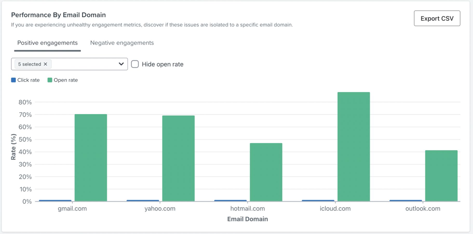
Negative engagements
When chosen, the graph will display:
- Bounce rate
- Unsubscribe rate
- Spam complaint rate
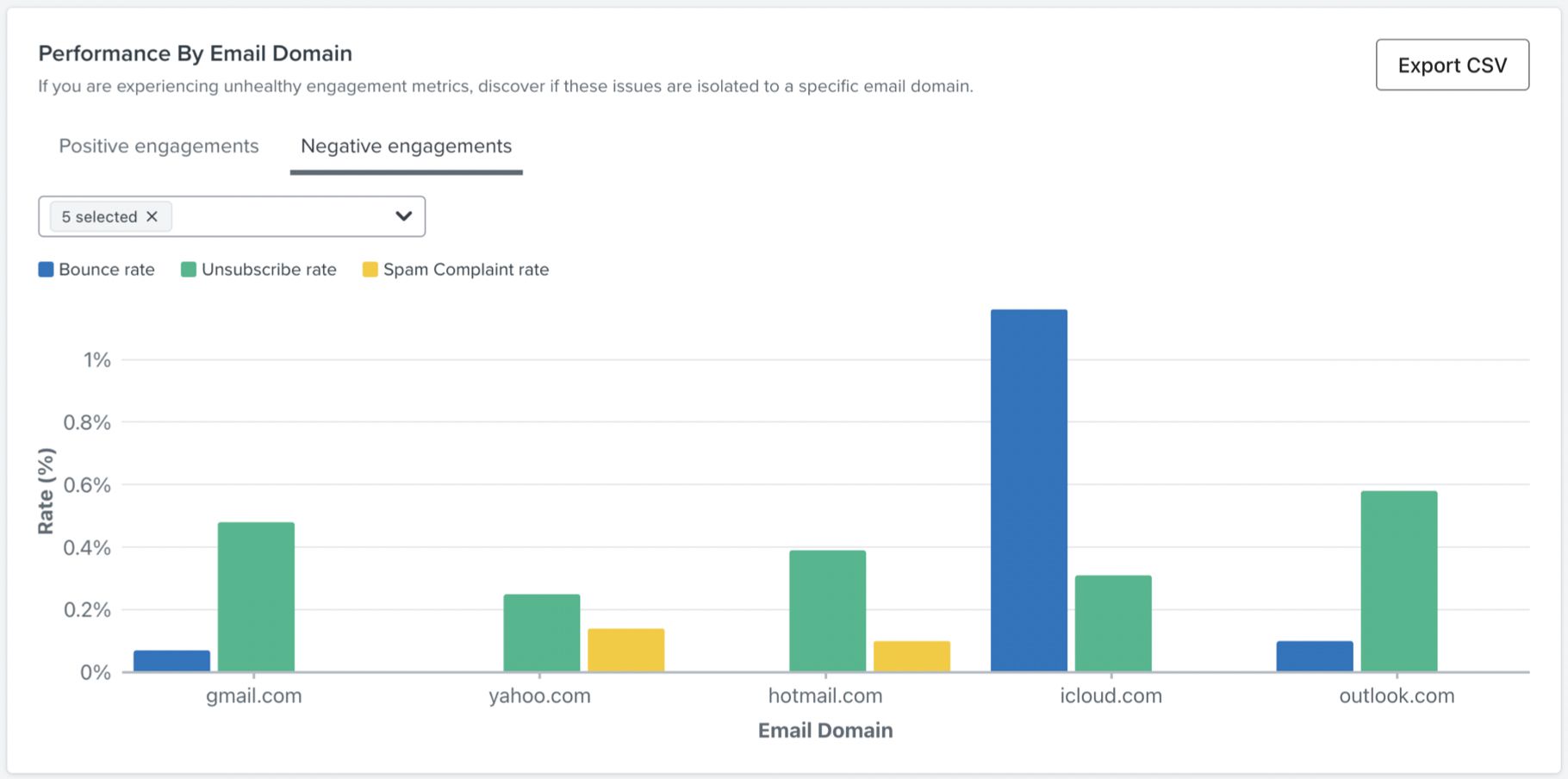
If you are seeing deliverability performance issues here, you can strengthen your sender reputation for a specific domain.
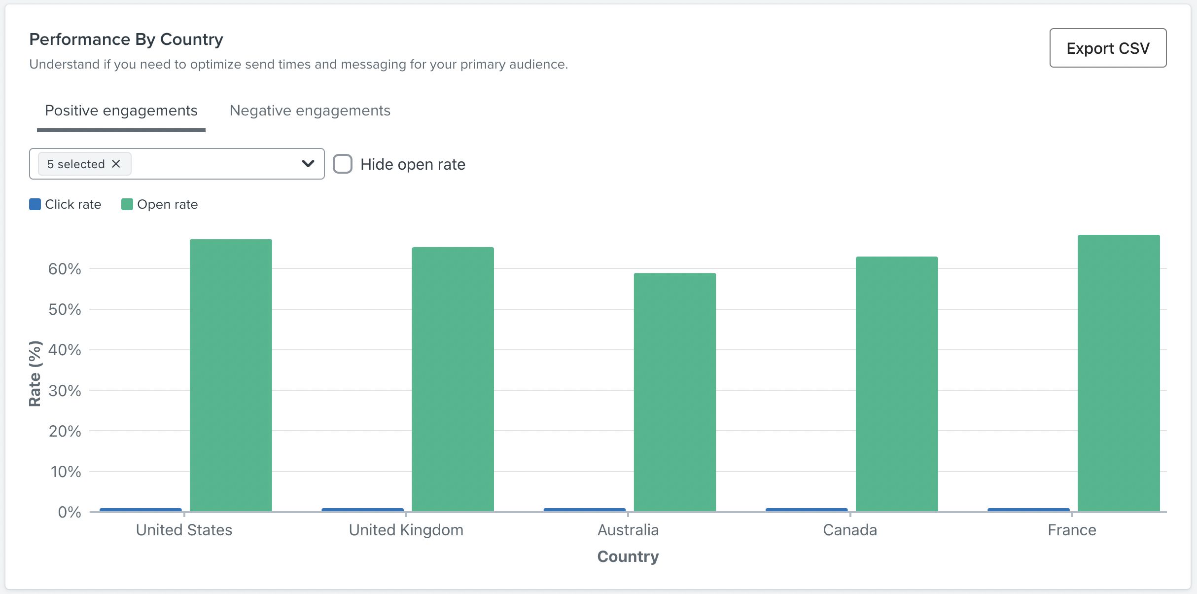
Performance by country
This chart helps you to better understand your contact base through a performance breakdown by country. This can help you optimize send times for your primary audience.
Learn more about how location is set for profiles in Klaviyo.
The five default countries that will appear are those with the most messages received. If a particular country has a health status of Needs Attention, it will appear on load for visibility.
This information is broken down into two categories:
Positive engagements
When chosen, the graph will display:
- Open rate
- Click rate
Negative engagements
When chosen, the graph will display:
- Bounce rate
- Unsubscribe rate
- Spam complaint rate
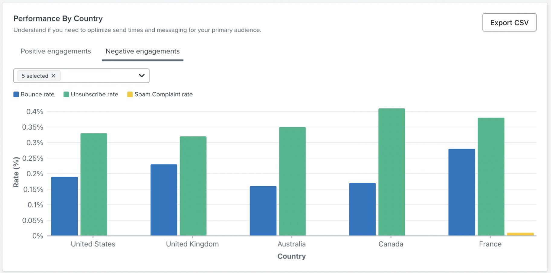
If you are seeing deliverability performance issues here, you can strengthen your sender reputation for a specific country.
Performance by email client
This chart helps you gain insight into how recipients are viewing your email. You can see a breakdown between desktop and mobile usage, and can use it to determine if you need to optimize for one device or the other. It shows the total opens and the breakdown of that total by device type, both as a percentage of the total opens and count of open events (i.e., the number in parenthesis). To optimize email content between desktop and mobile, you can utilize third-party tools such as Litmus or Email on Acid to preview your emails on a wide variety of devices and inbox providers.
Learn more about optimizing content for mobile in Klaviyo, and the basics of designing great emails.
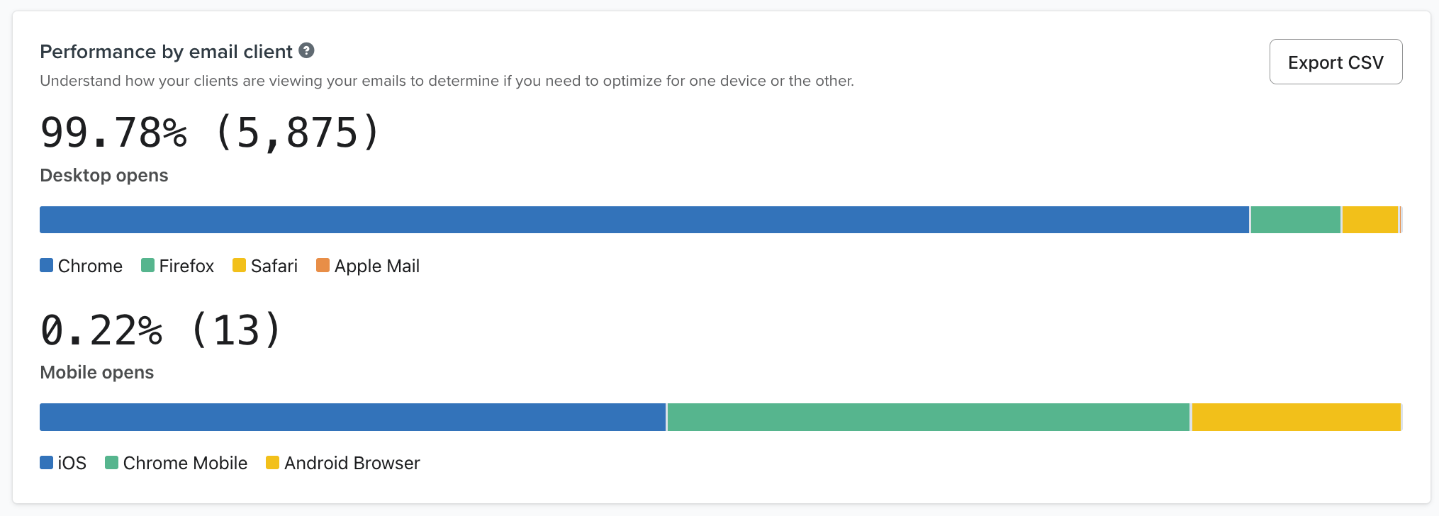
Note that customers' email client is hidden when emails are opened with Apple Mail Privacy Protection (MPP). Open data may be skewed towards desktop if you have many customers using MPP.
This information is based on the user agent properties from the Opened email event.
Email send volume breakdown
This email send volume breakdown shows information regarding what percent of the total send volume a particular inbox provider, email domain, or country accounts for. Sent emails are also split by Delivered and Bounced. This helps you understand where the majority of your emails are being sent, and whether the sends are successful.
You can switch between the tabs available on the card to see the different volume breakdowns.
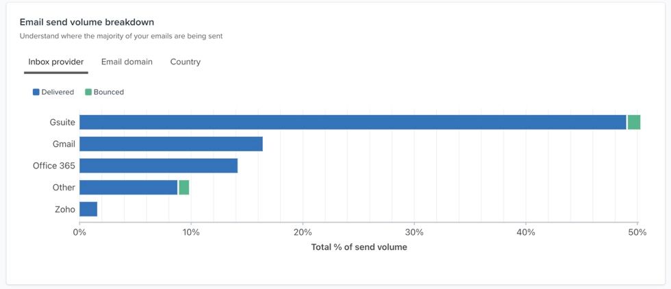
Note that this is reported as a percentage of total sends.
Dropdown health status
When a particular domain or country is experiencing very poor performance in any of the key deliverability metrics, a Needs Attention status will appear next to the field.
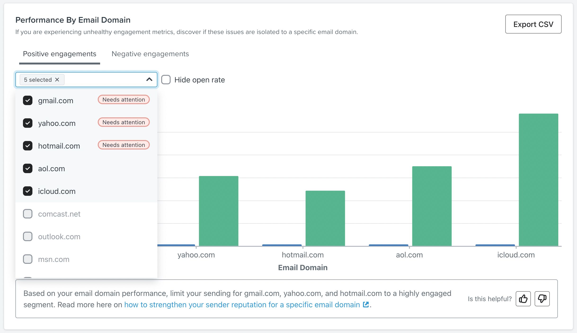
This status will only be visible if two or more of the deliverability metrics are in the Needs Attention range, and the country or email domain makes up 5% or more of the total send volume for the campaign.