Understanding form blocks and fields
You will learn
Learn how to use various content blocks from the form editor (i.e., elements and input fields) in your sign-up form to customize its appearance and the type of information you collect from subscribers.
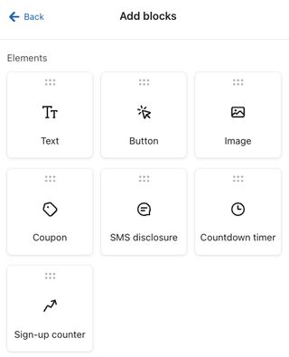
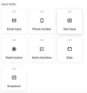
About the Add blocks tab
In the sign-up form editor, click on the Add Blocks tab to see the different content blocks that you can add to your form.
There are 2 different block categories:
- Elements
- Input fields
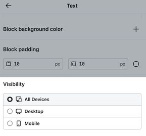
When you drag and drop a block into the form preview, editing options will appear in the left-hand sidebar. From here you can adjust the block's details text, including text and styling. At the bottom of this editing menu, you can also configure Visibility settings for the block to control whether it displays on all devices, only desktop, or only mobile. Learn more about dynamic blocks in forms.
If you're building a mobile-only sign-up form, see basics: mobile form design.
Best practices when adding content blocks to forms
If you plan to include several blocks and fields to ask your site visitors for multiple pieces of information (e.g., birthday, email address, phone number, etc.) in your form, use a multi-step form. Multi-step forms can help you learn more about your visitors and collect their consent across multiple channels, without overwhelming them with too many fields at once.
If you want to ask for both email and phone number in your form, it's best practice for list growth and compliance to include these fields on 2 different steps.
Form elements
Sign-up form elements add content to your form, including text, buttons, images, and coupons. These blocks inform the visitor of the purpose of your sign-up form and allow them to interact with it.
Text block
Text blocks allow you to insert text content on your form, such as a headline, instructions, or other display text. Klaviyo's form editor uses UTF-encoding standard, which means it supports Latin characters, emojis, double byte characters, and more. Additionally, you can add an inline image using the image URL input option.
Button block
Button blocks allow you to gather and save information in Klaviyo about those who submit your form. A button can allow the viewer to close or submit the form, direct them to a different page on your website, or subscribe them to SMS messaging.
Choose 1 of the following actions for your button:
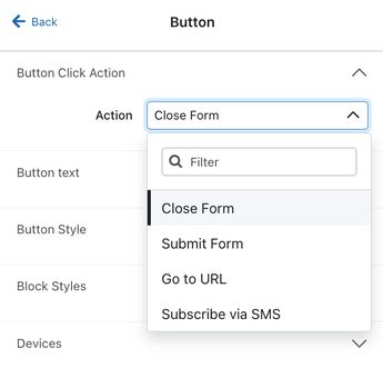
- Close Form
The form will close and data won’t be submitted to Klaviyo. - Submit Form
Any form fields that the visitor completed will be sent to Klaviyo, and the form will progress based on the option you select for the After submit field (either Show Next Step, Go to URL, or Close Form). - Go to URL (Redirect to a different page)
The visitor will be redirected to the URL you provide, and data from any form fields won’t be submitted to Klaviyo. When inputting your Destination URL, use the full URL, including https:// (e.g., use https://help.klaviyo.com/hc/en-us rather than help.klaviyo.com/hc/en-us).
The Go to URL action will not work with an incomplete URL.
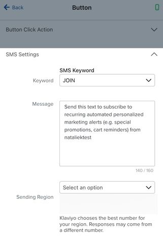
- Subscribe via SMS
You can configure this option on mobile-only forms, or on the mobile view of the SMS Opt-in step for forms that target all devices. It allows visitors to subscribe to SMS in just a few taps (tap-to-text). When a visitor clicks a Subscribe via SMS button, their text messaging app will appear with a pre-typed message they can send to subscribe.- Select a keyword from the Subscribe Keyword dropdown. This is the word that someone must text to your destination number in order to be added to your account’s SMS subscription list, and is configured at the account level.
- Set an opt-in message, which will populate in their messaging app. By default, this reads “Send this text to subscribe to <organization_name>!”, but you can customize the message content. This field allows up to 160 GSM-7 characters (1 message) only. Special characters, including emojis, are not valid.
- Choose the appropriate number under Sending Region if you operate in multiple regions and have more than 1 sending number.
Change the list a sign-up form submits to
You can change the list your form submits to (meaning the list that new subscribers collect to) in the button’s settings. To change a form’s submit list:
- Click on the button within the form editor.
- In the menu that appears along the left, select the new list under List to Submit.
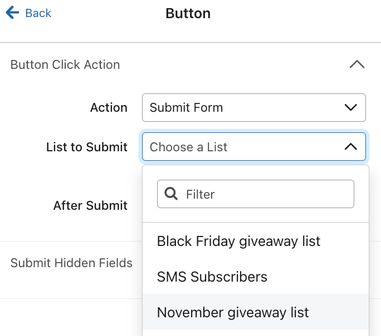
- Click Back in the editing sidebar.
- If your satisfied with your form's content, click Publish. Even if your form is already live you must publish the changes so that new subscribers collect to your newly selected list.
Submit hidden fields
Hidden fields are additional properties that will be added to a subscriber's profile in Klaviyo. This allows you to track visitors who interact with your form. By default, all forms have a $source property as a hidden field, which identifies how they were added to your list.
This option is only available for buttons with an Action set to Submit Form.
You can customize the $source property and other property names. Like other inputs on forms, if you add hidden fields for properties that already exist in someone's profile, they will be overwritten by the new value when they submit the form. For example, let’s say your form gathers collection preferences, and a customer has previously selected that they are interested in your men’s collection. If this form has a hidden field for interest in your women’s collection, then the preferences property will be overwritten when the button is clicked (i.e., from men’s to women’s).
To add a new hidden property, select Add a property.
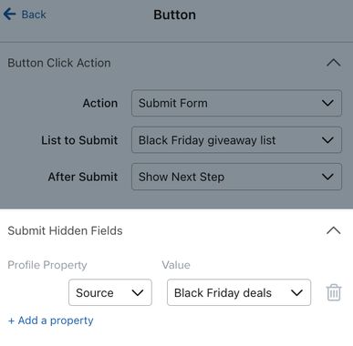
Image block
Image blocks allow you to add an image to your form (e.g., your logo). You can use this block to add images to match the look and feel of your brand.
JPEG, PNG, and GIF files are all accepted. As with all images viewed on the web, larger file sizes lead to slower load times. Aim for a file size of 50-100 KB for optimal performance.
You can also add a background image or a side image in the Styles tab of the form editor.
Coupon block
Add a coupon block to incentivize your site visitors to submit your sign-up form and use the included coupon to make a purchase on your site.
You can add static or unique coupon codes to a form. Klaviyo best practices recommend showing these codes in the Success step, so shoppers don't have to leave your website to get the code. Read our guide on adding coupon codes to sign-up forms for more details on set up.
SMS disclosure block
SMS disclosure language should be placed above an SMS opt-in button to help maintain SMS compliance. Learn more about SMS disclosure language.
Countdown timer
Countdown timers can add a sense of urgency to your sign-up forms, and are often paired with special promotions or holiday messaging. Learn more about adding countdown timers to forms.
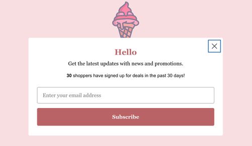
Sign-up counter block
Add a sign-up form counter block to display real-time submission counts (e.g., "500 people have signed up for these deals in the past hour!") on your form to boost conversions and accelerate list growth. This block uses social proof to create urgency and compel site visitors to subscribe.
When you add a sign-up counter block to a form, you can configure the following settings:
- Display settings
Determine how sign-ups are counted. Note that a subscriber must reach the success step of the form:- Sign-ups from the past 30 days
- Sign-ups from the past 7 days
- Sign-ups from the past 24 hours
- Sign-ups from the past hour
- Show after __ submits
Determine the minimum number of submissions required for the block to appear.
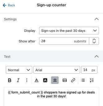
The block will be hidden from site visitors until the minimum number of submits is exceeded. Once the minimum number of submits is met (e.g., 200 submits), the block displays on your form.
The default text will reflect your selected Display settings. While this text is configurable, do not delete the {{ form_submit_count }} tag as this shows the real-time sign-up count.
Input fields
Input fields enable you to collect information from site visitors, like their email address, name, or birthday.
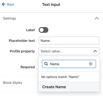
All input fields must be connected to a profile property, which is used to store the data each subscriber submits. When you add an input field to your form, select an existing property from the Profile Properties dropdown, or create a new one by typing in a new property name and clicking Create Option.
Unless otherwise specified, inputs from these fields will be stored within each individual's profile page.
It is not recommended to update custom profile properties in Klaviyo that were synced via an integration (e.g., Shopify tags), since these will be overwritten the next time your integration syncs.
Email input field
Email input fields allow visitors to input their email addresses and subscribe to the list connected to the form. A form can only have 1 email input, and it must appear in one of the form’s steps, not the success message.
Phone number field
If you add a phone number field, by default, it will collect promotional SMS consent, which allows you to send any SMS messages. This block validates submitted phone numbers to ensure they're stored in an acceptable number format. If you have not already, enable SMS if you're going to collect SMS consent, and set up your disclosure language to include anywhere you collect SMS consent.
If necessary, you can adjust the type of SMS consent the form collects; but, ensure the disclosure language matches the consent type and includes examples of the types of messages you'll send so subscribers understand what they're agreeing to.
You can also use dynamic blocks when collecting SMS consent to ensure shoppers see the best method for opting in.
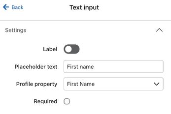
Text input field
Text input fields are used to collect information that doesn’t need to follow a specific format (like dates or email addresses), and when it doesn’t make sense to offer a preset list of options. Note that segmentation and flow filtering are case- and spelling-sensitive. Consider other field types if you plan to use this data for segmentation or filtering.
A common use case for text input fields is collecting subscribers’ names. To add a first name field, use “First name” as the label or placeholder text, and select First Name as the profile property.
Radio buttons
Radio buttons offer a preset list of options, of which subscribers can only select 1. These are useful for collecting information like gender or age range.
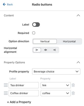
The Profile property field should contain the name you’d like to use for this property. For example, if your form asks visitors if they prefer coffee or tea, use a custom profile property like “Beverage Choice”.
Use the Labels column of the Property Options section to add the options your subscribers can choose from. Then, add corresponding values in the Values column. These values will be stored in the profile of anyone who fills out the form, so consider using a shorthand version of the answer that’s easy to reference.
If your option labels are “Tea drinker” and “Coffee drinker,” the values could be “tea” and “coffee,” respectively.
When a subscriber answers a radio button question, their response will be stored as a string data type.
Multi checkboxes
Multi checkboxes offer a list of options, and subscribers can select as many options as they would like. Multi checkboxes are useful for gathering preference information, interest areas, demographic information, and any questions where a subscriber should be able to select more than 1 option.
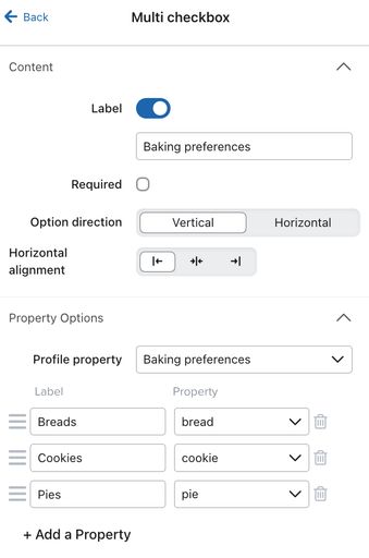
Like a radio button field, your multi checkbox field requires a profile property, a set of labels, and a set of values.
When a subscriber answers a multi checkbox question, their answer will be stored as a list data type, regardless of how many options they select.
Date field
Date fields are the best way subscribers can input date values, which can then, in turn, be used for segmentation or to trigger date-based flows.
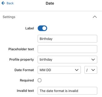
For example, you may want to collect subscribers' birthdays so that you can send them a coupon code via a flow on their birthday. In this case you'd add the date field and set the corresponding profile property to birthday. If you are interested in collecting date information about a customer, use a date block to ensure the dates are formatted correctly.
You have the option to customize how dates are inputted on your form (e.g., DD/MM/YYYY); however, dates will still be stored in the default MM/DD/YYYY format on personal profiles. If you select an option from the Date Format menu that doesn’t include a year (e.g., MM DD), a default year will automatically be included in each subscriber’s profile. Dates submitted through a date field are stored using the date data type.
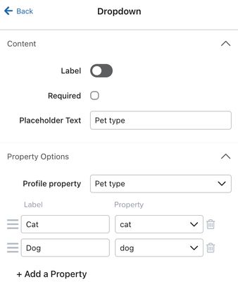
Dropdown field
Dropdowns are similar to radio buttons, in that subscribers can select 1 option from a preset list. This option also helps conserve space on your form. Consider using a dropdown instead of radio buttons when you have more than 4 options. Like radio buttons and multi checkboxes, your dropdown field requires a profile property, a set of labels, and a set of values.
Age gate
Age gate blocks may allow alcohol-related brands use SMS in the US, UK, and Australia. Age-gating must be enabled in your account before you can add age gate blocks to your sign-up forms and begin using SMS. Learn more about age-gating alcohol with Klaviyo.
Delete an element or input field
To delete any element or input field from your sign-up form:
- In the form preview within the editor, hover over the block you wish to delete.
- Select the trash icon that appears.
- On the Delete block modal, select Delete block. Note that a block cannot be recovered once you delete it.
Next steps
If you want to configure 1 form to have a distinct desktop view and mobile view, head to our guide on using dynamic blocks in forms.
Once you’ve added blocks and fields to your sign-up form, learn how to style it to match your brand. When you’re ready to publish a popup, flyout, or full page form, just click Publish to set it live on your site. If you build an embed form, add the form’s embed code to your site to publish.
Additional resources
- Getting started with sign-up forms
Learn how to create and customize sign-up forms in Klaviyo to publish on your website so you can engage shoppers, collect emails and phone numbers, and build long-lasting customer relationships.
- Basics: mobile form design
Learn the 6 basic principles of designing sign-up forms for mobile devices.
- How to use dynamic blocks in forms
Learn about dynamic blocks, and how you can use them in sign-up forms to create distinct views and experiences for shoppers on desktop and mobile devices. Any block in your form can be made dynamic by adjusting its visibility settings.