Understanding styles for a sign-up form
You will learn
Learn how to use Klaviyo’s sign-up form builder to design your form by editing the design settings available in the Styles section. Style settings apply across your sign-up form, including in all of a form’s steps and in its success message.
Keep the design of your sign-up form simple. It should be clear, uncluttered, and have 1 main purpose. Additionally, you'll want to make it easy to read and follow.
Before you begin
Before styling your sign-up form, navigate to the Sign-up forms tab > Create sign-up form. You can customize a pre-built template from the form library, or create a brand new sign-up form template. Add any content and input blocks you’d like to include before styling.
If you're building a mobile-only sign-up form, see basics: mobile form design.
Form types
At the top of the Styles section, you can choose a form type: popup, full page, flyout, or embed:
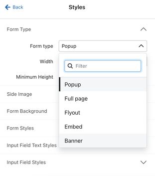
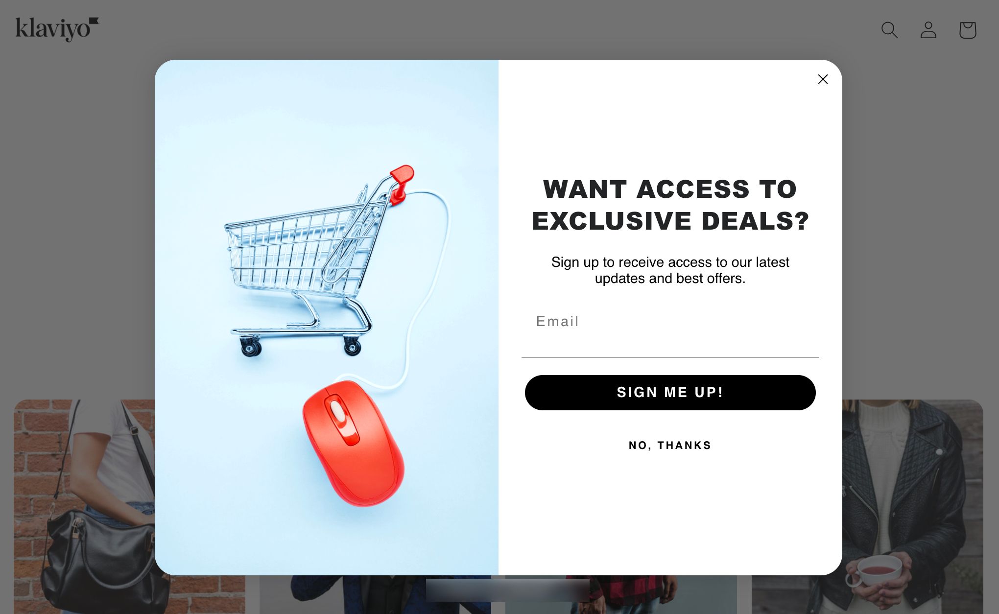
- Popups appear in the middle of the browser's window. A popup is attention-grabbing, and is best used for important offers or critical messaging. Popups have the highest conversion rate of any form type.
- Flyouts slide into the browser's window from any direction you select. These, like popups, can be used to get someone to accomplish something or redirect them, but because it’s a less intrusive option, you can use it to gather information about your browsers in a passive way.
- Embedded forms appear where you paste the provided code snippet on your site. Embedded forms are the least intrusive sign-up form and are typically used in the footer of a site to collect email addresses.
- Full page forms display over the entire browser window, capturing your shoppers' full attention. These are high-converting forms since they cannot be easily overlooked, however this also makes them more intrusive since shoppers' must interact with the form to close it.
- Consider using a full page form as a landing page to grow your subscriber list.
- Banners appear as a bar at the top or bottom of a webpage. They're less intrusive than popups or full page forms, offering continuous visibility and a mobile-friendly design that integrates smoothly with your website. You can set the banner to scroll with the page or stay fixed, add content blocks or input fields directly to the banner, or configure the banner so that when someone clicks on it it triggers a different form from your account to open.
- To trigger a different form to appear when a shopper clicks on the banner, click on the button in the preview and set the Action to Open another form, then choose the live form you want to display. Note this is not possible for embedded forms.
Background images and side images
To add custom imagery to your sign-up form, use a side image or background image. Side images appear to the left or right of your form content, while background images are displayed behind your form fields.
When using an image in a form, there are a few things to keep in mind:
- There are many types of image formats to choose from. JPEGs balance quality and size well for colorful images, while PNGs can keep transparent images or logos looking sharp.
- Aim for a file size of 50-100 KB for side images and less than 200 KB for background images to ensure high quality imagery without slowing down your site's loading times.
- As with all images viewed on the web, larger file sizes lead to slower load times.
- Note that a full-width image at 72dpi will often be larger than 1MB, and reducing the image's size may reduce its quality. Consider the tradeoff between image quality and load time when choosing images.
- Be sure to use a reasonably high-quality image for best results.
- Across the web, using 72dpi resolution is best practice. In order to balance image quality and load speed, try to keep your images between 600 and 1000 px in width, and less than 2000px in height for full-width images. Images that are less than full width of the email can be smaller than 600px.
- Note that if you're using a full page sign-up form, then you'll need a larger, high resolution image (e.g, a minimum width of 1980px) to fit the larger sized form. Keep in mind, though that this can still impact load time.
- Across the web, using 72dpi resolution is best practice. In order to balance image quality and load speed, try to keep your images between 600 and 1000 px in width, and less than 2000px in height for full-width images. Images that are less than full width of the email can be smaller than 600px.
- Add alt text to your image to promote accessibility for all users interacting with your forms.
Because sign-up forms are rendered on browsers (unlike emails, which are rendered on ESP's), there are less recommendations for how to format and adjust them. Browsers can render images of all types and sizes, so in general, stick to high-resolution images, manageable file sizes, and test the appearance on each type of device.
Add a side image
To add a side image:
- Head to the Styles section and scroll to the Side Image settings.
- Select Left image or Right image, depending on where you’d like the image to appear.
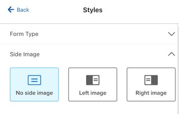
- Select an image. By default, forms with side images are set to 780px wide and medium sizing; however, this can be adjusted in the Side Image section of the Styles tab depending on the form size or if you'd like the image to appear smaller or larger.
Note that side images are set on the step level, so you can set separate images for each step of your form. For more information on display options for side images, head to our article how to add side images in sign-up forms.
Add a background image
To add a background image:
- Toggle on the Background Image setting under Form Background.
- Upload your image using the Browse button.
- Adjust the display settings to your liking.
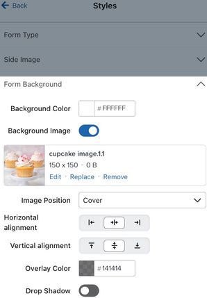
If you add a side or background image to your form, preview all form steps, including the success message, by selecting each step in the top menu bar. By default, your form’s height adjusts based on the content and form fields on each step, so some steps may be taller or shorter than others. When your form includes an image, some image content can be cut off on smaller-sized steps. To avoid this, set a minimum height under Form Type in the Styles section.
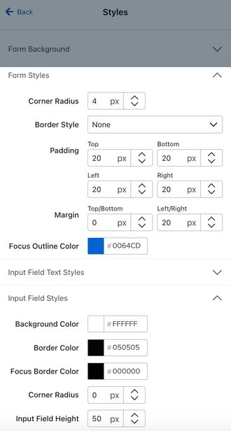
Color and spacing options
Use the Form Styles and Input Field Styles settings to set colors, border colors, padding, and margins. These settings will apply across all of your form's steps, unless you apply conflicting settings (e.g., for text or colors) within a specific content block’s style settings.
Fonts and text styles
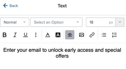
Edit the text (e.g., font, size, color, etc.) for your content blocks (e.g., an email or phone number field) under Input Field Text Styles.
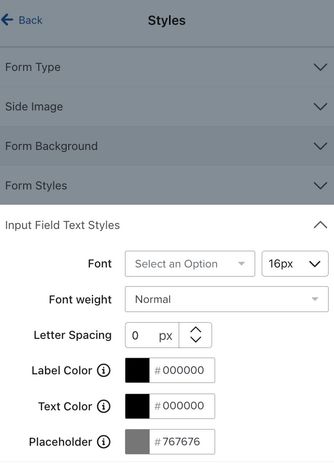
Edit text for a specific content block by clicking on the block in the form preview and using the Text options menu that appears. Klaviyo's form editor uses the UTF-8 coding standard, which means it supports Latin characters, emojis, double byte characters, and more.
Your sign-up form can use the web-safe fonts native to the Klaviyo editors, one of our Klaviyo-hosted custom fonts, or you can add your own custom fonts. Learn how to use custom fonts in your sign-up forms.
Close icons
You can adjust the size, color, and style of your form’s close icon (the X in the top right corner). Click the X icon in the form editor, then adjust the settings in the editor on the left. Learn more about styling a form’s close icon.
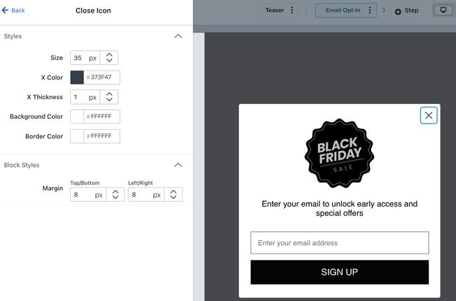
If you selected to use a full page form, the only way your shoppers can dismiss the form is by clicking the close icon. This is helpful for capturing their attention; but, be sure that the close icon is clear and visible so shoppers don't get frustrated by the interruption of your full page form.
Custom HTML and CSS
Klaviyo’s sign-up form editor does not currently support custom HTML or CSS content. For tips and inspiration on customizing your form using Klaviyo’s editor, head to the Community forum.
Outcome
You've now learned how to adjust various style settings in the form editor to design your sign-up form.
Next steps
Once you’ve styled your sign-up form, learn how to set up your form’s behaviors, including which visitors should see the form and when it should appear. Head to our article how to choose form targeting and behavior settings.
Once you've published your sign-up form, customize your opt-in confirmation email, if double opt-in is turned on for your list. Then, build a welcome series to deliver your form’s offer (e.g., a discount or free shipping on their first order) and introduce new subscribers to your brand.
Additional resources
- Getting started with sign-up forms
Learn how to create and customize sign-up forms in Klaviyo to publish on your website so you can engage shoppers, collect emails and phone numbers, and build long-lasting customer relationships.
- How to A/B test a sign-up form
Learn how to use A/B testing to evaluate the performance of various elements of your sign-up forms. By effectively analyzing the results, you can ensure that your forms resonate with site visitors and contribute to list growth.
- Create strategic sign-up forms