Basics: mobile form design
You will learn
Learn the 6 basic principles of designing sign-up forms for mobile devices.
Why is mobile form design important?
Online shoppers are increasingly using their mobile devices to discover new stores, browse products, and make purchases. In the US alone, more than 35% of online purchases used a mobile device, and this number continues to grow every year.
To make sure you convert these customers into subscribers, it’s critical that your sign-up forms look as good on mobile as they do on desktop.
The 6 basics of mobile form design
- Keep the form short and to the point
- Structure your form to match user expectations
- Help users navigate your form
- Choose content blocks that work well on mobile
- Make your form easy to open, read, and fill out on mobile devices
- Consider your colors and their contrast
Keep the form short and to the point
With mobile forms, less is always more. While it may be tempting to learn everything you can about a subscriber all at once (their name, email, birthday, etc.), long mobile forms can lead to a lower completion rate.
Limit the number of form elements or fields someone needs to fill out as much as possible.
- Recommended number of input fields: 1–3 per page
- Recommended number of call-to-action buttons: 1–2 per page
What do I do if I need more than 3 fields?
If you need more than 3 fields, such as if you want to collect email and SMS consent at the same time, consider a multi-step form.
A multi-step form allows you to gather more information without overwhelming potential subscribers. Plus, having a separate step for SMS is a compliance best practice when collecting multiple types of consent in 1 form.
Alternatively, you can learn more about your subscribers by re-targeting them later in the customer journey. Maybe you ask about your current subscribers’ birthday by showing them another form after 30 days, or perhaps you ask as part of your welcome series.
Structure your form to match user expectations
People expect forms to follow a certain logic, and it can be frustrating (or just plain weird) if a form doesn’t.
Below are tips for structuring a form for mobile.
Ask for the less personal info first
Even if all fields on a form are required, it is still strange to ask someone’s birthday before their name.
Generally, ask for information from least to most personal. For instance:
- Name
- Email or phone number
- Birthday
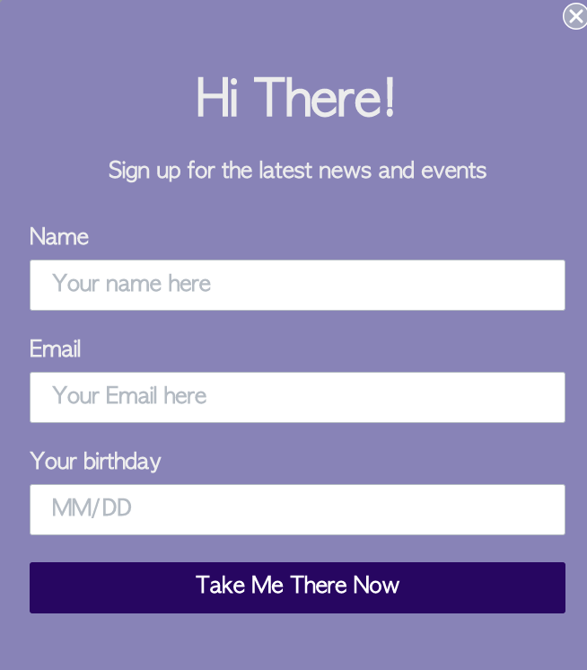
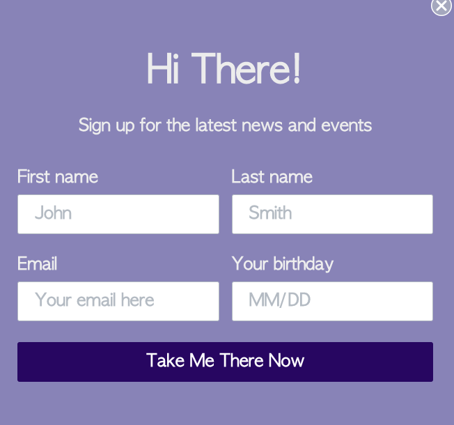
Use a single-column structure on mobile
A single-column means all the inputs, fields, and buttons follow a single line in the form. While multi-column formats are fine to use on desktop, they can make mobile forms look cluttered or crowded. Single-column forms are also easier to scan on mobile.
Single-column form | Multi-column form |
 |  |
Place call-to-action (CTA) buttons at the bottom of a form
The CTA button should be at the end of the viewer’s scanning journey, so it’s the last thing they see. You don’t want them to have to scroll up to complete the form, or have to search for the button.
Typically, the CTA button is placed in the center or left-hand side.
Put the close button in the top right corner
The reason why the close button needs to be in the top right corner is simply because that’s where users expect to see it.
If you place it somewhere else, like in the top left or near the bottom, your users may spend time searching for a way to close the form, and get frustrated while they look. This could cause them to leave with a negative impression of your brand, meaning they’re less likely to visit your site in the future or become customers.
Help users navigate your form
With mobile, you want to be as clear as possible about what someone needs to do, how it should be done, and what they have already done.
Place concise labels above (and close to) every field
Place a label directly above each field in your form that clearly describes what information they should provide.
Also, put labels close to the fields they’re describing, so it’s clear the two are together.
Each label should take up less than a single line when viewed on any mobile device, so being concise is key.
Use placeholders within each text input field
In every field where users need to input text or numbers, include placeholders to show your audience what their input should look like (e.g., an example email, name, date format, etc.).
This helps reduce the number of errors someone might make. Working together with labels and placeholders makes it easy for users to navigate through your form.
Use a descriptive call to action for buttons
Pro-tip: buttons should have labels too. Being more descriptive in the button text also helps the user.
For instance, rather than a simple “Submit” call to action, saying “Subscribe to newsletter” or “Sign up for SMS” gives a clearer idea of what the button does. Plus, this can help you save precious space in the smaller form.
Indicate which fields are required and which are optional
Telling your customers which fields they have to fill out and which they don’t streamlines the user experience. You can make certain form elements required and others optional,
Include a success message
Include a success message after someone submits the form so the user knows they were successful.

Choose content blocks that work well on mobile
Certain types of form blocks are more mobile-friendly than others. Below, we list out what to use on mobile and what not to.
Good to use on mobile | Bad to use on mobile |
Text or number inputs (email, phone, date) | Multi checkboxes |
Radio buttons | Dropdowns |
Tap-to-text buttons (for SMS consent) |
Make your form easy to open, read, and fill out on mobile devices
Generally, your form should be easy to use on mobile devices. People shouldn’t need to struggle to read the text or click a specific button. If this happens, they may get frustrated and could abandon the form or your site completely.
There are several best practices when designing for mobile.
Make the font size at least 16 pixels
Using a font size of 16 or more pixels helps ensure the text is legible. This way, users don’t need to zoom in to read.
16 pixels is the minimum font size recommended for any text in your mobile form, including labels, placeholders, and button text.
Add at least 8 pixels of space between fields, buttons, etc.
Leave enough space between individual actions in your form so that users don’t struggle to click into the field they want. Otherwise, they may decide to walk away rather than to continue trying.
As you build your form, try to make it as difficult as possible for users to make a mistake. Test the user experience on different types of devices.
Make touch targets at least 48 pixels
Any “touch targets,” such as input fields or buttons, should be big and easy to click.
The average adult finger is 11 mm, which is around 41.6 pixels. To account for this, a best practice is to make touch targets at least 48 pixels.
Use a form teaser
Use a form teaser so mobile visitors can open and close the form as desired while they browse, and so the form doesn’t cover up your site’s content.
Note that Google has a penalty on sites with intrusive interstitials. Teasers help avoid this penalty, but you should also use a long time delay with forms.
Consider your colors and their contrast
You always want your form colors to match your brand, so that it reflects your brand.
However, it’s just as important to make the color combinations accessible to all users. Otherwise, you risk alienating potential subscribers or customers.
When choosing your colors, there are 2 key considerations.
Pick high-contrast colors
Color contrast is the difference in light between text or objects in the foreground and the background. Good color contrast improves your form’s readability, and it is a key component of accessibility. Use a color contrast checker to check your color contrast.
The smallest contrast is 1:1 and is impossible to read (think white text on a white background). The highest contrast available is 21:1, or black text on a white background. In other words, the larger the ratio, the better the contrast is.
Under the Web Content Accessibility Guidelines (WCAG), the minimum color contrast is 4.5:1 for small text, images, and text in images and 3:1 for large text or important elements.
Ideally, the contrast should be even larger. According to WCAG, a better minimum is:
- 7:1 for smaller text, images, or images of text
- 4.5:1 for larger text, key visual elements, etc.
Choose colorblind-friendly colors
It’s important that everyone can appreciate the content you work so hard on. Using certain color combinations can make the form difficult or even impossible for some groups to read.
Colorblind-friendly combinations | |||
Blue and orange |   | Blue and yellow |   |
Blue and red |   | Orange and yellow |   |
Blue and brown |   | ||
As for which ones to not use, keep in mind that there are many types of color blindness (it’s not just red and green).
Color combinations to avoid | |||
Green and red |   | Blue and purple |   |
Red and orange |   | Blue and gray |   |
Green and orange |   | Purple and red |   |
Red and brown |   | Blue-green and pink |   |
Green and brown |   | Blue-green and gray |   |
Green and blue |   | Yellow and pink |   |
Light green and yellow |   | Pink and gray |   |
Green and gray |   | Gray and brown |   |
Green and black |   | Orange and brown |   |
Red and black |   | ||
Additional resources
- Getting started with sign-up forms
Learn how to create and customize sign-up forms in Klaviyo to publish on your website so you can engage shoppers, collect emails and phone numbers, and build long-lasting customer relationships.
- How to collect SMS consent with a tap-to-text form
Learn how to set up a tap-to-text sign-up form to collect phone numbers from new prospects. With tap-to-text, site visitors can click a button in your sign-up form to automatically open their text messaging app where Klaviyo has added a message. They only need to send the message to subscribe.
- How to create ADA-friendly sign-up forms
Learn how to use the accessibility assistant feature in the Form Alerts tab of the sign-up forms editor to avoid some of the most common web content accessibility guidelines (WCAG) compliance issues. Companies striving to make their websites ADA-friendly should reference and follow WCAG standards. The accessibility assistant guides you in creating sign-up forms that are accessible for all of your site visitors.