Understanding sign-up form dismissal settings
You will learn
Learn about dismissal settings for your sign-up forms, including how to style the close icons and the close options available for each form type and form teasers.
Making your sign-up form easy for shoppers to close might seem counterintuitive, but a shopper who gets frustrated trying to dismiss a form is unlikely to keep browsing on your site. Providing a positive experience, even when someone is closing a form, can build goodwill and make a visitor more likely to subscribe at a later time.
Before you begin
When it comes to dismissal settings for a sign-up form, you have the ability to:
- Customize the style of the close icons on sign-up forms and form teasers
- Control the dismissal behavior for pop-up forms
- Control the dismissal behavior for flyout forms on mobile devices
Styling a form’s close icon
All pop-up, flyout, and full page forms have a close icon (X button) located in the top right corner of the form by default.
Embed forms are embedded onto a specific page on your site, so they do not have a close icon.
To customize the style of your sign-up form’s close icon:
- Go to Sign-up forms, open the 3-dot menu beside your form, and select Edit.
- Click the form's X button in the preview.
- In the Close icon panel on the left, adjust the position, size, color, thickness, background color, border color, and block margin.
- For example, to create a simple X with no background or border, set the background color and border color to transparent.
- For example, to create a simple X with no background or border, set the background color and border color to transparent.
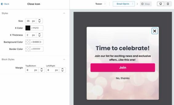
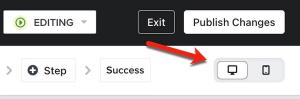
The design settings you select will apply to both desktop and mobile versions of your form (if your form is set to display on both device types). Use the desktop/mobile view selector above the preview to check the form’s close icon on mobile.
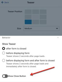
If your sign-up form has a teaser, you can choose whether it has a close button. By default, your teaser will not include a close icon. To add one, select Teaser in the bar above the preview, then click the plus button beside Close icon (Add close icon). Use the controls in that section to style the teaser’s close icon.
Dismissal settings and behavior
For a pop-up form, you can choose whether site visitors can close it by clicking or tapping outside the form area. The close icon remains available either way.
The outside-click dismissal setting is only available for pop-up forms. Full page and flyout forms do not have this setting.
In the form editor, click Targeting & behavior, then select the Display tab. Under Click outside form to close, select On desktop, On mobile, both, or neither.
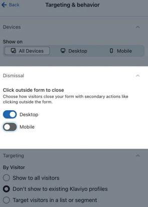
- When a device is selected, clicking or tapping outside the form closes it on that device. Outside-click dismissal is enabled by default.
- When a device is deselected, clicks or taps outside the form are ignored on that device. Visitors can still close the form with its X button.
Visitors using a keyboard can also press Escape to close the pop-up, regardless of the outside-click dismissal setting.
The dismissal setting is device-specific. You can choose whether clicks outside the form area should close the form on desktop, mobile, both, or neither.
If your form has a teaser configured to show after closing, visitors can click the teaser to reopen the form. Learn how to add a form teaser.
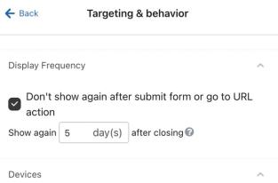
Whether visitors close the form with its X button or by clicking outside it, you can control when it can appear automatically again. In Targeting & behavior > Display > Frequency, enter the number of days in If visitor closes form, show again after. This setting does not prevent visitors from reopening the form through a teaser.
Dismissal options for mobile sign-up forms
To let shoppers close a form by swiping on a mobile device, use a flyout form and dock it to the top or bottom of the screen.
- In the form editor, click Edit styles, then select Flyout under Form type.
- Under Flyout settings, open Mobile flyout position and choose one of the following options:
- Dock to top to allow visitors to swipe up to close the form.
- Dock to bottom to allow visitors to swipe down to close the form.
Docking and swipe dismissal apply when the mobile device is in portrait orientation. In landscape orientation, the form uses its regular flyout position, and visitors can close it with the X button.
Publish and test your changes
When you have finished adjusting your form, publish your changes to apply them on your website.
- Click Publish or schedule in the editor. Select Publish now, resolve any blocking alerts, then click Publish now to apply your changes.
- On your website, test the close icon on each device your form targets. For a pop-up, check that clicking or tapping outside it behaves as you selected. For a docked mobile flyout, test the swipe gesture in portrait orientation. If your teaser is set to show after closing, check that it reopens the form. If you added a close icon to the teaser, check that it closes the teaser.
After publishing, review your form analytics to see key metrics and learn more about how your forms are performing.