Understanding sign-up form dismissal settings
You will learn
Learn about dismissal settings for your sign-up forms, including how to style the close icons and the close options available for each form type and form teasers.
Making your sign-up form easy for shoppers to close might seem counterintuitive, but a shopper who gets frustrated trying to dismiss a form is unlikely to keep browsing on your site. Providing a positive experience, even when someone is closing a form, can build good will and make a visitor more likely to subscribe at a later time.
Before you begin
When it comes to dismissal settings for a sign-up form, you have the ability to:
- Customize the style of the close icons on sign-up forms and form teasers
- Control the dismissal behavior for popup forms
- Control the dismissal behavior for flyout forms on mobile devices
Styling a form’s close icon
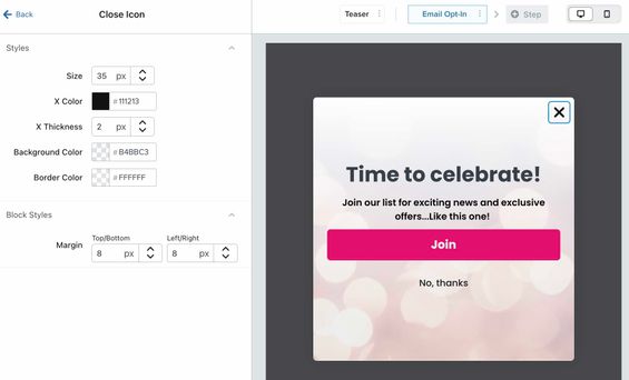
All popup, flyout, and full page forms have a close icon (X button) located in the top right corner of the form by default.
Embed forms are embedded onto a specific page on your site, so they do not have a close icon.
To customize the style of your sign-up form’s close icon:
- Open the editor for your form.
- Click the form's X button in the preview.
- On the left, the Close Icon settings will appear to edit(i.e., size, color, thickness, background color, border color, and block padding).
- For example, to create a simple X with no background or border, set the background color and border color to transparent.
- For example, to create a simple X with no background or border, set the background color and border color to transparent.

The design settings you select will apply to both desktop and mobile versions of your form (if your form is set to display on both device types). Use the desktop/mobile view selector in the top right corner to preview the form’s close icon on mobile.

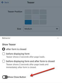
If your sign-up form has a teaser, you can decide whether you want the teaser to show a close button or not. By default, your teaser will not include a close icon. To add one, click Teaser in the menu bar, scroll down to Behavior, then toggle the Show close button on.

Dismissal settings and behavior
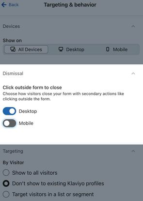
If you're building a popup form, you have the option to enable a dismissal setting. The dismissal setting allows you to choose whether site visitors can close your popup by clicking outside of the sign-up form area, or if they must click the X button to close the form.
The dismissal setting is only available for popup forms. Full page and flyout forms do not have this capability.
To find the dismissal setting, navigate to Targeting & behavior, then scroll down to Dismissal.

- When this setting is toggled on (which is the default), any click outside of the form will close the form, and the visitor won’t be able to return to it.
- When toggled off, visitors must click the form’s close icon in order to close it; clicks outside the form area will be ignored.
The dismissal setting is device-specific. You can choose whether clicks outside the form area should close the form on desktop, mobile, both, or neither.
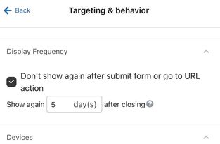
In both cases, you can still control when the form will re-appear again based on the setting in Targeting & Behavior > Display Frequency > Show again X days after closing.

Dismissal options for mobile sign-up forms
If you have a form specifically for shoppers on mobile devices, or just want to make it easy for site visitors on a mobile devices to close your form, use a flyout form.
- Under Styles, select Flyout as your form type.
- The Mobile Flyout Position menu will appear beneath. Set to one of the following options:
- Dock to top to allow visitors to swipe down to close the form.
- Dock to bottom to allow visitors swipe up to close the form.
Next steps
Now that your forms are easy to close, head to your form analytics to see key metrics and learn more about how your forms are performing.