How to add side images in sign-up forms
You will learn
Learn how to add a high-quality image to the left or right of your sign-up form for a compelling sign-up experience that matches your brand's design.

Before you begin
Side images appear to the left or right of your form content. Side images aren't available for banner forms. When using an image in a form, there are a few things to keep in mind:
- Use a JPEG, PNG, or GIF image. JPEGs balance quality and size well for colorful images, while PNGs can keep transparent images or logos looking sharp.
- Be sure to use a reasonably high-quality image for best results.
- Try to keep your images between 600 and 1,000 px in width and less than 2,000 px in height for full-width images to balance quality and load time. Images less than full-width can be smaller than 600 px.
- As with all images viewed on the web, larger file sizes lead to slower load times.
- Aim for a file size of 50-100 KB for side images and less than 200 KB for background images to ensure your image looks high-quality without slowing down your site.
- Add alt text to images that convey information so visitors using screen readers can understand them. Leave alt text empty for purely decorative images.
When uploading an image in the form editor, use a file that's 5 MB or smaller. Keep the image sharp at its displayed size, use a manageable file size, and test the form's appearance on desktop and mobile.
Add a side image to your form
To add an image on either side of your sign-up form content:
- Navigate to the Sign-up forms tab.
- Next to your form, open the 3-dot menu and click Edit.
If your form was created prior to July 2021 and uses a right- or left-aligned background image as a side image, remove it before using the side image feature. In Styles, turn off Background image. Then open Padding and remove any excess padding on the right or left side.
- In Styles, open Side image. Select Left image or Right image to choose where the image appears.
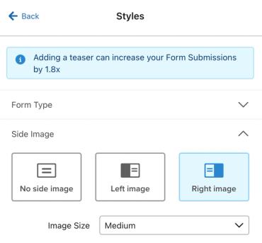
- Select the form step you want to edit, then click the empty image placeholder in the form preview.
- Click Select image to open the image chooser. Choose an image from your Klaviyo image library, upload an image, or import a new image from a URL.
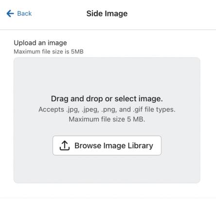
Make sure to use a reasonably high-quality image for best results. As with all images viewed on the web, larger file sizes lead to slower load times. Aim for a file size of 50-100 KB for side images to ensure your image looks high-quality without slowing down your site.
For a multistep form, select each step, including the success message, and choose its side image. You can use a different image on each step. Side-image placement, size, and device settings apply across the form.
Side image display options
Form styles
When you first add a side image to a popup or flyout form, the form width is set to 780 px and the side-image size defaults to Medium. Full page forms keep their existing width setting. Embedded forms can fill the width of the container on your website.
In Styles, adjust Width in the settings for your form type to change the form's width. For popups, flyouts, and standard embedded forms, you can also adjust Min height to keep shorter steps from cutting off important image content.
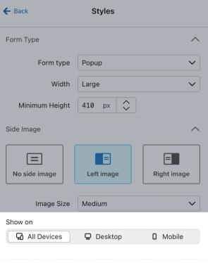
To change how much space the side image takes up, open Styles > Side image and choose Small, Medium, or Large. The Custom option under Image position changes the image's width within that area, rather than the area's size.
Your form's side image is hidden on mobile devices by default to leave more room for the form content. To display it on desktop and mobile, open Styles > Side image. Under Devices, select All Devices.
Side image styles
Click the side image in the form preview to open its settings. Use Image to adjust the image, and Background color to fill any space around it.
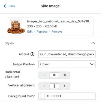
- Alt text
Describe the image for visitors using screen readers. Leave alt text empty if the image is purely decorative. - Image position
This determines how the image will fit within the side image area. Select from the following options:- Contain
The full image will appear within the section, and will not be cropped at all. If the image doesn’t fit precisely into the image area, the background color for the section will fill in any uncovered areas. - Cover
The image will completely fill the side image area. Some parts of the image may be cut off, to allow the image to fill the space. - Custom
Select your own width for the image.
- Contain
- Image position alignment grid
Choose whether the image is centered or aligned to the top, bottom, left, or right of the image area. - Background color
If you're using a smaller image in your form, set a background color to fill the empty space behind it.
Review and publish your form
- Select each form step, including the success message, and review it in the desktop and mobile previews. Check the image crop and alignment, particularly on steps with less content.
- When you're ready to apply the changes, click Publish or schedule. Review any alerts and resolve blocking issues, then choose Publish now and click Publish now.
Additional resources
- Accessibility in emails and forms best practice reference
Learn how to make your emails and sign-up forms more accessible. When designing your emails and signup forms, you’ll want to make sure your designs are accessible to all of your recipients.
- Understanding styles for a sign-up form
Learn how to use Klaviyo’s sign-up form builder to design your form by editing the design settings available in the Styles section. Style settings apply across your sign-up form, including in all of a form’s steps and in its success message.
- Getting started with Canva for Images
Learn how to integrate Klaviyo with Canva in order to bring images from Klaviyo into Canva, and designs from Canva into your Klaviyo image library. Once Canva designs are in your Klaviyo image library, you can use them within email templates, SMS content, sign-up forms, and more.