Accessibility in emails and forms best practice reference
You will learn
Learn how to make your emails and sign-up forms more accessible. When designing your emails and signup forms, you’ll want to make sure your designs are accessible to all of your recipients.
Accessibility in emails
Optimize subject lines and preview text
Make your subject lines and preview text descriptive, enticing, and short.
Follow general email design best practices
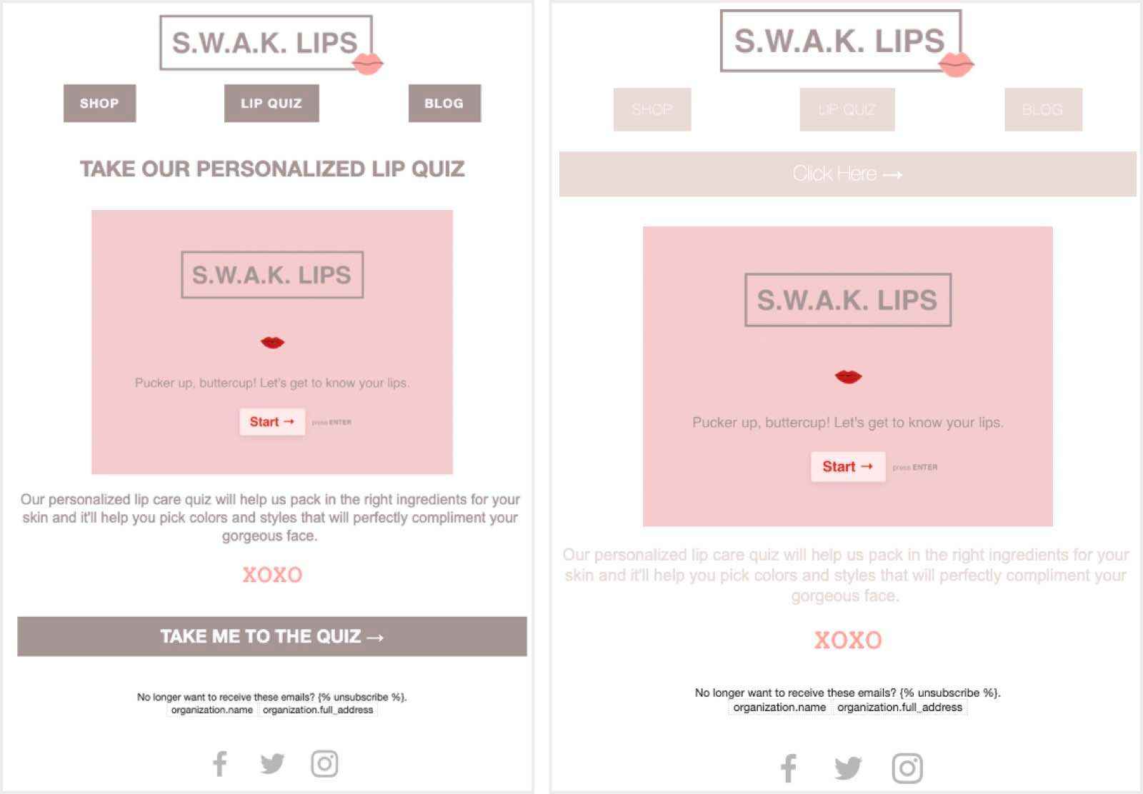
Following general email design best practices will make your emails more accessible:
- Add alt text to all of your images.
- Avoid image-only emails.
- Avoid using images to convey key details.
- Use starkly contrasting colors (e.g., white and black, grey and dark blue, pink and dark red).
- Use headers to separate ideas.
- Use descriptive links (e.g., "Shop the collection" rather than "Click here to go to the collection").
- Structure your emails logically.
Below is an example of an email that is optimized for all recipients (left) and one that is not (right).
Accessibility in sign-up forms
Klaviyo automatically optimizes sign-up forms for accessibility. A Klaviyo form published to your website enables site visitors to navigate the form entirely using their keyboards and screen-readers. Additionally, site visitors can close a form with the escape key and submit with the enter key. You can add a Focus Outline Color, located in the Styles tab within the form editor, to help users understand which field is highlighted when tabbing through the form.
Sign-up form design
Just like email design, you'll want to follow some basic guidelines to ensure that all of your recipients will get the information you want to share with them through your forms. When designing forms:
- Use contrasting colors.
- Avoid putting pertinent information in images
- Use descriptive language in links
- Build your forms in a logical structure.
As you're building your sign-up forms, Klaviyo monitors for a number of accessibility issues, and will prompt you to fix any identified issues in the Forms Alerts tab.
Head to how to create an ADA-friendly sign-up form to learn more creating accessible sign-up forms in the Klaviyo form editor.
Below is an example of a well-designed form (right) and a form that will not be accessible to all (left).