How to style your Customer Hub
You will learn
Learn about design options for styling your Customer Hub drawer, and how you can design it to match your brand. Because the Customer Hub interface is ingrained in the customer experience, it’s best practice to style it to appear as an extension of your website.
Customer Hub for Shopify currently supports standard storefronts and Shopify Headless. For WooCommerce, navigate to https://help.klaviyo.com/hc/en-us/articles/47792369863451
For feedback about Customer Hub functionality, email customerhub@klaviyo.com.
Before you begin
This guide explains how to customize the style of your Customer Hub interface. Before proceeding, ensure that the Customer Hub feature is enabled.
Learn more about Customer Hub.
Customer Hub design options
The Customer Hub drawer has multiple customizable tabs:
- For you
- Orders
- Profile
- Chat (only visible when web chat is enabled)
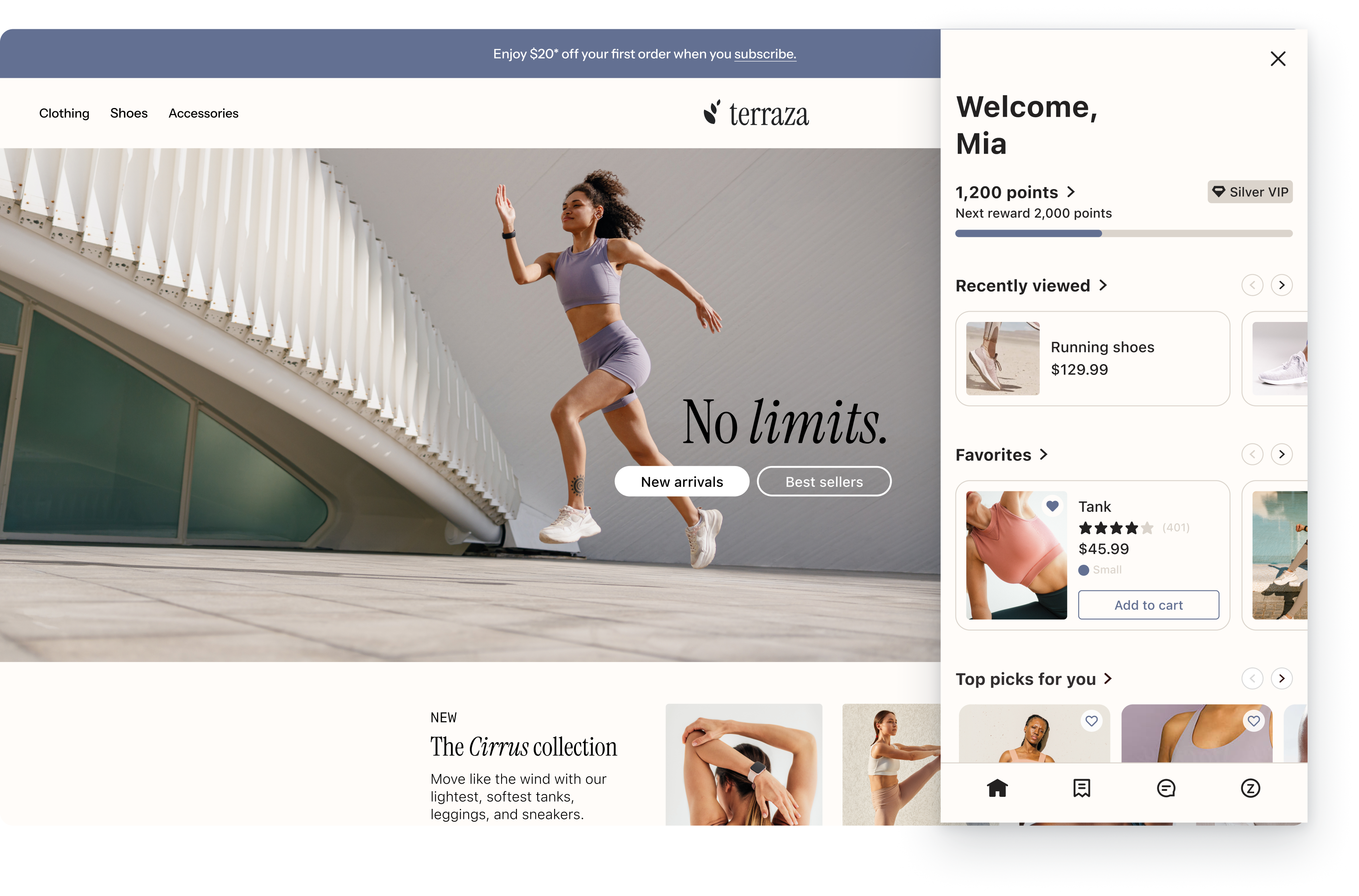
You have various options for customizing the design across each of these tabs, including editing text, colors, fonts, and more. Style customization selections cascade across each tab in the Customer Hub drawer to ensure a consistent, on-brand experience for your site visitors.
While the appearance of most elements in Customer Hub drawer can be adjusted, their positions cannot. Only general layout options are currently available.
As you edit the design settings for your Customer Hub in Klaviyo, use the View live button to see the changes made to the hub interface on your website. Note that if your Customer Hub is live, saved changes are published to your site.
Customize a main call to action for each tab
By default, when a shopper signs into their customer account, Klaviyo displays “Welcome, first.name” as the main heading on the For you tab of the Customer Hub drawer. This text is not editable.
For unauthenticated shoppers, however, you can write your own call-to-action heading to display above the “Sign in” button before they log in. This can be helpful for incentivizing unauthenticated visitors to sign in and engage with your Customer Hub interface.
In the example below, the main call to action reads “Earn rewards, track orders, and save your shopping history.”
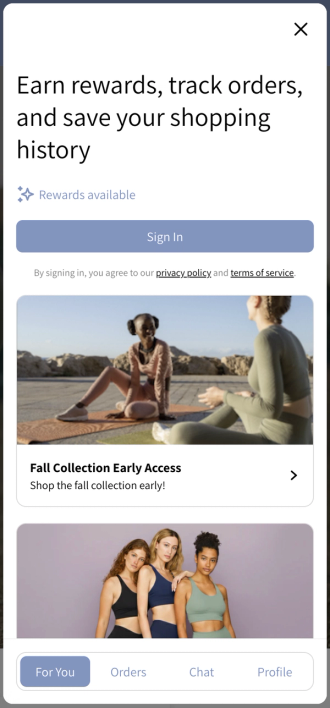
Note: the "rewards available" indicator shows automatically if you have either:
- A static coupon set up within Customer Hub, OR
- If you have a loyalty integration enabled (such as Smile).
To update the Main call to action for your Customer Hub interface:
- Open Service - Customer Hub tab in Klaviyo’s left-hand navigation.
- Click Settings.
- Under Welcome messages, customize a call to action to display above the "sign in" button for unauthenticated shoppers. You can do this for each tab of the Customer Hub drawer:
- For you
- Orders
- Profile
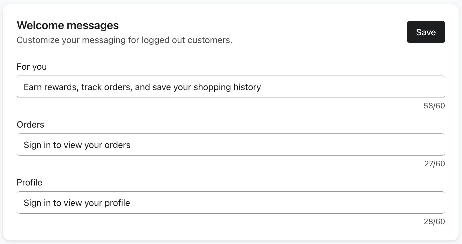
- Click Save.
Design your Customer Hub
For design options to customize your Customer Hub interface:
- Navigate to Customer Hub in Klaviyo's left-hand navigation.
- Select Design.
- Select Hub at the top of the preview.
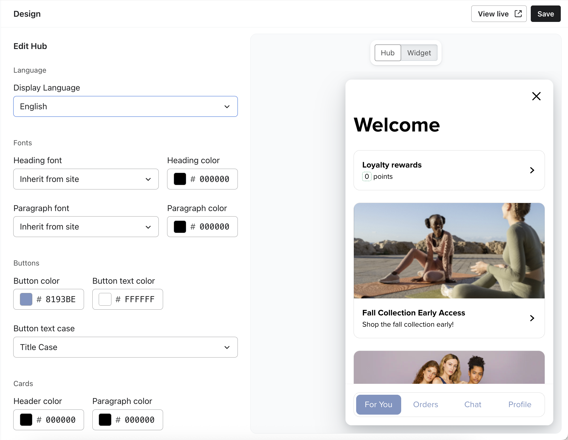
- From the Style menu you can adjust Display Language, Fonts, Color and Style settings and preview how these adjustments will look in the Customer Hub interface canvas
- You can optionally apply advanced styling with Custom CSS. See the Custom CSS section below for more details.
- See the Language and locale support in Customer Hub article for more information on selecting another language.
- Click Save to set your changes live.
Customize the Customer Hub widget
Aside from designing Customer Hub itself, you can also customize the hub widget, which is a small, floating element on your website that visitors can click to quickly open Customer Hub interface. The widget presents timely information to your shopper such as incoming chat messages and feedback when adding items to their Favorites list. We recommend enabling the widget UI to drive meaningful engagement with customers, especially when Web Chat and Favorites are enabled.
To customize the hub widget:
- Select Customer Hub in Klaviyo's left-hand navigation.
- Select Design.
- Select Widget at the top of the preview.
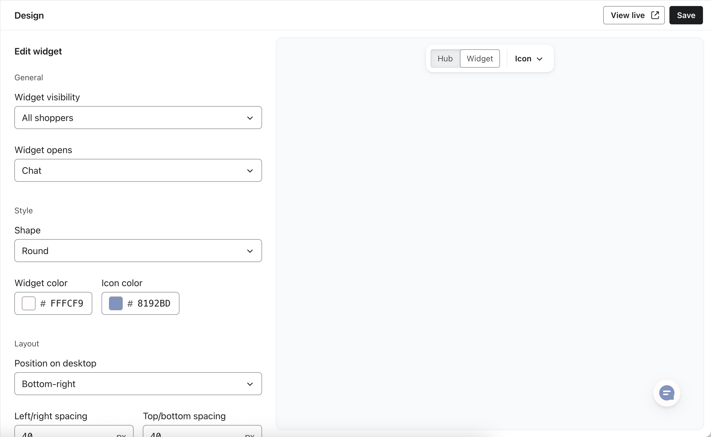
- From the General menu you can adjust which shoppers should see the widget and which Customer Hub View should open when the widget is clicked.
- Choose which shoppers should see the widget on your site:
- All shoppers (recognized, logged in and logged out) – The widget appears for everyone.
- Recognized or logged in shoppers – The widget only appears if Klaviyo recognizes the person (Identified) or if they are logged in (Authenticated). This is ideal for reducing clutter for brand-new visitors while maintaining a high-touch experience for returning ones.
- Logged in shoppers only – The widget only appears for those with an active Shopify session.
- Choose which shoppers should see the widget on your site:
- From the Style menu you can adjust Color and Style settings and preview how these adjustments will look in the Customer Hub Widget interface canvas
- From the Layout menu you can adjust how the widget is positioned on your website.
- Click Save to set your changes live.
Customize Additional Widget States
You can customize additional widget states by selecting the caret next to Icon and navigating to another widget state.
- The Add to Cart state is visible on product detail pages. The customizable widget encourages shoppers to make a purchase or save a product for later when they have scrolled below the top of the Product Detail Page when the traditional Add to Cart button is no longer visible. Learn more about How to set up the Add to Cart Widget in Customer Hub.
Custom CSS for Customer Hub
If your branding needs aren’t met by the Customer Hub design options, you can apply advanced styling with Custom CSS.
While Customer Hub uses CSS resets to avoid collision with your site’s CSS, you may need to add custom CSS to address edge cases or apply unique styling, such as floating drawer or custom border radius values.
Implementing custom CSS for your Customer Hub involves editing your site’s code. This is only recommended for technically savvy marketers or those who have access to a developer. While our product does support custom CSS, our support team cannot help you add custom CSS to Customer Hub beyond the general guidance covered in this documentation. To maintain the security of your data, Klaviyo's support team is not able to open your HTML files.
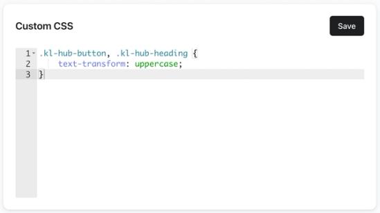
Apply custom CSS
Add any custom CSS directly to the Custom CSS section of the in your Customer Hub design settings, and make sure to save your changes.
All basic elements within the Customer Hub have class names prefixed with kl-hub-:
- All text elements have the class
kl-hub-text, while headings have the classkl-hub-heading - Buttons have the class
kl-hub-button, and also include their variants (e.g.,kl-hub-button-primary,kl-hub-button-secondary, etc.) - The Customer Hub drawer itself has the class
kl-hub-drawer - Text inputs have the class
kl-hub-input - All content blocks have the class
kl-hub-content-block, and also include their block Internal name (e.g.,kl-hub-content-block-reward-programfor a content block named "Reward program")
This is not an exhaustive list; you can find more by inspecting the Customer Hub with your browser’s debugger. If an element has a class that starts with kl-hub-, it’s safe to use for custom CSS.
CSS example
If you wanted to make all buttons and headings in the Customer Hub uppercase, you could write the following custom CSS:
.kl-hub-button, .kl-hub-heading {

    text-transform: uppercase;
}
Additional resources
- Getting started with Customer Hub on Shopify
Learn about Customer Hub, a unique personalized experience for online store visitors that guides them from product discovery through purchase and post-purchase support.
- Getting started with web chat
Learn about web chat, which is a 2-way communication channel you can add to your website. Web chat can be set up on its own for you to use with Customer Agent and Helpdesk, but it's also designed to be a seamless part of Customer Hub. Web chat allows your business to engage in live, personalized conversations with visitors on your website so they can easily get answers to their questions or assistance with issues.
- How to create content blocks for Customer Hub
Learn how to create content blocks for your Customer Hub. Content blocks are highly customizable and personalizable blocks that have access to Klaviyo profile data which allow you to display integrations (e.g. loyalty point balance), personalized offers, and more.
- How to set up the Add to Cart Widget in Customer Hub
Learn how to display an interactive Add to Cart Widget on your Product Detail Pages. The customizable widget encourages shoppers to make a purchase or save a product for later when they have scrolled below the top of the Product Detail Page when the traditional Add to Cart button is no longer visible.