Getting started with metrics
You will learn
Learn how to access and use your Klaviyo metrics (i.e., events) to better understand your account health and what channels or profiles are creating this data. You can then use this data to create targeted flows and segments. You can also use metrics for light analysis to understand how your data evolves over time.
For a list of metrics, head to our guides on understanding email metrics and SMS metrics.
Accessing your metrics
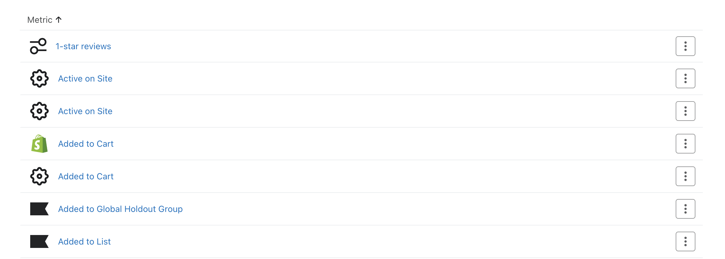
1. Head to Analytics > Metrics. Here you will see a list of your metrics that are specific to the features you use and integrations you have.
How metrics are created
Metrics are created in your account when you:
- Add an integration
When you enable an integration, we will create integration-specific metrics in your account as data syncs to Klaviyo. - Send an events API request
We will create a custom metric for an event request if it doesn't currently exist, and future event requests will be added to this metric. - Upload a CSV
If you import event data into Klaviyo, you will be asked which metric name you want to be associated with your data — if the metric name already exists, we will map to it. Otherwise, a new metric will get created.
Klaviyo limits the number of metrics you can create to 200. When you approach this threshold, you will get a warning in Klaviyo and the account owner will receive an email.
Reviewing your metrics
It's important to remember that the metrics section uses your set account timezone, while the segments section uses UTC timezone. This may cause your numbers in metrics to slightly differ from those reflected in segmentation.
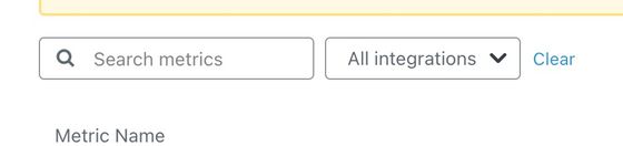
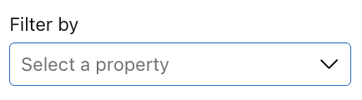
- If you wish to filter metrics by specific integration select the All integrations dropdown and select the integration you want to focus on.
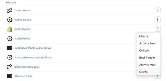
- Once you have chosen which metric you want to analyze, hover over the metric and you will see the action menu option appear to the right.
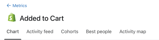
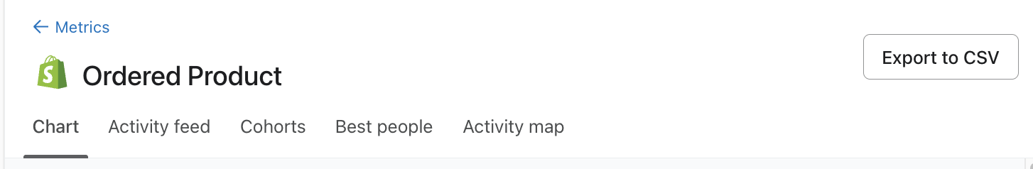
- Open this menu and choose how you would like to analyze and visualize this given metric (i.e., Charts, Activity Feed, Cohorts, Best People, or Activity Map).

When you click into a metric, you will likewise see these listed out in the upper left of the main tab.
You can also export your Charts and Best People data to a CSV file with the Export to CSV button. Additionally, you can filter Best People to a specific list (e.g., to find the total revenue that list has generated). Exports from the last 30 days are visible by navigating to Account > Downloads.
Deleting a metric
You cannot delete Klaviyo-specific metrics in your account; however, you can delete custom metrics and metrics synced from an integration.
- To delete all events for a given metric and remove it completely from your account, navigate to Analytics > Metrics. Here, you will see a list of your account metrics. Hover over which metric you wish to remove.
- Select the action menu (i.e. the 3 dot menu).
- From here, click Delete from the dropdown menu. This will remove the metric along with all associated event data from your account.
If you delete a metric but have an integration that is still syncing data to this metric, a metric with the same name will automatically be created in your account as soon as data associated with it flows to Klaviyo. However, no historic data for the metric will re-populate unless you run a historical integration sync.
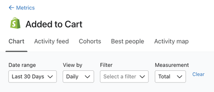
Charts
Charts provide a visual format for you to better understand your account data. When you click into this option, you will be taken to a dynamic line graph and accompanying table where you can view your most recent activity for this metric. As you customize the chart view, the graph and table will automatically update to reflect your changes.
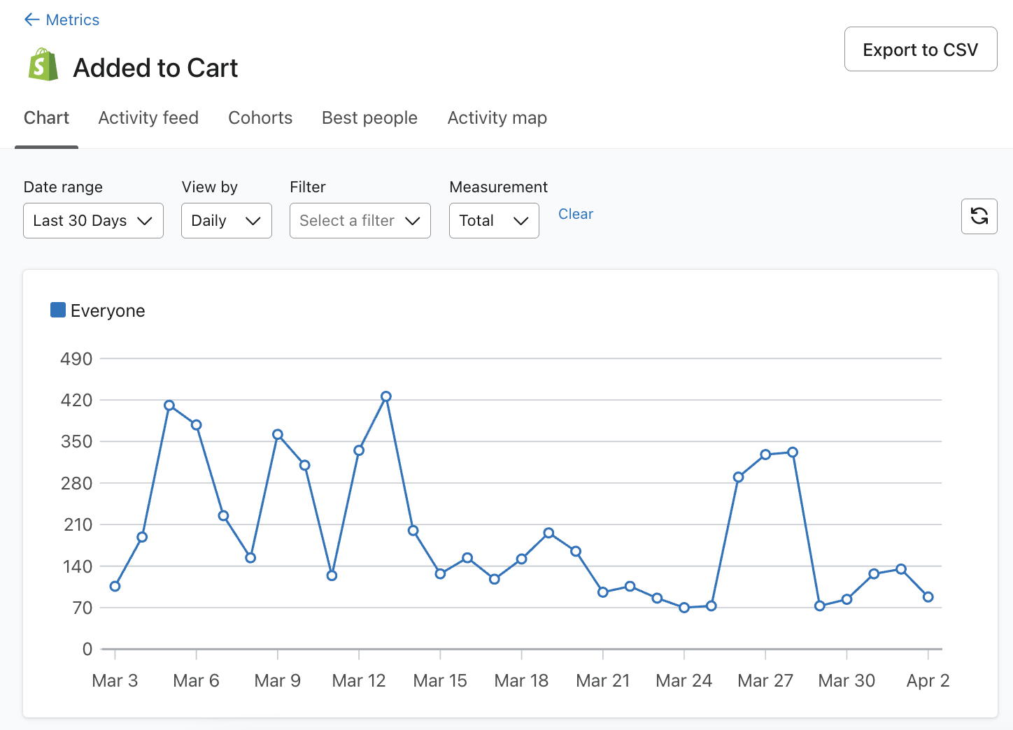
Customizing your chart's date range and aggregation
In the upper left-hand corner of the chart, you can customize your date range.
- Select an existing time frame or select Custom to create your own custom range. Your chart will automatically limit your results to your selected date range.
- You can edit the time aggregation in the View by field. Time aggregations let you track performance over the course of common time periods (i.e. daily, weekly, monthly). By default, the time aggregation dropdown is set to daily, but you change this to weekly or monthly.
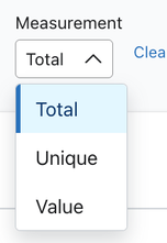
Changing your measurement
In addition to time ranges and aggregations, you also have the option to customize how your metric is measured. The Measurement field lets you customize how the metric is analyzed. The dropdown always includes the options Total and Unique. If the metric has a monetary value associated with it (e.g., Placed Order), then Value will also be an option.
- Uniques
Measures the unique number of profiles that performed the metric. Each profile is counted only once, even if they performed the metric multiple times. - Total
Measures the total number of times a particular metric was performed. - Value
Measures the sum total of all metric activity.
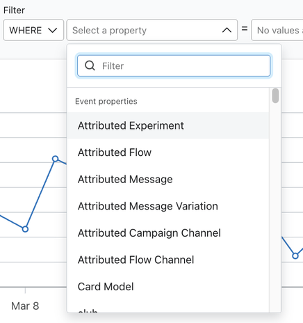
Adding filters
You can further customize your report by adding filters. Filtering let you group, filter, and analyze both event and profile property data.
It’s important to note that metric reports record profile properties when they are initially ingested into Klaviyo. In comparison, segments recognize profile properties that are currently present on the profile. For example, you choose to filter a profile property about someone as a location with it equaling "Boston." However, since this profile information has been recorded this individual has moved locations. In the metrics reports, this will still be recognized as the original "Boston" location for filtering.
- To view these options, select Filter in the left corner of your graph. A dropdown will appear that lets you pick how you want to refine your report. For example, you can group placed orders by state/region to understand where orders are coming from, or filter your chart to only show data for profiles who have answered a survey with a particular response.
- In this dropdown select By to group your results by event or profile property data, or Where to limit results to a specific event or profile property value.
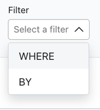
- Once you’ve decided how you want to refine your report, you’ll need to select an event or profile property to focus on. You can select any event or profile property stored against that particular metric you’re analyzing.
Once you select your filters, both the chart and the accompanying table will update to reflect your selections.
Exporting and refreshing results
1. Once your report is customized to your liking, you can export the results to a CSV file by selecting the Export to CSV button.
2. To pull in recent data, click the Refresh icon.
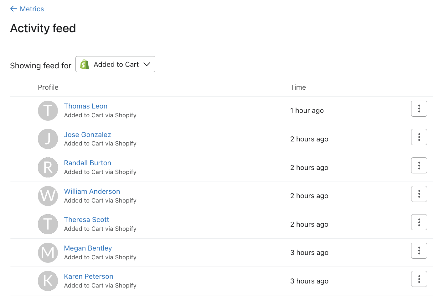
Activity feed
The activity feed lets you verify that a given metric is actively receiving data by letting you view the most recent events for your chosen metric. The feed displays the profile’s name, email address, details about the activity, and the date and time the activity occurred.
The activity feed can help you answer questions about different metrics like:
- Is my ecommerce integration successfully sending Placed Order data to Klaviyo?
- When is the last time a profile triggered a Received Email event?
- What kind of metadata do I have access to for a Clicked Email event?
Customizing activity feed date range and aggregation
You can adjust the time range of the activity feed to narrow the results to a specific period of time.
- In the upper left-hand corner of a metric's activity feed, you will see text that says On or Before with an accompanying date. By default, it will show today’s date and the range will always be between the selected date and the moment it's opened. Click on the date to change it. A calendar picker will appear to let you change the date range as you see fit.
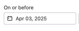
- Select the date of your choice and it will automatically update your feed to match the new date range.
Adding a filter
You can also choose to add a filter to your activity feed to narrow your scope so that only the activity that matches a specific event or profile property value will appear in this list.
It’s important to note that metric reports record profile properties when they are initially ingested into Klaviyo. In comparison, segments recognize profile properties that are currently present on the profile. For example, you choose to filter a profile property about someone as a location with it equaling "Boston." However, since this profile information has been recorded this individual has moved locations. In the metrics reports, this will still be recognized as the original "Boston" location for filtering.
To do so, select the dropdown on the Filter by field.
Here, you can select an event property or a profile property to limit the activity feed results to.
Say you want to focus on activities within a specific geographic area. You can filter by city and add your specified city as a filter value. For example, setting Boston as the value for the City profile property will limit the activity feed to relevant results where City equals Boston.
Cohorts
A cohort report is a type of analysis that allows you to take a group of profiles with common characteristics (i.e., a cohort ) and analyze their behavior over time. This allows you to identify trends and patterns in engagement, conversions, and other key metrics across their lifecycle.
Cohort reports are only available for conversion metrics in Klaviyo.
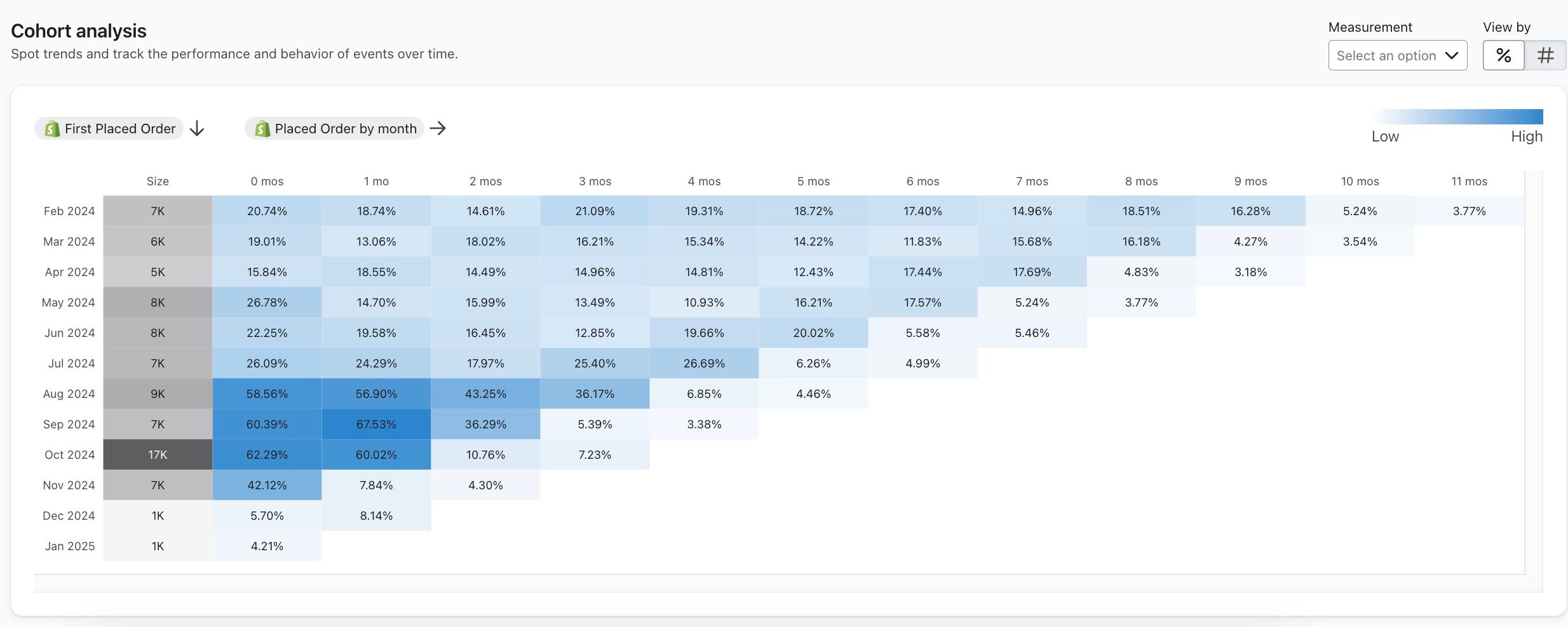
You can use cohort reports to answer questions like:
- How long until new customers make additional purchases?
- How did new customer onboarding strategies impact repeat purchase rates?
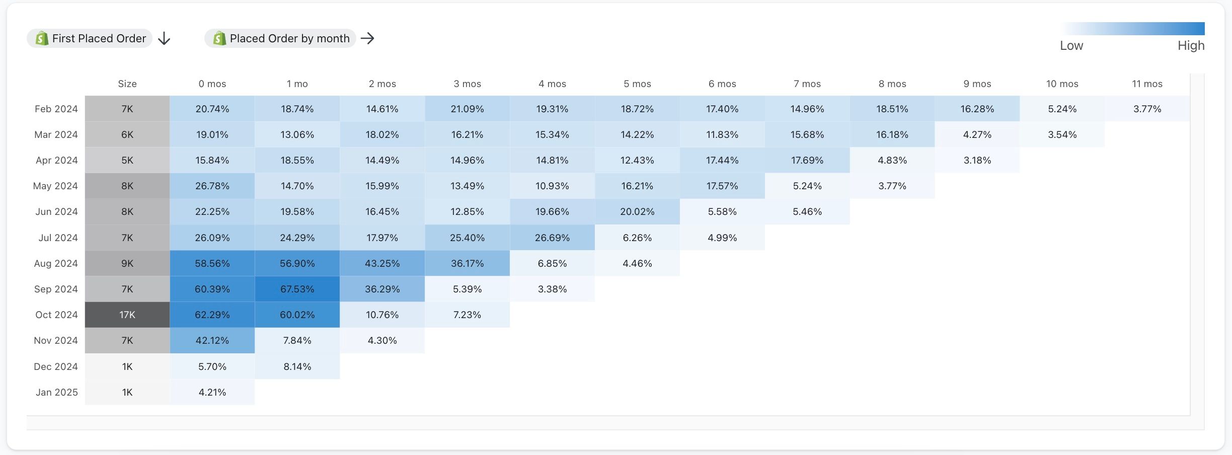
The first column of your graph shows the dates for each cohort. Klaviyo will always display the last 12 calendar months (in this case February 2024 - January 2025).
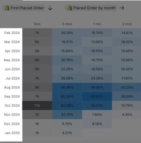
The second column, titled Size, displays the total number of profiles that engaged in this specific metric activity. In the example above, this cohort report shows the total number of profiles that performed a Placed Order event. You’ll notice that the report has blue highlights. The higher the value of each cohort, the darker the color will be. This helps you quickly identify the strongest and weakest performance of these cohorts over time for your given metric.
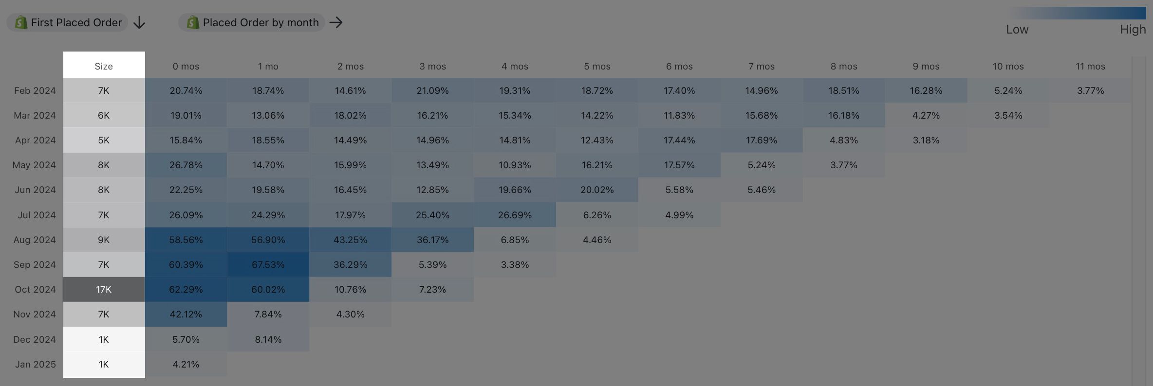
The third column, titled 0 mos lists the percentage of the percentage of profiles from the cohort (or count of profiles) that engaged in the activity for the month listed in the adjacent row. The subsequent numbered columns (labeled 1 mos - 11 mos) show the total number of profiles that continued to engage in that activity in each subsequent month.
Learn more about the cohort report in the metrics tab.
Best people
Best People allows you to pinpoint your most engaged profiles for a given metric. You'll see a list of your top active people for this metric with details around their metric activity. This lets you answer questions like:
- Which profiles are requesting the most refunds?
- Who are my most high-value profiles based on their placed order values?
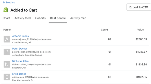
You'll also see the following information on this page:
- Person
The profile's name, email address, and geographic location. By default, they are listed in order of how frequently they have done this metric in descending order. - Count
The total count of events (from this metric) for the listed profile over all time. - Value
If your chosen metric has a monetary value associated it with (e.g., Added to cart) you will also have access to a Value column. Value refers to the total monetary value of this profile's events (for this metric) over all time.
Note that you can export your data to a CSV file with the Export to CSV button.
Activity map
The Activity map allows you to visualize how, from where, and how often your customers interact with your brand. It allows you to, not only understand your customers, but also understand all of the data that is being pulled into Klaviyo at any given moment.
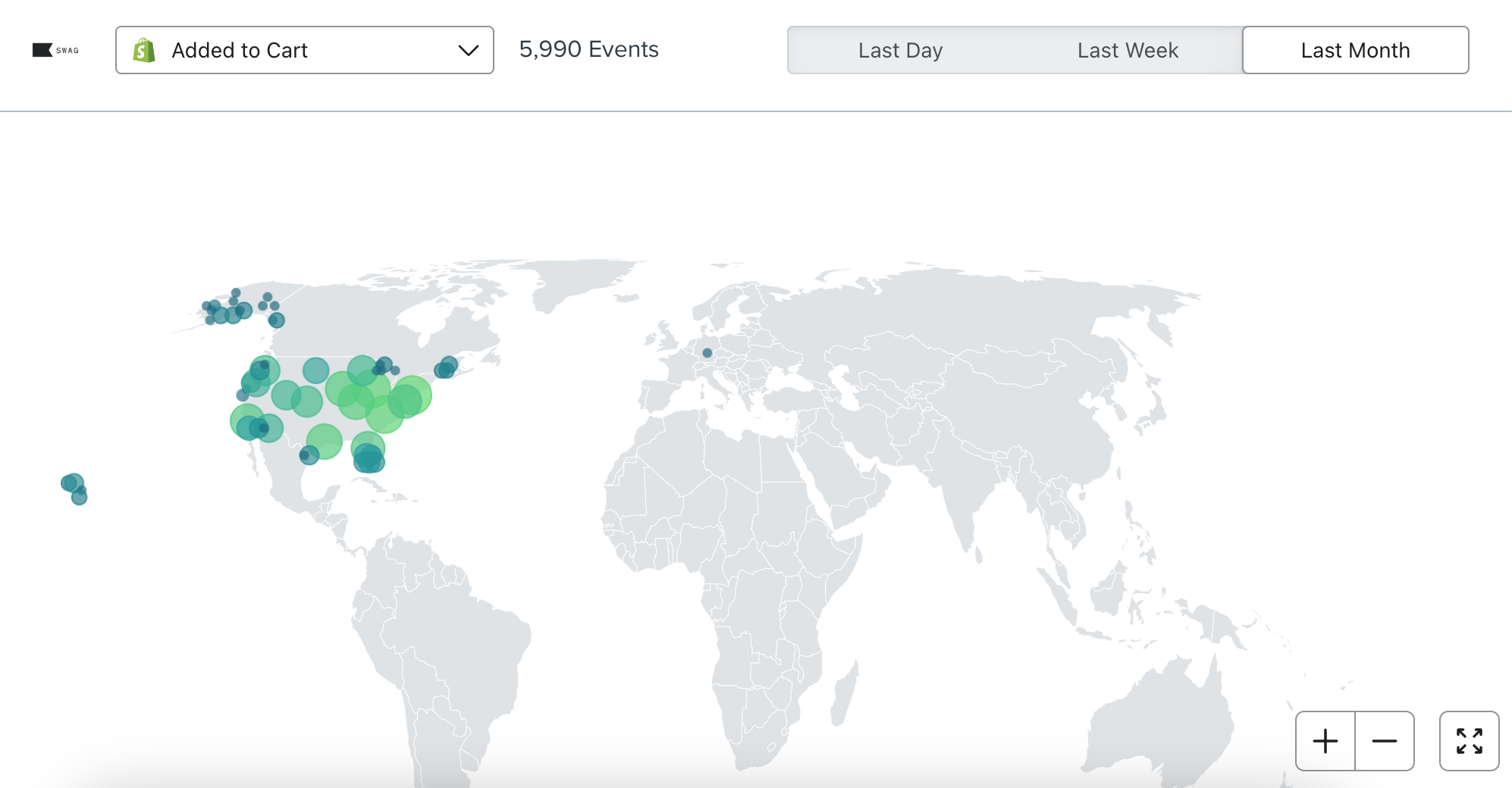
You can toggle between different metrics and adjust the timeframe associated with this metric. Additionally, you have the option to toggle to full-screen and dark mode.
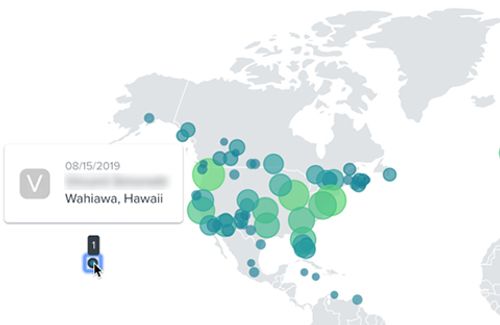
If you select a particular event, you can find more information when clicking on one of the circles. The corresponding information refers to the last customer who triggered an event in that location.
Additional resources
- Email metrics reference
Learn more about what specific metrics in Klaviyo are associated with your customers' interactions with your emails. Understanding the metrics in your account is crucial to gaining insight into how your marketing initiatives are performing.
- Understanding SMS metrics
Learn about the SMS metrics that are pulled into Klaviyo, such as what they are, where to find them, and what they mean.
- Analytics glossary
The glossary below defines common terms and acronyms used in Klaviyo analytics and data offerings.