Understanding the email deliverability hub in Klaviyo
You will learn
Learn about Klaviyo’s account-level email deliverability reporting. The Email tab in Klaviyo’s deliverability hub is a centralized space that allows you to analyze and diagnose your email deliverability health across all your sends.
The account deliverability hub
The Deliverability hub in Klaviyo allows you to analyze and diagnose your email and SMS deliverability health at the account level.
To access the page, navigate to the Deliverability tab under Analytics.
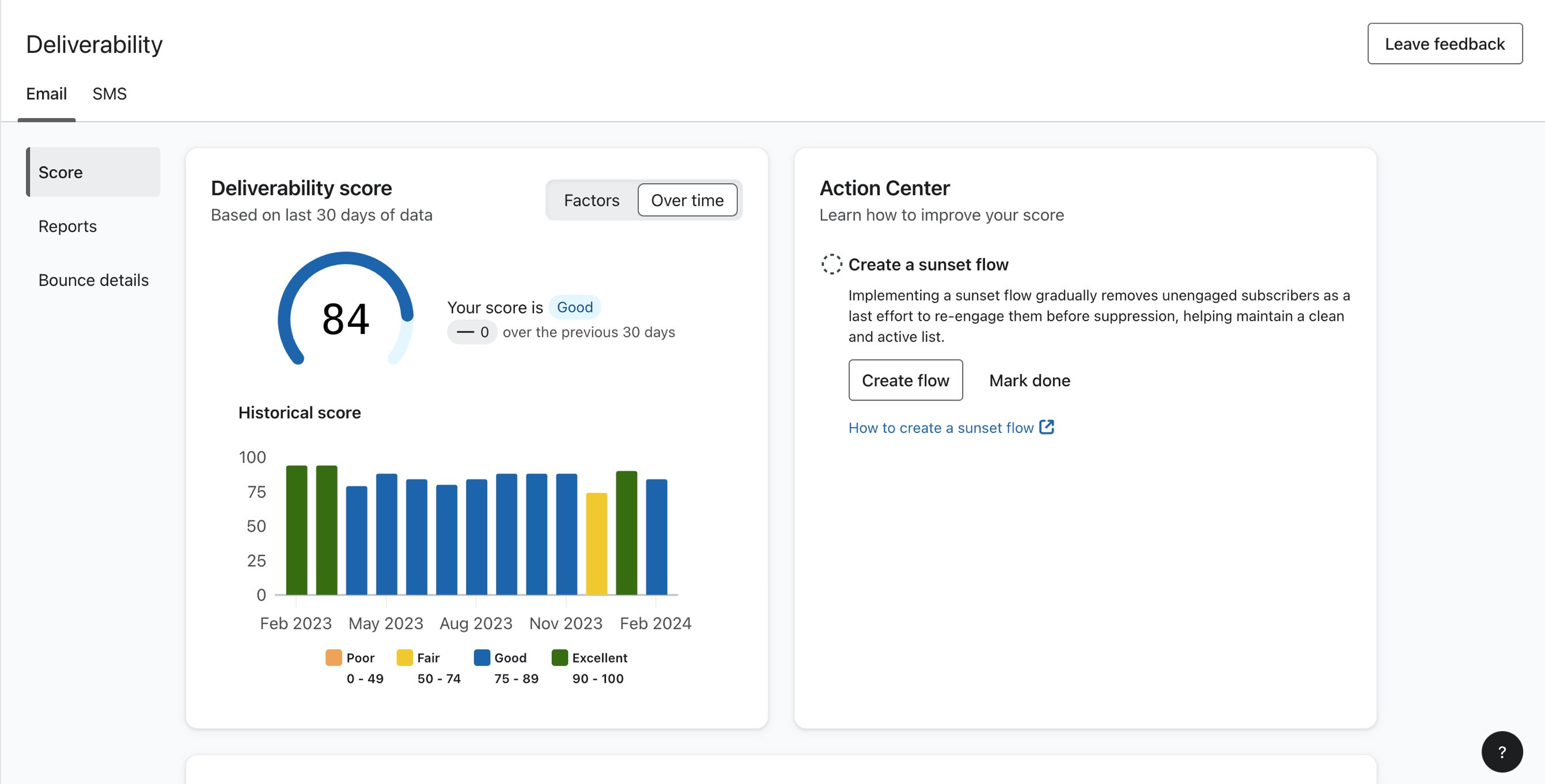
To analyze your account's email deliverability performance, select Email.
The email deliverability hub in Klaviyo has 3 main tabs:
- Score
- Reports
- Bounce Details
Score
On the Deliverability score card, you’ll see a deliverability score that acts as a metric to represent your account’s deliverability health, or sender reputation. It is important to keep a high deliverability score to have the best chance of your emails reaching your subscribers inbox. The lower your score the more likely email will be sent to spam or not delivered at all.
You must send at least 1000 emails in the last 30 days for a deliverability score to be calculated and presented. Score history is retained for up to one year.
Deliverability scores can range from 0 to 100, and are determined based on your performance in the following deliverability metrics over the last 30 days:
- Open rate
- Click rate
- Bounce rate
- Unsubscribe rate
- Spam complaint rate
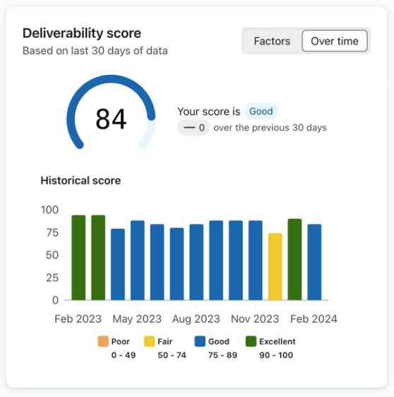
Your score is updated daily using the last 30 days of data.
Next to the score is a badge that shows how your score is trending compared to the previous 30 days, along with one of the following health statuses based on your score:
- Poor (0 - 49
- Fair (50 - 74)
- Good (75 - 89)
- Excellent (90 - 100)
You can use the Over time option on the toggle to see more data around how your deliverability score has changed over time, or the Factors toggle to see the key deliverability metrics impacting your score and your performance with them.
You can use the deliverability score to monitor your sender reputation, and better understand how inbox providers may view your brand as a sender. To improve your score, take the recommended actions presented in the action center next to the deliverability score. Additionally, see our guide on how to repair your sender reputation.
Key metrics impacting your score
When you set the Deliverability score toggle to Factors, you’ll see an overview of the key deliverability health metrics and your performance for each one.
These metrics are:
- Open rate
- Click rate
- Bounce rate
- Unsubscribe rate
- Spam complaint rate
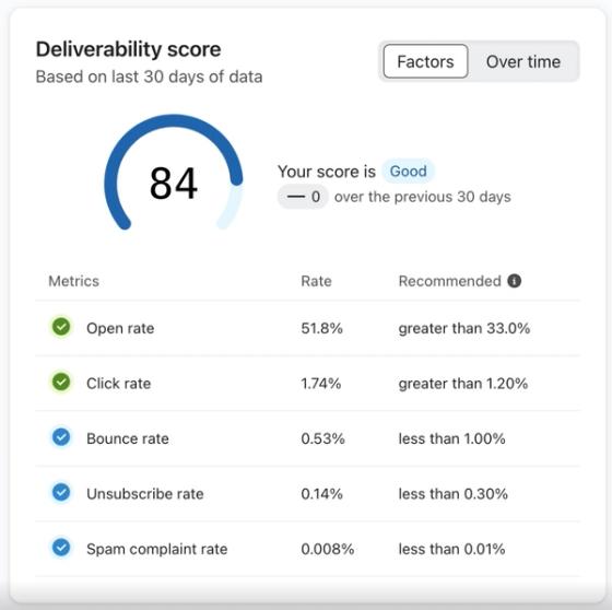
Next to each metric, you’ll see an indicator that reflects your performance (i.e., poor, fair, good, or excellent) along with Klaviyo’s recommended benchmarks.
Action center
The action center features key steps you can take to improve your sender reputation and overall deliverability.
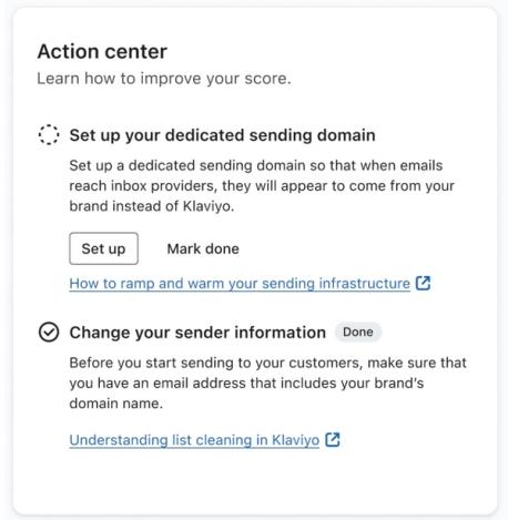
You’ll see key onboarding actions that your account should take for the best deliverability performance, that are presented in the order they should be completed. Once completed, the onboarding actions will no longer appear.
In addition to essential onboarding actions, you may also see actions appear in response to your deliverability performance with resolution steps. Actions triggered due to performance may appear multiple times after being completed if the deliverability issue appears again, and new actions will appear and disappear based on your specific Klaviyo account. Once an action is completed, you can select the Mark done button next to the task.
The action center is updated each time the page is loaded.
Campaigns performance
The Campaign performance card shows you some of the recent campaigns on your account that are impacting your deliverability score.

You can toggle between campaigns that have a Healthy status and campaigns that have a Needs attention status. The Healthy toggle shows the 5 most recent campaigns that have all metrics in a healthy zone. When the Needs attention toggle is chosen, the 5 most recent campaigns that have at least 2 metrics in the Needs attention range will be shown.
Flows performance
The Flows performance card shows you some of the recent flows on your account that are impacting your deliverability score.

You can toggle between flows that have a Healthy status and flows that have a Needs attention status. The Healthy toggle shows the 5 most recent flows that have all metrics in a healthy zone. When the Needs attention toggle is chosen, the 5 most recent flows that have at least 2 metrics in the Needs attention range will be shown.
Deliverability alerts
Above your deliverability score is a collapsable card that appears when a deliverability alert has been triggered for your account. Each alert indicates a key deliverability metric is experiencing poor performance, and provides details about the issue with a link to a troubleshooting guide for resolution steps.
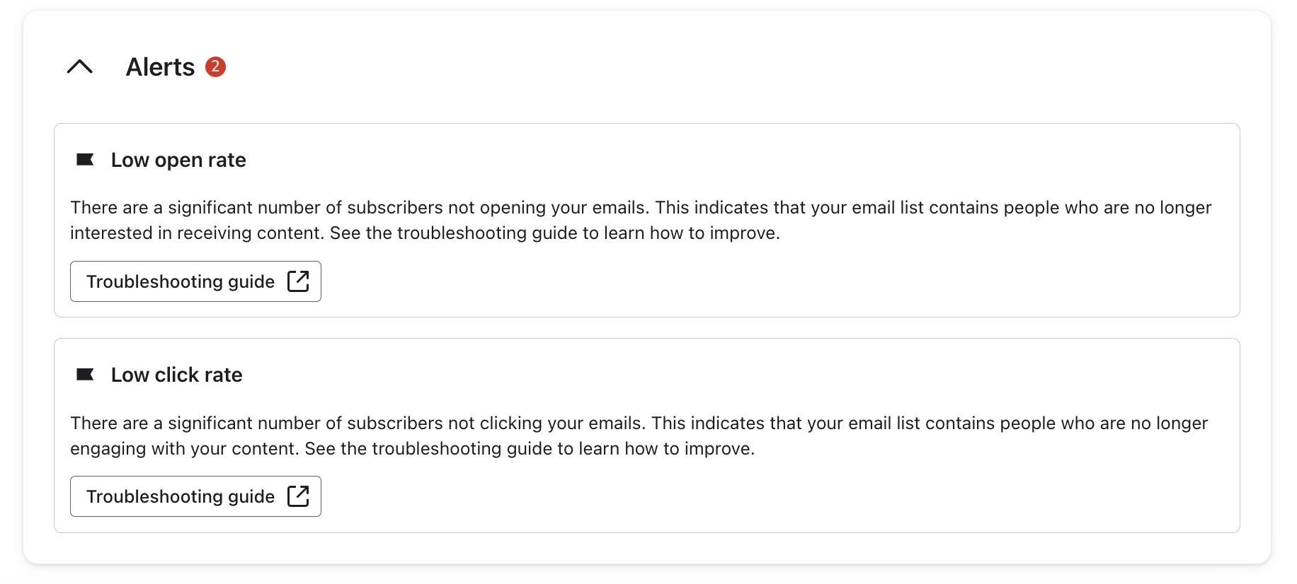
You’ll see alerts appear in the following cases:
- Low open rate
- Low click rate
- High bounce rate
- High spam complaint rate
- High unsubscribe rate
- Overall account reputation issue
Once the deliverability issue is resolved, the alert will disappear.
Reports
On the Reports page, you’ll see account-level email deliverability reports that provide insight towards your performance with different inbox providers or email domains.
At the top of the page, you can set filters that apply to all the reports.

You can filter the reports on the page with the date dropdown, and set the date ranges to:
- Today
- Last 7 days
- Last 30 days
- Last 60 days
- Last 90 days
- Custom Dates
With the Filters button, you can set the following types of filters:
- Message type
The type of email (i.e., all messages, all campaigns, or all flows). - Message category
The groups you want to analyze deliverability performance (i.e., Inbox providers or email domains).
Klaviyo is able to determine email domain based on the recipient's email address. From the email domain, Klaviyo can map the domain to the corresponding inbox provider.
- Category value
Select up to 5 specific inbox providers or email domains to analyze.
Email send volume
The Email send volume report shows a breakdown of your delivered and bounced emails across the 5 email domains or inbox providers with the highest send volume.
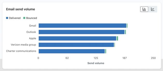
If you are seeing bounce issues here, learn how to decrease bounce rates.
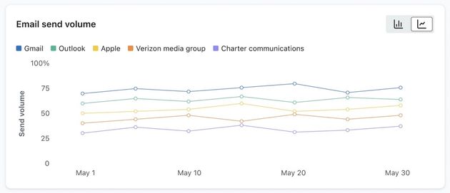
To see a breakdown of your email send volume over time, select the chart toggle switching to a line graph:
Negative engagement metrics
The Positive engagement metrics chart shows your negative engagement rates across the 5 email domains or inbox providers with the highest send volume on your account.
- Bounce rate
- Unsubscribe rate
- Spam complaint rate
You can switch between the available tabs on the card to see the breakdown for each metric.
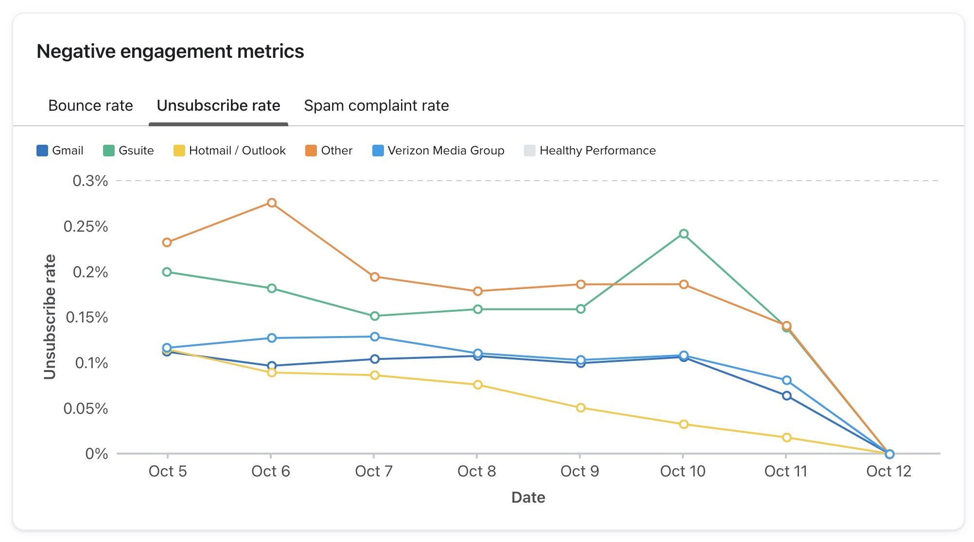
If you are seeing deliverability performance issues, learn how you can strengthen your sender reputation for a specific inbox inbox provider or email domain.
Positive engagement metrics
The Positive engagement metrics chart shows your positive engagement rates across the 5 email domains or inbox providers with the highest send volume on your account.
- Open rate
- Click rate
You can switch between the available tabs on the card to see the breakdown for each metric.
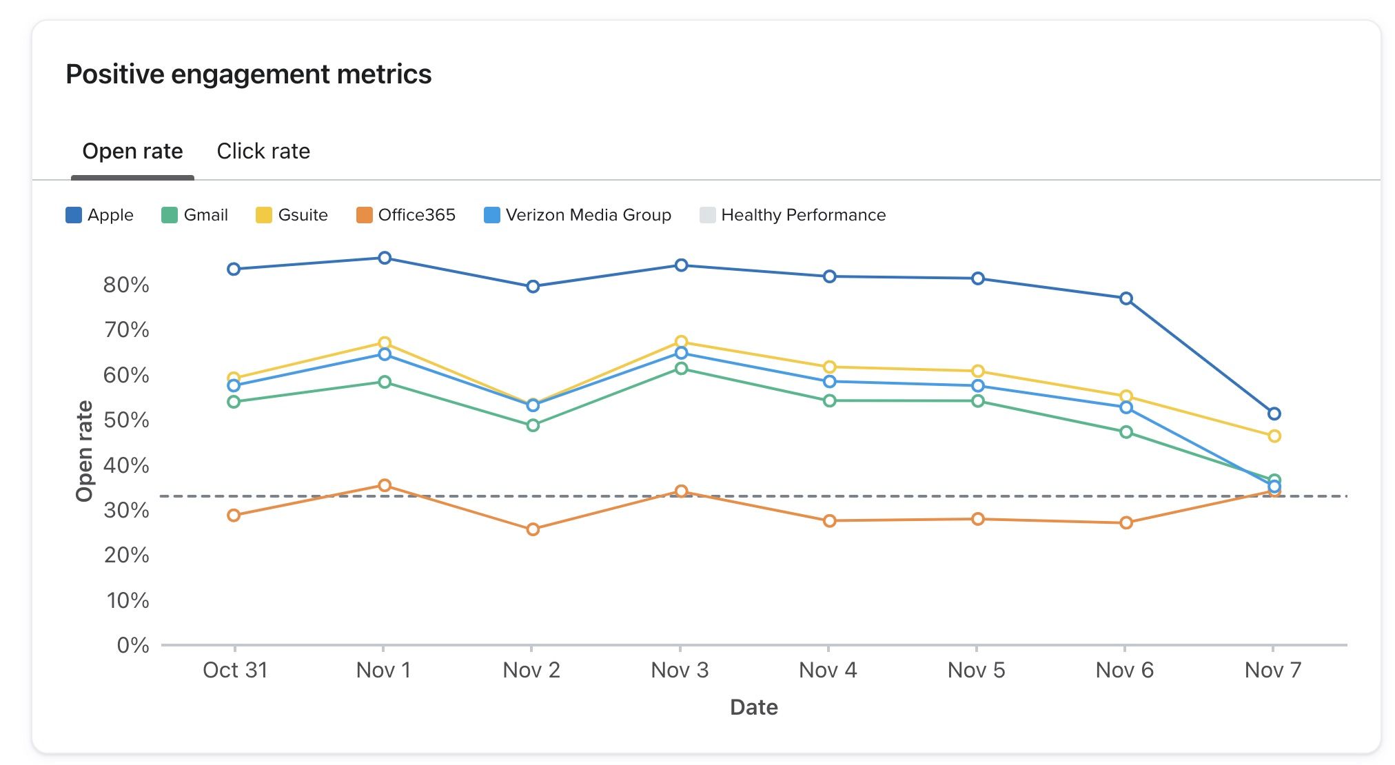
If you are seeing deliverability performance issues, learn how you can strengthen your sender reputation for a specific inbox inbox provider or email domain.
Bounce details
The Bounce details page on the deliverability hub provides information around why your sends are bouncing. If you are seeing issues with bounces, you can analyze this data to take corrective action and improve your overall email deliverability.
Filters apply to all the data on the page.
Filters
At the top of the Bounce details page are filters that allow you to analyze the page data based on:
- Message type
- All messages
- All campaigns
- All flows
- Date range
- Today
- Last 7 days
- Last 30 days
- Last 90 days
- Custom dates
Top bounce categories
The Top bounce categories card provides information about the types of bounces you are experiencing.
The card features a heatmap that shows:
- All 10 bounce categories.
- The 5 inbox providers with the most send volume.
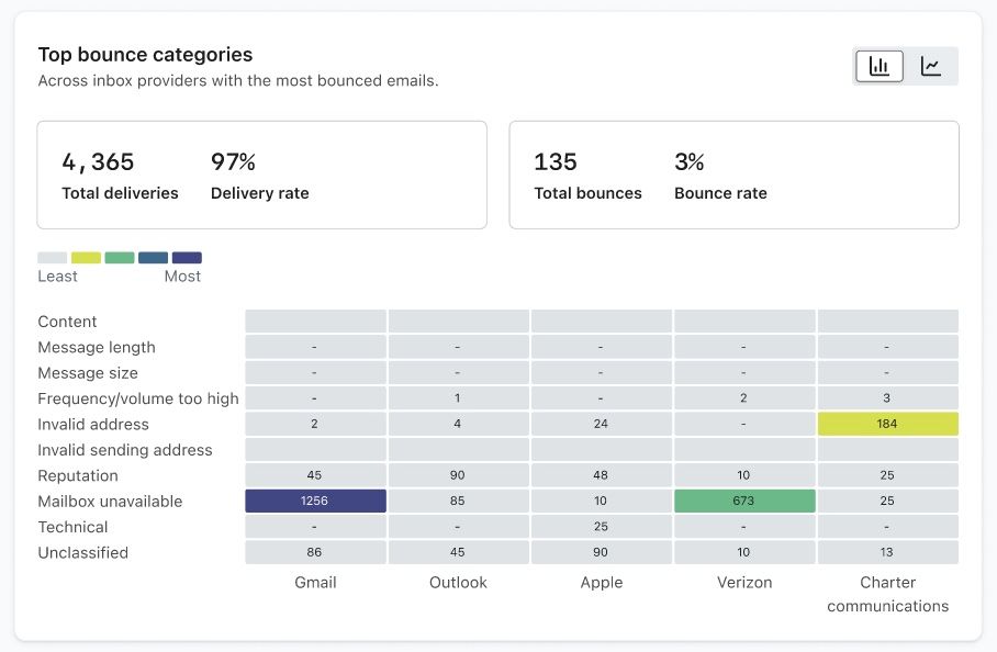
Each box on the heat map will show the count of bounces for the corresponding category and inbox provider. The color of the box is based on the percentage of total messages sent in the chosen time period.
In the top right corner is a toggle between the heatmap view and the line graph view. The line graph shows the following information:
- Date range
- Bounce count
The 5 lines on the graph each represent one of the inbox providers with the most volume, and match the values on the heatmap.
By default the top occurring bounce category is selected, but you can select a single bounce category to filter the line graph by.
Bounce report
The Bounce report card shows a further breakdown of the bounces on your account.
The report shows the:
- Count
The number of bounces for the respective category and the percentage of the total number of bounces. - Type
Hard or soft bounce. - Inbox provider/email domain
The inbox provider experiencing the bounces. - Category
The bounce category. - Definition
A definition explaining the reason for the bounce.
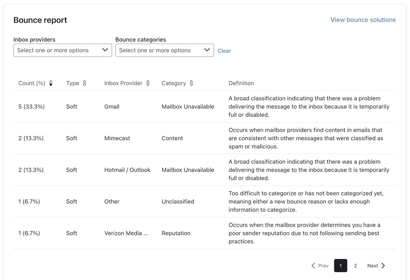
To troubleshoot bounced emails, see our guide on understanding bounces.
Additional resources
- Understanding the deliverability tab in campaigns and flows
Learn about the deliverability tab in Klaviyo, that provides an overview of key deliverability performance metrics for your campaigns and flow emails. This can help you easily identify low-performing email domains and countries, so you can take action to protect your deliverability.
- Understanding sender reputation
Learn about email sender reputation, and why it is an important concept to understand for good deliverability. Maintaining a positive sender reputation is essential to maximize your emails’ likelihood of being successfully delivered.
- How to strengthen your sender reputation for a specific inbox provider or email domain
Learn best practices to strengthen your sender reputation if you are seeing deliverability issues with specific inbox providers or email domains. If your deliverability issues are not limited to specific inbox providers or domains, see our guide on repairing your sender reputation.