Getting started with the business review dashboard
You will learn
Learn how to use the business review dashboard to track and review your conversion trends and strategies over a specific time frame. The business review dashboard creates a summary of insights into your performance across specific channels and flows, and breaks down how those channels contribute to your overall success.
Note that the business review dashboard is view-only for all Klaviyo users and permissions. You will not be able to edit, remove, or adjust the order of any cards. However, you can customize the time frame, conversion metric, and comparison period.
Accessing the dashboard
Navigate to Analytics > Dashboards and look for the business review dashboard from your list, as shown below.

Learn how to customize and build your dashboard to reflect your business and data needs.
Dashboard settings
Chosen conversion metrics If you are using a revenue-based conversion metric in your dashboard (e.g., Placed Order, Started Checkout, Fulfilled Order, etc.), you will see monetary values displayed in your cards. All other non-revenue conversion metrics (e.g., Active on Site, Opened Email, Clicked Email, etc.) will show the total or unique number of applicable conversions.
Percentage changes
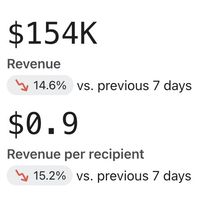
Some cards will display percentage changes (positive or negative), as shown in the example below. In these cards Klaviyo will compare the revenue or conversion percentage change from the prior period. For example, if you are looking at the last 7 days, we will compare the revenue percentage change from the 7 days prior to your range.
Card data and time frames
When customizing your dashboard, whatever time frame and comparison period you use will reflect in both the data on the left-hand side of the card and the charts on the right.
Dashboard cards
Below the top of your dashboard, you will see the performance cards. These cards represent ways to view success across channels, conversions, and revenue for your business over specific periods of time. Your dashboard will contain the following cards:
Campaign performance summary card
Growth overview card
The growth overview card provides a summary of your conversion performance with the ability to hone in on performance by message and channel.
Conversion summary tab
In the conversion summary tab, you can review your conversions (either by revenue or total number depending on what conversion metric you chose) over time. Here you can review which revenue was attributed to Klaviyo (green bars in the chart), and which revenue may be attributed to outside sources (blue bar in the chart).
Attributed vs. unattributed revenue
- Attributed revenue
All flow and campaign revenue that can be attributed to messages sent within the time frame on your dashboard. However, it’s important to note that we do not require that the conversion events also happened during the time frame you are reviewing. For example, if the dashboard timeframe is set to Jan 1–Jan 31 and a campaign was received by recipients on Jan 31, all revenue attributed to that campaign will be included in the attributed revenue even if the conversions actually took place in February. - Unattributed revenue
Unlike attributed revenue, unattributed revenue looks at real-time conversions per day. Simply put, any revenue that was generated during the time frame of your dashboard will be counted here regardless of when your message(s) were sent.
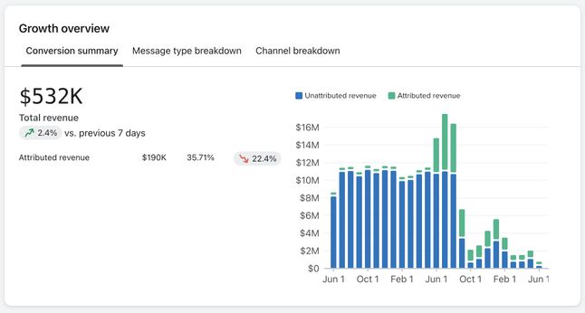
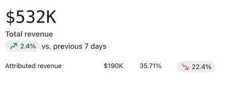
The large number represents the total combined revenue (attributed to Klaviyo and other sources) as well as the percentage change versus the same, prior period. For example, if you chose the last 7 days as your time frame, you will see the revenue compared to the 7 days prior to this period.
Below the total revenue number, the attributed revenue is shown. Additionally, the percentage of total attributed revenue for the timeframe you selected and the percentage change compared to the prior period, will be indicated.
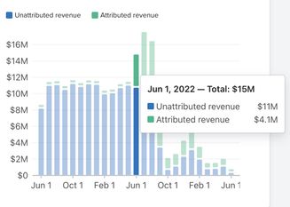
If you hover over any bars in the chart, you will see the breakdown of attributed or unattributed revenue to each for that point in time.
Message type breakdown tab
In the message type breakdown tab, you can see attributed and unattributed revenue by specific channel. By default, when first landing on this view, you will see all channels together. Using the Channel dropdown allows you to choose a specific channel (i.e., email, SMS, or push), so you can review revenue data specific to that channel.
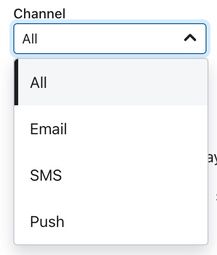
Once you choose a specific channel to review, you will see a breakout of revenue by campaigns or flows that contain this channel (e.g., email), the percentage this accounts for, and the percentage change compared to the same, prior period.
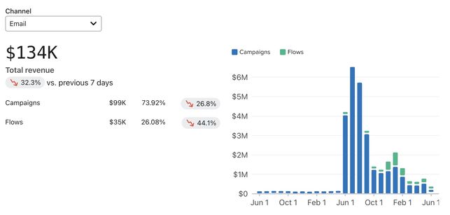
Note that the percentage change under total revenue will represent the change for both campaigns and flows compared to the same, prior period. The percentage change to the right of campaigns or flows will show the change for these specific messaging types.
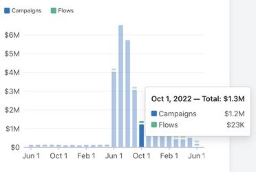
The bar chart on the right will also update to show this breakdown across campaigns (blue) flows (green) over time. If you hover over any bars in the chart, you will see the breakdown of attributed or unattributed revenue to each messaging type (campaigns or flows) for that point in time.
Channel breakdown tab
The channel breakdown tab provides a view of your revenue across time and by channel (email, sms, or push). Here you can review which channel(s) are contributing to your revenue the most and which may need to be adjusted.
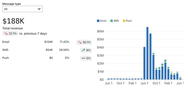
By default, when first landing on this view, you will see all message types together. Using the Message type dropdown allows you to choose a specific channel (i.e., campaigns or flows), so you can review revenue data specific to certain types of message.
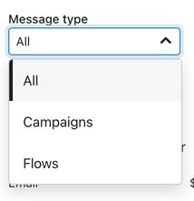
Once you choose a specific channel to review, you will see a breakout of revenue by the type of channel message (i.e., email, SMS, or push), the percentage this accounts for, and the percentage change compared to the same, prior period.
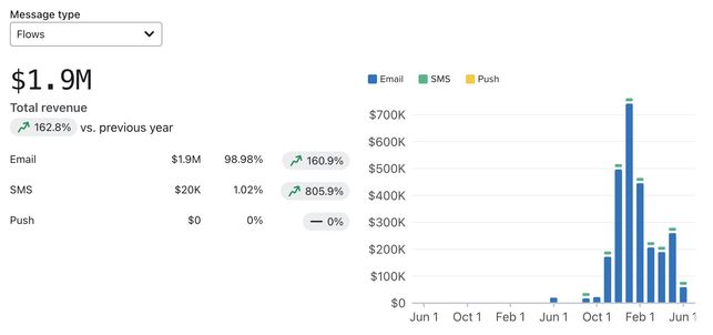
Note that the percentage change under Total revenue will represent the change for email, SMS, and push to the same, prior period. The percentage change to the right of email, SMS, or push will show the change for these specific messaging types.
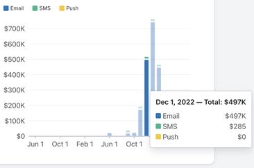
The bar chart on the right will also update to show this breakdown across email (blue), SMS (green), and push (yellow) over time. If you hover over any bars in the chart, you will see the breakdown of email, SMS, or push revenue to each messaging type (campaigns or flows) for that point in time.
Campaign performance summary card
The campaign performance summary card provides a summary of your revenue by channel with the ability to hone in on performance metrics (e.g., open rate, click rate, average order value, etc.). You can also review recently sent campaigns and their individual performance metrics.
Overview tab
The overview tab provides a view of your revenue and total recipients across specific channels.
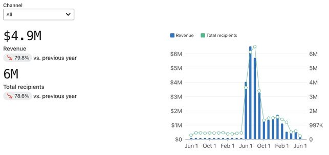
The large number represents the total revenue and the bottom number represents the total number of recipients. You will also see the percentage change versus the same, prior period for each of these values. For example, if you chose the last 7 days as your time frame, you will see the revenue compared to the 7 days prior to this period.
Note that totally revenue here will be total attributed revenue.
Once you choose a specific channel to review, you will see a breakout of revenue and recipients by the type of channel message (i.e., email, SMS, or push).
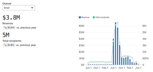
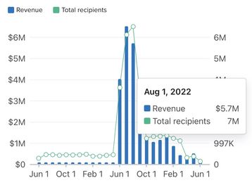
Note that the percentage next to revenue and recipients will be compared to the same, prior period. The bar chart on the right will also update to show this breakdown revenue (blue), and recipients (green) over time. If you hover over any bars in the chart, you will see the breakdown of revenue or recipients for that point in time.
Metrics tab
The metrics tab provides a chart of metrics (e.g., open rate, click rate, average order value, etc.), a breakout of the unique number of these metrics, and the percentage change compared to the same, prior period by each channel.
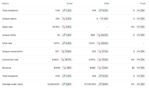
Keep in mind that this chart uses your chosen conversion metric from the top of the dashboard. For example, if you chose Placed Order, this chart would reflect metrics related to all recipients that actually placed an order. In other words, if you use a non-revenue related metric (e.g., Active on site), your chart will look slightly different from the above and not include revenue specific data such as average order value. Any areas of your chart that are missing numbers or percentages did not have those specific channel messages (e.g., SMS) sent within your timeframe and related to your chosen conversion metric.
Top performing tab
The top performing tab provides a snapshot of your your top 5 message by revenue, the message type, the total recipients and delivery rate percentage, unique fulfilled order number, and the revenue associated with that message. The Type column displays icons to indicate the types of message used. These message types could include one or more of the following:
- The envelope icon represents email campaigns.
- The text bubble icon represents SMS campaigns.
- The page icon represents push campaigns.
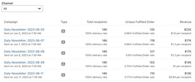
By default, when first landing on this view, you will see all channels together. Using the Channel dropdown allows you to choose a specific channel (i.e., email, sms, or push), so you can review metrics specific to that channel.
Flows performance summary card
The flows performance summary card provides a summary of your revenue by channel with the ability to hone in on performance metrics (e.g., open rate, click rate, average order value, etc.). You can also review recently sent flows and their individual performance metrics.
Overview tab
The overview tab provides a view of your revenue and total recipients across specific channels.
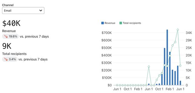
The large number represents the total combined revenue (attributed to Klaviyo and other sources) and the bottom number represents the total number of recipients. You will also see the percentage change versus the same, prior period for each of these values. For example, if you chose the last 7 days as your time frame, you will see the revenue compared to the 7 days prior to this period.
Note that revenue here will be total attributed revenue.
Once you choose a specific channel to review, you will see a breakout of revenue and recipients by the type of channel message (i.e., email, SMS, or push). In other words, flows containing the specific message type.
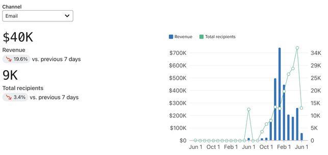
Note that the percentage next to revenue and recipients will be compared to the same, prior period.
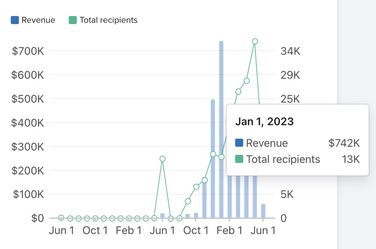
The bar chart on the right will also update to show this breakdown revenue (blue), and recipients (green) over time. If you hover over any bars in the chart, you will see the breakdown of revenue or recipients for that point in time.
Metrics tab
The metrics tab provides a chart of flow metrics (e.g., open rate, click rate, average order value, etc.), a breakout of the unique number of these metrics, and the percentage change compared to the same, prior period by each channel.
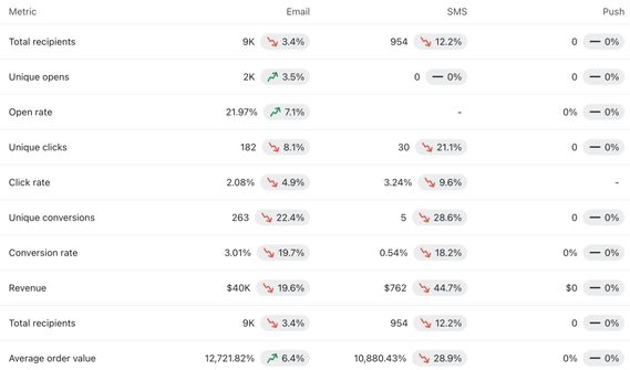
Keep in mind that this chart uses your chosen conversion metric from the top of the dashboard. For example, if you chose Placed Order, this chart would reflect metrics related to all recipients that actually placed an order. Any areas of your chart that are missing numbers or percentages did not have those specific channel messages in your flows (e.g., SMS), sent within your timeframe, and related to your chosen conversion metric.
Top performing tab
The top performing tab provides a snapshot of the most successful campaigns or flows that were active within your selected time frame. Here, they will be sorted in descending order by success (revenue or number of unique conversions), and include additional information around:
- The message status (live or manual)
- The types of messages it contains (email, SMS, or push)
- The total recipients and delivery rate percentage, unique fulfilled order number
- The revenue associated with that message
The Type column uses icons to indicate the types of message used. These message types could include one or more of the following:
- The envelope icon represents flows containing email.
- The text bubble icon represents flows containing SMS.
- The page icon represents flows containing push notifications.
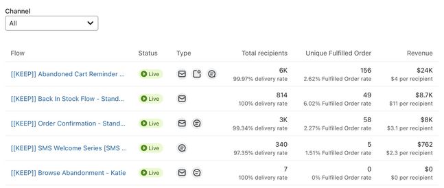
By default, when first landing on this view, you will see all channels together. Using the Channel dropdown allows you to choose a flow specifically containing that channel type (i.e., email, sms, or push).
Deliverability card
The deliverability card provides a view of your deliverability across email, SMS, or push channels. Additionally, you can review metrics that may impact your deliverability (e.g., bounce rate), the percentage and percentage changed compared to the same, prior period. These insights help you to see where you may need to invest efforts or address issues affecting your deliverability.
You can either toggle a view that displays the chart and values by percentage rates or by counts. The example below shows the Rates toggled view.
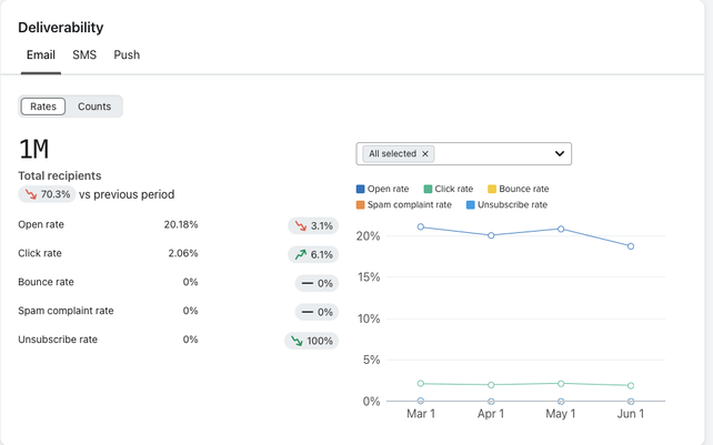
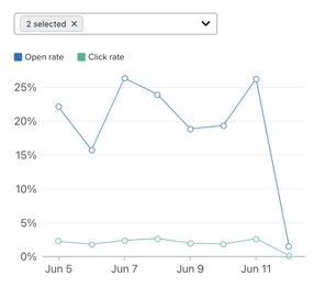
In each tab (email, SMS, or push), you have the option to see all metrics or hone in on specific metrics using the All selected dropdown.
Note that some metrics may not be shown for a specific channel (e.g., bounce rate for SMS) as it cannot be tracked for that channel or is not applicable.
Once you select or deselect these metrics the line graph will update to reflect these adjustments.
Additional resources
- How to build a business review dashboard
Learn how to build a business review dashboard to visualize your revenue performance, deliverability trends, and better understand the health of your business. The business review dashboard provides a customizable report detailing your success across each marketing channel and type over specific time periods.
- Understanding Klaviyo message attribution
Learn about Klaviyo's event and message attribution or the ability to review which of your messages or channels led to customer actions.
- Understanding message conversion tracking
Learn how conversion tracking works for email, SMS, and mobile push messaging and how to edit these settings. For each campaign and flow sent, Klaviyo automatically tracks conversions. This allows you to analyze the performance of your marketing channels and their individual success.