Getting started with the segment growth report
You will learn
Learn how to build and use the segment growth report to gauge your audience's health week by week. The segment growth report provides a comprehensive view of each of your segments with the ability to hone in on growth, added and dropped members, and any trends or potential issues. Additionally, export the report to easily review data in more detail and take actionable steps with your segments.
Data can only be pulled from June 21, 2023 onwards.
Before you begin
You have 2 options for reviewing a segment growth report:
- A report within an individual active segment.
- Cards on your overview dashboard.
The cards on the overview dashboard do not show member profile information including events dates per individual profile. If you would like to see this information by member, use the full report in an individual active segment.
Additionally, note that this does not report on any profiles that were added and removed within the same day.
Using a segment growth report within an individual active segment
Navigating to the report
- Head to Lists & Segments and click on any existing segment. Note that this report is only available on segments and not lists.
- Select Segment Growth.

Customizing the report
To tailor the report to your marketing needs, you can customize the time range that the report looks at and pulls data from, as well as change how it displays in your charts. For example, you may want to look at a segment growth report for your VIP customers and their behaviors during slower-selling months.
Data can only be pulled from June 21, 2023 onwards.
Customizing date range
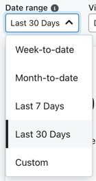
- Open the dropdown menu under Date range. It will have 7 days selected as default.
2. Choose one of the following options:
- Week-to-date
- Month-to-date
- Last 7 days.
- Last 30 days.
- Custom
Custom has a max limit of up to 5 years and can only be pulled from when the data or segment was created. If you are attempting to pull too much or unavailable data, you will receive an error to redo your data parameters.
Customizing the time aggregation
Adjust how your data displays in your charts by either weekly or monthly views.
- Open the dropdown menu under View by.

2. Select either Daily or Weekly.
Daily is only available for date ranges equal to or less than 90 days. Weekly is only available for date ranges equal to or greater than 8 days, and cannot display more than 104 consecutive weeks or ~2 years.
Refreshing the time dashboard
If you want to see your latest data, you need to manually refresh the report. In the upper right corner next to the circular arrows icon, you can see the timestamp of whenever the report was refreshed by anyone in your account.
- To refresh the report, click on the circular arrows icon. Your report timestamp will change to reflect this refresh update.
Reviewing the Segment size card
The Segment size card provides the ability to review the following over a certain date range:
- Total segment size.
- Total segment percentage change (compared to the previous period).
- Segment growth.
- Number of added profiles.
- Number of dropped profiles.
For the previous period percentage change, it compares to the same prior period. For example, it's September 1 and your date range is the last 90 days. In this case, the data compares segment growth from the past 90 days (June 3-September 1) to the 90 days before that (March 5-June 2).

Additionally, the total number of members added appear in a green status, while the total number of members dropped during this time period appear in a red status.
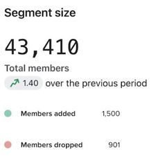
On the right-hand side of the card, you will see 2 graphs:
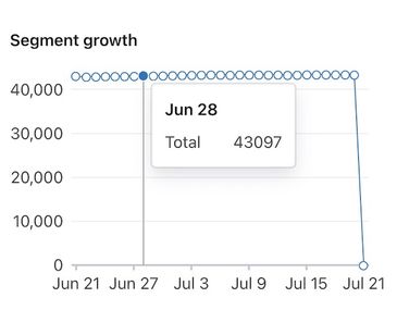
- Segment growth over time.
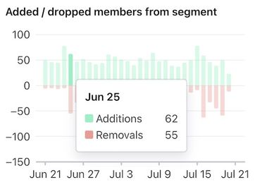
- Members that were added or dropped over time.
The Segment growth chart shows the total number of members per week. By hovering over any of these plot points, you can review how many profiles existed at that point in time.
The Added / dropped members from segment chart shows the total number of profiles added and dropped (visualized as bars) during distinct points in time. Members added appear at the top of the chart in green, while members lost appear at the bottom half of the chart in red. Additionally, by hovering over any point in time, you can see the addition and subtraction counts for that date.
Reviewing the Segment Growth Details card
The Segment Growth Details card provides the ability to view segment size over time, with details on total members, changes, change percentages, etc.
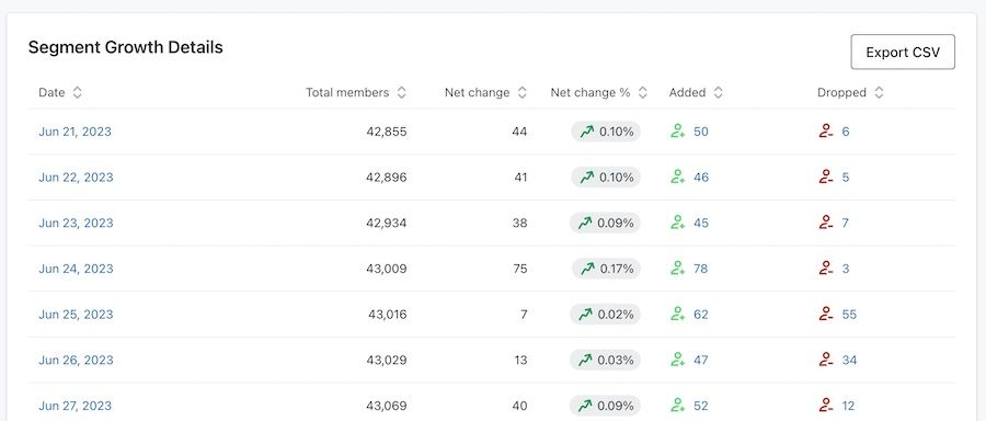
This card’s table will contain the following columns:
- Date
The current points in time that are pulling in segment data.
Note that if you chose Weekly as your time aggregation, you will see weeks listed here, and if you chose Daily, you will see individual days listed here.
- Total size
The number of total, individual members in your segment at that point in time. - Net change
The number of individual members added, dropped, or merged/deleted at that point in time. - Net change %
The percentage change that the individual members added, dropped, or merged/deleted at that point in time represents from the prior column. - Added
The number of individual members added at that point in time. Note that this will only show up to 1,000 members who were added. - Dropped
The number of individual members dropped at that point in time. Note that this will only show up to 1,000 members who were dropped.
You can sort these columns by ascending or descending order by using the arrows to the right of each.

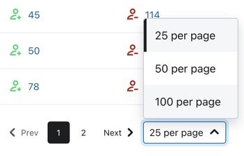
Further, you’re able to review older data or more pages of data by clicking between pages at the bottom or changing how many results display per page.
Handling reactivated segments
If a segment is reactivated less than 90 days after it went inactive, no historical data is kept, and your report only displays data from the date of reactivation on. If a segment is reactivated equal to or more than 90 days after it went inactive, historical data is available prior to the inactive period and then resumes after reactivation.
Any segments that have been reactivated at a given point in time show a page icon, as shown in the example below.
Handling segments where definitions changed
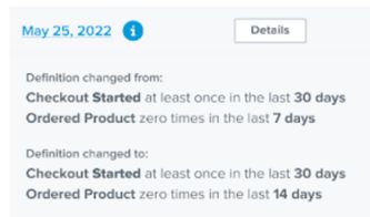
If a segment definition changes at all during your report’s time period, an info icon appears next to the date this change occurred, as shown in the example below.

By clicking on this icon, you can review what the prior and current definitions are.
Viewing specific added or dropped profile information
By clicking on any date in the main table view, you will be taken to the Added & dropped from segment section, where you can see:
- An aggregate of all profile added or dropped during this time period. Note that it will only show up to 1,000 added or dropped profiles.
- All profiles’ personal information (e.g., name, email, phone number).
- When a profile was added or dropped.
Keep in mind that this profile information reflects the time range you selected.
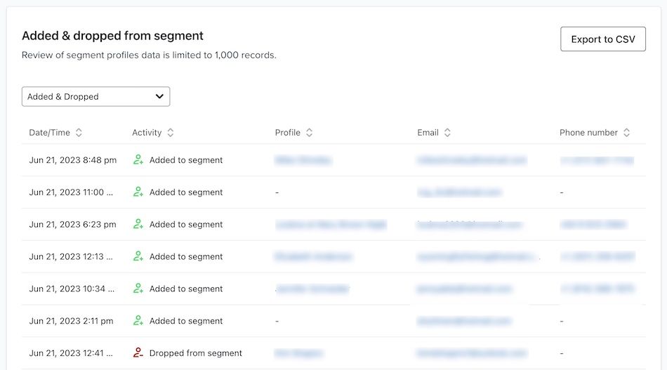
By clicking on any number in the Added or Dropped columns in the main table view, you will be taken to the Added & dropped from segment section, where you can see the added or dropped members separately. Note that depending on what you clicked, you will only see one or the other (added or dropped).
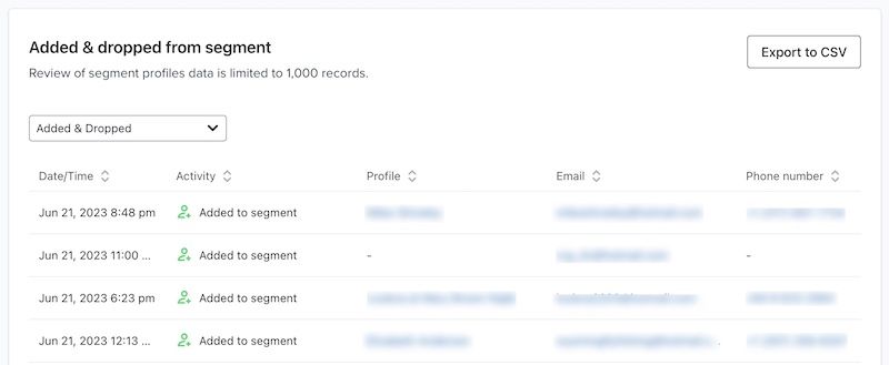
Finally, when navigating to the Added & dropped from segment section from any column, you have the ability to adjust your report view directly.
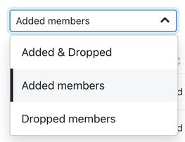
- Open the dropdown at the top and choose the view you want to see (Added & Dropped, Added Members, or Dropped Members).
Exporting your aggregated data
On the main Segment Growth Details card, you have the option to export the entire table of aggregated data totals as a CSV. The export will contain virtually all the same information as displayed in the table, except without any of the colored visualizations.
- Click on Export CSV on the right of the card.
- Look for the file in your browser or local downloads with the naming convention “CSV filename = AcctName_SegmentName_DownloadDate.csv.”

Exporting added or dropped member information
In the Added & dropped from segment section, you can export that particular set of member information as a CSV.
- Click on Export CSV on the right of the section.
- Look for the file in your browser or local downloads with the naming convention “CSV filename = AcctName_SegmentName_DownloadDate.csv.”
Depending on what your current section is showing (Added & Dropped, Added Members, or Dropped Members) will be the information that downloads in your CSV. Toggle to a different option if you to export different information. Additionally, all exports will be limited to showing up to 1,000 added or dropped profiles.

Troubleshooting empty reports
You will see a blank state if you attempt to run a segment growth report and either:
- Your segment was created the same day (today).
- Your segment does not have a lot of data yet. You must wait until your segment has enough data to fill out the report.
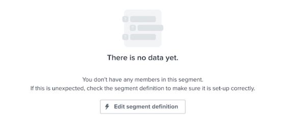
If there are issues happening and Klaviyo is unable to retrieve your data, you may need to refresh the report by clicking the Retry button that appears. This should reload your report once we are able to reprocess it.

Using segment growth cards in the overview dashboard
Navigating to the Starred Segment Growth card
- Go to Analytics > Dashboards.
- Either open up an existing overview dashboard or create a new one by clicking Create Dashboard.
- Click Add Card.
If you cannot add a card, this means you have reached your max and will need to remove one.
- Within the library, look for the Starred Segment Growth card and click Add Data View.
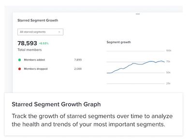
Once you add this card to your report, it appears at the bottom by default.
Data can only be pulled from June 21, 2023 onwards. Even if your dashboard's data range includes time before this, your segment growth card will be limited in what data it can display.
Reviewing the Starred Segment Growth overview dashboard card
The Starred Segment Growth card on your overview dashboard shows you provides the ability to review total segment size and percentage changes, and segment growth, including added or dropped profiles, over time.
The time range and aggregated view of your report will match your overall overview dashboard time settings.

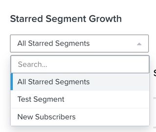
The dropdown at the top defaults to All Starred Segments, but you can open this dropdown to find another segment to analyze.
If you choose to review a different segment, all other widgets on your dashboard automatically update with this new choice.
On the left hand side of the card, you will be able to review total segment size (i.e., the number of individual members or profiles), and percentage change compared to the previous period. For example, it's September 1 and your date range is the last 90 days. In this case, the data compares segment growth from the past 90 days (June 3-September 1) to the 90 days before that (March 5-June 2).
Additionally, the number of members added will appear as a total in a green status, while the number of members dropped during this time period, will appear as a total in a red status.

On the right hand side of the card, you will see two graphs:
- One for segment growth over time.
- One for members that were added or dropped over time.
The Segment growth chart shows the total number of members added each week to your segment within your time range. Moreover, by hovering over any of these plot points, you can review how many profiles existed at that point in time.
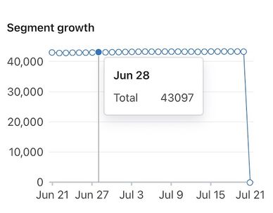
The Added / dropped members from segment chart shows the total number of profiles added and dropped (visualized as bars) during distinct points in time. Members added appear at the top of the chart in green, while members lost appear at the bottom half of the chart in red. Additionally, by hovering over any point in time, you can see the addition and subtraction counts for that date.

Reviewing the Starred Segments overview dashboard card
The Starred Segments card on your overview dashboard has provides the ability to review:
- Total segment size.
- Segment percentage changes.
- Segment growth.
- Number of added or dropped profiles.
This card only shows information for starred segments; it cannot pull in non-starred segments for review. The time range and aggregated view of your report matches your overall overview dashboard time settings.

This card’s table contains the following columns:
- Name
Name of your starred segment. - Total members
The number of total, individual members in your segment at that point in time. - Added
The number of individual members added at that point in time. - Dropped
The number of individual members dropped at that point in time. - Net change
The number of individual members added, dropped, or merged/deleted at that point in time.
You can also sort these columns by ascending or descending order by using the arrows to the right of each.

Viewing your complete segment growth report
By clicking on the name of the starred segment, you will be brought to the main active segment growth report for the section view of dropped and added member information.
Additional resources
- Understanding engagement reports for lists and segments
Learn how to analyze engagement reports for email lists and segments to understand how engaged your subscribers are. Engagement reporting can also help determine if you need to take additional steps, like list cleaning, to address engagement issues.
- Getting started with analytics or overview dashboards
Learn how to use analytics dashboards (also referred to as overview dashboards) and understand how each data card can measure performance. Once you send messages from Klaviyo, this dashboard is a place to visualize the data points and trends that matter most to your business.