How to build an analytics or overview dashboard
You will learn
Learn how to build a dashboard to visualize all email, SMS, flow, and deliverability trends, and understand the health of your business. Dashboards (also referred to as overview dashboards) provide an all-encompassing, customizable report detailing your success across each marketing channel.
For information on how to interpret the data and performance cards, head to our Getting started with analytics dashboard guide.
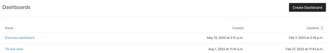
Creating or accessing the dashboard
- Navigate to Analytics > Dashboards.
- If this is your first time creating a report, click Create Report. Otherwise, choose a pre-existing report from the list below. You will already have a pre-built dashboard (i.e., Overview dashboard) created for you and can customize this dashboard if you like.
Customizing the analytics dashboard
Choosing a date range
By default, your dashboard will show your performance metrics over the last 30 days.
- To change the date range, click on the dropdown next to Date range.
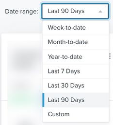
You can adjust the date range to show:
- Week-to-date
- Month-to-date
- Last 7 Days
- Last 30 Days
- Last 90 Days
- Custom (note: you can pull up to 12 months maximum within your date range)
All data views will be based on your account’s local timezone. Dates are inclusive of both start and end date. For example, if you select March 1-March 30, the data is inclusive of both March 1 and March 30.
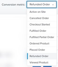
Choosing a conversion metric
Besides the date range, you also can choose any account-wide conversion metric. The conversion metrics will pull from any integration or custom conversion-related event and visualize your data.
- To change the conversion metric, click on the dropdown next to Conversion metric.
- Choose the conversion metric that suits your current dashboard's needs.
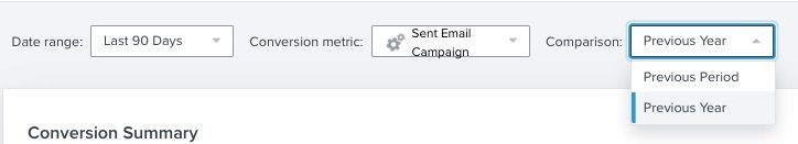
Changing the comparison period
You also have the option to choose whether you want to compare your performance in your date range to a previous period, either the previous year or the previous month.
- Click on the dropdown next to Comparison and choose your option (i.e., Previous Year or Previous Period).
In the example below, the date range is the last 90 days. If you were choose the Previous Year option, your data will compare to the same 90days in the previous year. If you choose the Previous Period, your data will compare to the same prior date range or, in this case, the 90 days prior to our chosen data rage.
Note that if you use the custom time range, the range cannot exceed 12 months and, if typed in manually, needs to be exactly formatted as shown below.”
For previous year comparisons, we use exact date matches. For example, if your data range is the last 30 days and it’s Sept 1st- Sept 30th of 2022, Klaviyo compares that to Sept 1st- Sept 30th of 2021.
Refreshing the dashboard
In the upper right-hand corner of the dashboard, the timestamp will appear for the last time a user updated the dashboard.
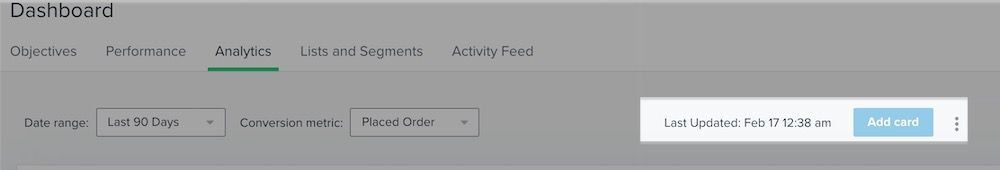
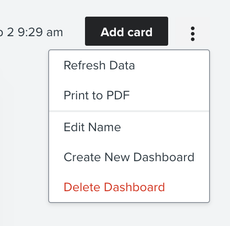
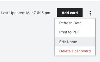
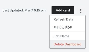
- To manually refresh the dashboard and the data displayed, click on the three dot menu (...) in the upper right and select Refresh Data. This will update all the data on the dashboard.
All users on your account will see the same dashboards. The last updated timestamp represents the last time any team member updated the board.
Adding a card
You can find additional pre-built data cards in the dashboard library. Use these cards to dive deeper into your marketing channel performance and troubleshoot potential issues.
Learn more about the additional cards available in the library and how to use each.
- Click Add Card in the upper right-hand corner. A pop-up will appear showing the data view library. This library contains many pre-built cards to serve your data visualization needs.
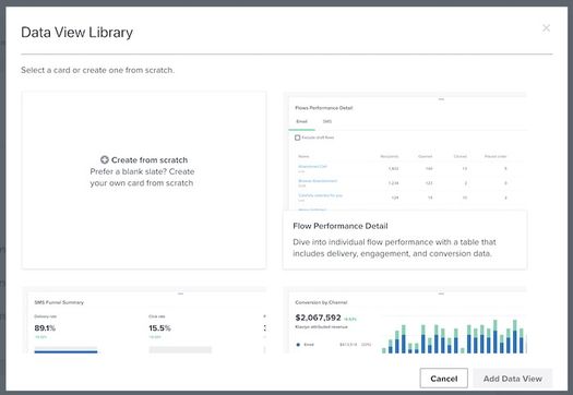
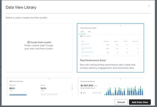
2. Once you have chosen a pre-built card to add to your dashboard, select it and then click Add Data View.
The newly added card will appear at the bottom of your dashboard.
There is a limit of 10 cards per dashboard. If you need a different card and have reached the limit, remove a card and then add your new one, or create a new dashboard and add your supplementary cards there. However, if a card is simply appearing empty, head to our Troubleshooting empty cards on analytics dashboards guide.
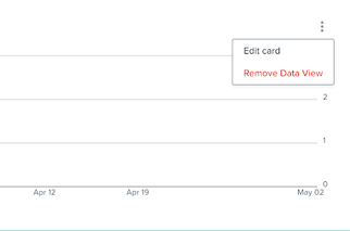
Deleting a card
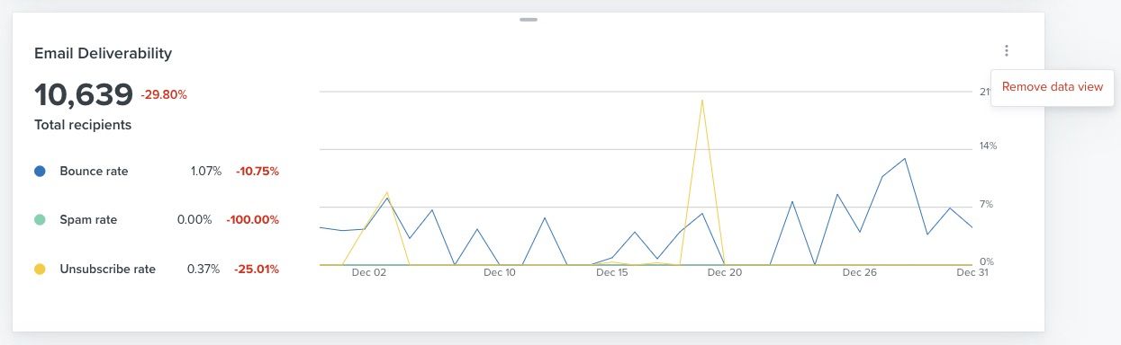
- To edit or delete a card, click on the three-dot menu (...) in the upper right.
- Select Remove data view.
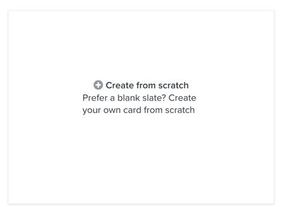
Creating a custom card from scratch
If the pre-built options offered in the data view library do not fit your needs, you have the option to create your own custom cards.
- To create your own card, click Add Card and choose the option Create from scratch.
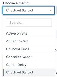
2. Choose your metric from the dropdown (e.g., Checkout Started).
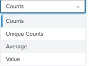
3. Choose how you would like this metric displayed (e.g. Average, Counts, Unique Counts, or Value). Note that Counts represent the total number of a metric (e.g., total number of opens including duplicate opens by the same subscriber), while Unique Counts are the unique number of these (e.g., number of opens per unique subscriber).
You also have the option to group your data by choosing an option from the Group by dropdown. You can add up to 5 additional filters to narrow down your data (e.g., item or product type).
4. Choose if you would like your data displayed as a table, line graph, bar graph, or as a single number.
5. Once you finish setting up your card, click Add Card.
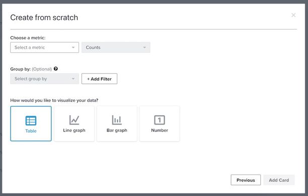
If you choose a line or bar graph and a grouping option with no filters, you will see the top 5 values in the graph. To see all Group by data, you must choose the table visualization.
Editing your custom card
- If you need to make any adjustments to your custom card, click on the 3 dot menu (...) inside your card.
- Click Edit Card. This will bring you back to the original card setup in the data view library.
Adjusting the order of cards
- Click on the line at the top middle of each card (-) and drop them to your desired order, as shown below.
Exporting your complete dashboard
- Click on the 3 dot menu (...) in the upper right and select Print to PDF. A function will then appear to allow you to print or download the entire dashboard as a PDF.
Cards with graphs will appear without filters applied, and cards with tables will only show the first page of data.
Adding additional dashboards
By default, you will see a pre-populated dashboard and have the option to create up to 9 additional cards.
- Navigate to Analytics > Dashboard.
- Click Create Dashboard in the upper right.
You can then add cards to your blank dashboard using the data view library, which includes both pre-built cards and a fully configurable Create your own option.
Editing the name of your dashboard
You can edit the name of your dashboard by navigating into your existing dashboard.
- Click on the 3 dot menu (...) in the upper right.
- Select Edit Name.
Deleting your dashboard
You can also choose to delete any individual dashboard by either two options.
Option 1
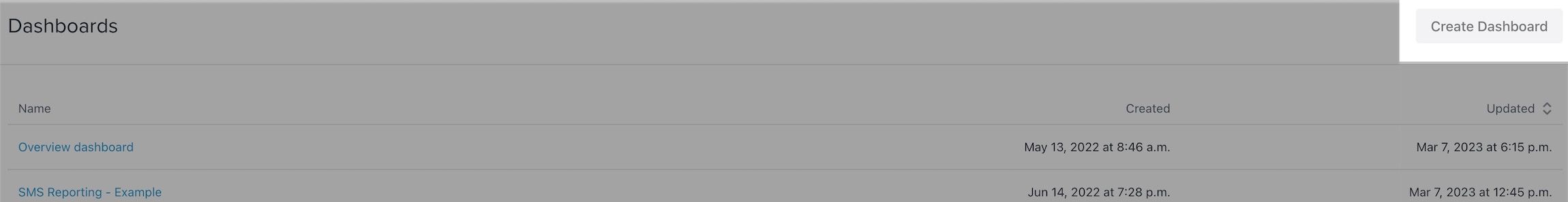
- Navigate to Analytics > Dashboard and find the report you wish to delete.
- Hover over the report in your list and click Delete.

Option 2
- Navigate to Analytics > Dashboard and click directly into the dashboard you wish to delete.
- Click on the 3 dot menu (...) in the upper right.
- Select Delete Dashboard.
Note that if you delete a dashboard, there is no way to retrieve it thereafter. You will need to recreate this dashboard and cards.
Additional resources
- Getting started with reporting
Learn about the different robust Klaviyo reporting tools available in your account. Klaviyo is built to help your business grow and strengthen your relationships with your audience by putting data to work. Segmentation and automation tools allow you to personalize and target your communication efforts across channels to boost engagement and drive business growth. However, in order to understand how well your business strategies and marketing efforts are working, you need proper reporting to measure and analyze performance trends over time.
- Getting started with analytics or overview dashboards
Learn how to use analytics dashboards (also referred to as overview dashboards) and understand how each data card can measure performance. Once you send messages from Klaviyo, this dashboard is a place to visualize the data points and trends that matter most to your business.
- Troubleshooting empty cards on analytics or overview dashboards
Learn how to troubleshoot and fix empty cards that are appearing in your analytics dashboard (also referred to as the overview dashboard).