Brand design reference
You will learn
Learn how to make your business look professional and reputable through your colors, designs, fonts, and brand concepts. This guide will walk you through
Creating a design concept
To start, you should have at least a rough idea of your business plan and audience. Before you dive in creating a logo or choosing your fonts, you need to map out an idea of your design concept that will give credibility to your brand and attract clients. First, make sure that you have a good understanding of your audience. It's crucial to know the kinds of media that your audience consumes and where they spend their time both on and off of the internet. Using that information, head to competitors’ sites and observe their colors, fonts, logos, photography, and other design work. What colors do they use? Do they have script, serif, or sans serif fonts? What is the basic imagery they use to develop their brand? Makes notes of what you like and what works well.
Choosing brand colors
Deciding which colors to use can be daunting. Color elicits different emotions and will impact how people respond to your brand. Let’s go through some basic color theory.
- Blue
Connotes trust, intelligence, confidence, reliability, tranquility.
Because we automatically associate blue with trustworthiness and reliability, it is widely used by hospitals, pharmaceutical companies, governments, and technology companies. Look at the apps on your phone that carry your sensitive information. Chances are, the logos are mostly blue.
- Red
Connotes excitement, attention, stimulation, strength.

Red has many different effects. Red makes you hungry, increases your heart rate, makes you angry, grabs your attention, etc. Red makes you more likely to purchase fast food, watch a video because you feel like it’s exciting, or buy something you don’t need.
- Green
Connotes sustainability, durability, health, freshness, friendliness.
Green gives a friendly and sustainable energy. You’ll see it in healthy food options and outdoor brands.
Other colors like yellow (cheerful, positive), purple (glamour, mystery), and black (VIP, high end, exclusive) are used in logo design also but aren’t as common as the colors above.
Where should you start? Pick one neutral color, two bold colors, and one call-to-action color. Start with a color you like and fits well with the message you are trying to portray and fill in the other colors around it. You want to make sure that the colors look good together.
Where can you go for color scheme inspiration? Head to Adobe Color CC. Under the “Explore” tab, you can search different keywords that pertain to your brand. Additionally, under the “Create” tab, you can explore different color combinations of your own choosing.
When you’re picking your brand’s colors, the most important thing is to reflect on the message you want to portray to your customers. Think about how your colors will translate to logo design, websites, and even to merchandise you might sell. Once you have an idea of your color scheme, you’re ready to move onto fonts.
Choosing brand fonts
Finding and choosing brand fonts can seem like a daunting task. After all, there are thousands of fonts out there. But what’s most important to realize is that fonts ultimately fall into a few categories — serif, sans serif, script, and display.
- Serif
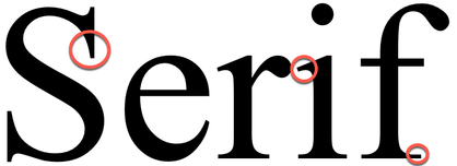
Serif fonts have lines attached to the end of each letter. They are classic, traditional, and serious.
- Sans Serif
Sans Serif literally means “without serif.” These fonts do not have lines at the end of their letters, thus giving them a more modern feel. Both serif and sans serif fonts are usually easy to read, with the slight advantage given to sans serif fonts.

- Script
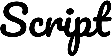
Script fonts look the most like handwriting and have letters that are connected in one way or another. They have come into a lot of popularity over the last few years and give off an air of fun and DIY. They are used in logos and headers but are rarely used in body text.
- Display
Display fonts attract attention. They are the hardest to read and should be used intentionally and rarely.

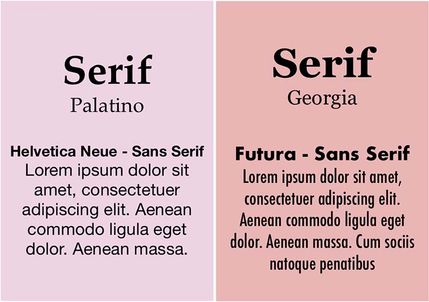
The best way to add depth and character to your brand and website is to pair either different weights of the same font or different types of fonts together. Contrasting font weights are usually with a serif or sans serif font and adds in bolded headers.
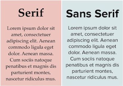
Using different font types, on the other hand, could look like pairing a serif and sans serif font. Usually, the serif font is used as the header and the sans serif font is used for body text. You can also use script and display fonts as your header with a serif or sans serif font, but use caution. At the end of the day, you want to make sure that your content is easy to read. Lastly, don’t pick fonts that are closely tied to another brand (i.e. Coca-Cola, Sopranos, Harry Potter, etc.). A great resource for downloading free fonts is Google fonts.
Logo design
Now that you have done the hard work of researching the design of competitors, creating a color scheme, and choosing fonts that you think would work well for your brand, it’s time to build out your logo. But before we get started, let’s walk through some concepts to keep in mind as you build out your logo.
Your logo should be:
- Simple
- Scalable (i.e., easy to read on a mobile device as it is on a billboard)
- Primarily horizontal
You have two options when it comes to creating a logo. You can design a logo yourself or have someone else design it for you. If you choose to design something yourself or want to toss around some options but don’t want to invest in an expensive new software, GIMP, Inkscape, Pixlr, and Canva are all free image editing and design tools that you can use to build your logo.
When designing, keep in mind that you’ll need the following logo variations for the best scalability of your brand:
- Background is transparent, white.
- Text coloring provides dark and light colored text options.
- Shapes include optons for square, horizontal, and one for a favicon.
If you forgo creating something yourself and also don’t want to hire someone to design your logo, Shopify’s app Hatchful will help you design a logo for free. Just make sure that your logo matches both your brand and industry.
After you have your site up and running, you may need a handful of stock photos and videos to give life to your emails, website, and other communications. Unsplash, Gratisography, and Pexels all provide high-quality stock photos and videos to help boost your brand.
Outcome
So you have brand colors, styling, and a logo, now what? Next, figure out where you’re planning on hosting your website. Are you selling something? Set up an ecommerce store, keeping in mind the branding choices for your website. Check out our article on platforms that you might need that integrate with Klaviyo. Once you’ve zeroed in on your branding and design, coming up with branded content becomes much easier.
Additional resources
- About email images best practices
Learn about best practices when using images in Klaviyo emails, including size recommendations and how to add images.
- Building a brand community
- Getting started with Klaviyo