Guide to the email template editor
You will learn
Learn about Klaviyo’s drag-and-drop email template editor, including how to use template styles and configure each block type.
About blocks and layouts
When you open the Klaviyo email template editor, the sidebar will display a selection of block and section options to choose from. Choose between basic blocks, which are blank slates used to build emails from scratch, and universal content, which is content you’ve built in other templates and saved for later use.
In the Basic section, you’ll find a selection of both blocks and layouts. Use blocks to add content, like text, images, or buttons. Use layouts (i.e., sections and columns) to group your blocks and configure them.
Blocks and sections can be cloned, deleted, or saved using the icons that appear when you hover over the block or section.
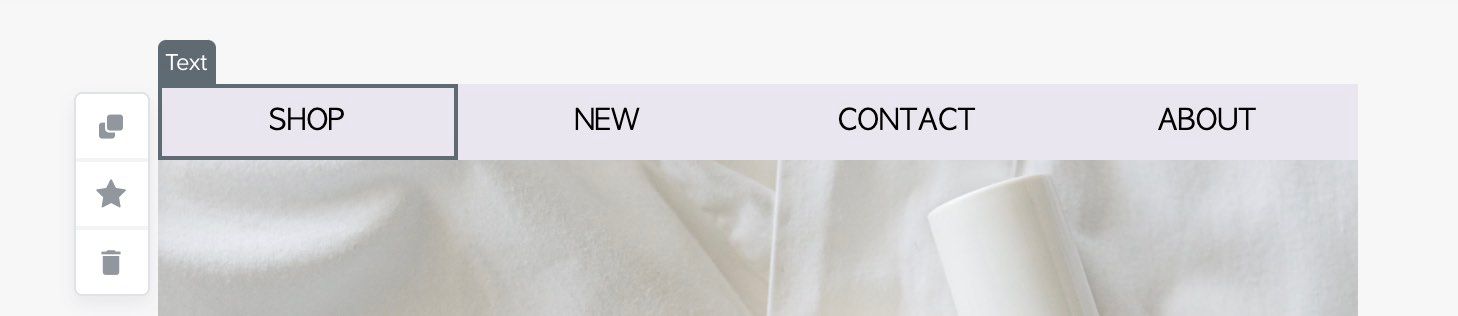
To move a block or section, click and drag it.
Template styles
The main Styles tab contains several styling options that will apply to your entire template. To access a template’s main styles settings, navigate out of any blocks or sections you’re working in using the Done button, then click Styles.
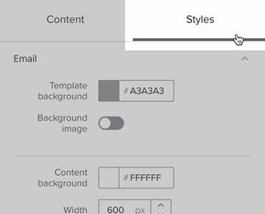
This is where you can set the look and feel of your email. If you've gone through the setup wizard, this area will already contain some of your brand styles.
To adjust the brand styles that populate in new templates, navigate to Brand Library > Brand.
Here, you can edit the following settings:
- Email
- Template background
Choose a background color for your template - Background image
Optionally add a background image - Content background
Set a background color for the content of your email; this color can be different than the template background, and only spans the width of your email’s content - Width
The width of your email content (600px recommended) - Corner radius, margins, padding, and border
Add spacing and borders to your template
- Template background
- Text & Headings
Set styles for normal text and four heading styles, then choose a text style from the dropdown menu in any text block to apply it - Font
Select a font, font spacing, size, weight, and color for the text style - Letter spacing
Spacing between each letter horizontally - Line spacing
Vertical spacing between lines of text - Text alignment
Choose left, center, or right-aligned - Mobile
Choose whether to enable mobile optimization (recommended) or display the same styles and content on both desktop and mobile - Other
- Currency
Select a default currency for the template, if different than your account settings
- Currency
How template styles interact with block and section styles
Your template style settings will be applied to your template first, before any block or section-specific settings are applied. If a block or section’s styles conflict with your template styles, the block and section styles will be used. For example, if you set a content background color in the main Styles section, then set a block-specific background color, the block's background color will be used for that block's area.
Sections and section styles
All content in the template editor is organized into sections. When you create a new template, it will contain one or more sections by default, and you can add or delete sections as needed.
To open a section’s settings, click the area to the right or left of that section’s content. Note that clicking a block will open the settings for that block, rather than the section containing it.
Each section has a Styles tab and a Display Options tab. Use the section’s styles to add background images, padding, and other styles to that section. Use the section’s display options to choose which device types and recipients should see the sections.
The section style settings will be applied to your template after your template styles, but before any block-specific styles. If the template styles conflict with your section styles, section style will be used. If a block’s settings conflict with your section styles, the block’s style will be used.
Blocks and block styles
Within sections, add blocks to populate your email with content. Most content blocks have a Styles tab, where you can configure the appearance of the block, and a Display Options tab, where you can choose who should see the block and which device types it should display on. The specific styles settings available are different for each block type, but the same display options are available for all blocks.
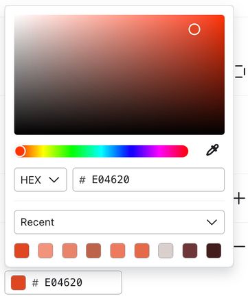
Any style sections with color options include the color picker tool, which offers several ways to select a color:
- Use the gradient field to select a shade and hue.
- Copy and paste a HEX or RGB code.
- Select from your recently used colors or the colors already present in this template.
- Use the eyedropper tool to choose a color from anywhere in the email canvas (not currently available for text, split, or table blocks).
Learn about display options or read on to learn about block types and how to use them.
Text
Use a text block to add text to your emails. Choose a text style (Normal or Heading 1 - 4) to apply the style settings from your main template’s styles, or customize the text content with the text editor’s settings.
Klaviyo's email editor uses the UTF-8 encoding standard, which means it supports Latin characters, emojis, double byte characters, and more.
You can add dynamic content to your text block to personalize the message for each recipient. Learn more about message personalization.
To add copy in a language that uses a right-to-left (RTL) script (e.g., Hebrew), add the following code snippet to the source code of a text block at the top of your template:
<style type="text/css">
    p, h1, h2, h3, h4, ol, li, ul { direction: rtl; }
</style>
Collapse the Content section or scroll past it to adjust the block’s styles. Choose a background color for the block or text content area and add padding.
If you write your copy outside of the Klaviyo editor (for example, in Google Docs or Microsoft Word) make sure to paste as plain text when pasting your text into the editor. Use Command+Shift+V or Ctrl+Shift+V to paste as plain text. Otherwise, certain style tags will be pasted in along with the text, which can cause design issues.
Image
Use an image block to insert an image into your email. You can add images from the following sources:
- Image Library
Add an image that you’ve uploaded in the past by searching your Image Library - Upload Image
Upload a JPEG, PNG, or GIF from your device - Import Image
Import an image using its image URL - Dynamic Image
Display a custom image for each recipient using a dynamic image variable (e.g., by referencing an image URL stored in a recipient’s event data or as a profile property)
Once you select your image, adjust your image settings, including alt text (a description of the image), a link address so the image is clickable, image width, alignment, and other styles.
Read more about inserting images into templates.
Split
Use a split block to display content in two columns of any width. The content on either side of a split block must either be an image or text content. By default, your split block will use a 50/50 split; navigate to the Split Settings tab to adjust this ratio. Alternatively, you can use the Columns layout to split your content into two or more columns.
Button
Button blocks create large links that are more obvious than regular text links and great for emphasizing important calls-to-action (CTAs). Because they're used for CTAs, you'll likely want to use only a few in each email.
At a minimum, fill out the Text and URL fields. Text is what the recipient will see in the button, and the URL is where the visitor will be taken when they click the button. Adjust the button’s appearance, shape, and size using the color, corner radius, and padding options. You can also adjust the block’s font and other styles below.
Header/link bar
Use the header/link bar block to add a logo and navigation links that redirect to different content on your site.
When you drag in the block, you’ll be presented with some common header/link bar layouts to pick from. You can select different layouts for desktop and mobile, to better accommodate each device’s size.
Due to Outlook’s unique HTML rendering engines, a border may be added to your header/link bar elements for recipients using Outlook as their inbox. To avoid this, create a header using an image block for your logo and a table for your links.
Add any links to the link bar that you’d like. You can set device display settings for each link, and we recommend showing only key links in mobile, since the device size is smaller.
Once you’ve added your links and logo, apply the finishing touches using the style options below. You can change the font, colors, and spacing for the block. Once it’s ready, preview in both desktop and mobile to see the final product.
Drop shadow
Use a drop shadow to add depth to your message or emphasize a certain area. Color options for the shadow include light, dark, and darker, and you can set a background color and padding for the block.
Divider
Add a simple line between other content blocks. Choose between solid, dashed, or dotted lines. The color, size, and padding are fully customizable. Formerly called Horizontal Rule.
Social link
The social link block is an easy way to add social icons for your Instagram, Pinterest, Facebook, X (Twitter), and more. Klaviyo offers the standard full-color icons for a variety of sites, as well as simplified black, white, or grey options.
If you would prefer to use fully custom social icons, use the custom option and upload your own image files. If you go this route, we recommend using images that are 96px square. To maintain spacing and alignment between Klaviyo's social icons and your custom images, use icons that are 50px wide, and both vertically and horizontally centered in the image file.
Drag the icon labels in the sidebar to reorder the icons. You can use the Add Spacer button for more granular control over the space between each icon.
Spacer
The spacer block adds a customizable amount of space between vertically stacked blocks. To customize the space between blocks that are side-by-side (e.g., in a column), use left/right padding.
Product
Use a product block to add recommended items from your store’s catalog. When you add a product block, you will have two options: Dynamic or Static.
A dynamic feed updates automatically, and is configured via a product feed. To learn more about setting up a product feed, read our article How to use product feeds and recommendations.
A static product block shows only the catalog items you hand-select in the template editor, and won’t be updated automatically or targeted towards individual recipients.
With either option, once you’ve selected either the feed or items, you can customize the block’s appearance. Product blocks can show images only, or include each item’s name and price. Scroll through all the options in the product block’s styles tab to fully customize the block.
Coupon
Use a coupon block to display a coupon code in your email. When you drag a coupon block into the canvas, click the + button to choose a coupon from your account. You can search by name or filter by category.
The selected coupon code will display to all recipients. If a recipient hasn't already been assigned the coupon, it will be assigned to them automatically at send time. This behaves the same as inserting a coupon using a template tag, but with built-in styling options.
You can add header text to provide context for the coupon and customize the block's appearance, including the coupon text style, background color, and border.
Table
Table blocks can help you structure images and text within an email template. The table block gives you the flexibility to add as many columns or rows as you'd like (which will autospace themselves, or you can set a width in the Width setting of the Columns tab).
When a table block is first dragged into your template, it has one row with two columns. Use the Table Settings tab to add additional rows and columns, then navigate back to the Content tab to configure the table’s content.
Use the Cell selector section to open a specific cell’s contents. Use the Cell content section to choose between Text or Image content, then add your content. Note that if you switch back and forth between the text and image content types, you may lose content that was previously in that cell; use the undo button to revert your changes.
To edit the colors, fonts, borders, and layout of the table, open the Table Settings tab.
Table blocks are also used to display dynamic content, like the details for a list of items in the recipient’s cart. Learn more about dynamic table blocks.
HTML
Add custom code to your template using the HTML block. Use this block type when adding custom-coded elements, third-party features like countdown timers, or custom CSS. If you have trouble with custom code in your email, learn how to troubleshoot custom code in templates.
Review quote
If you use Klaviyo reviews, feature real customer reviews to offer social proof of your brand’s value and boost conversions.
The reviews quote block offers a selection of reviews to feature in your messages. If you aren’t yet able to select a review, it may be because:
- There aren’t enough high-quality reviews in your account to select from. Check back at a later date for a selection of reviews.
- Your reviews haven’t yet been processed. If you’d like to feature a brand-new review, wait a few hours before trying again.
- The reviews in your account aren’t verified. To be verified, a review must be submitted through a personalized link in a Klaviyo review request flow or marked as verified in an uploaded CSV of reviews from another platform. Unverified reviews, including reviews submitted directly to your site, are not eligible for inclusion in a review quote block.
Columns
There are two different blocks you can use to drag columns into your email templates: the Split block and the Columns layout. With a split block, you’re limited to text and image content in two columns, but can adjust each column’s width precisely.
With a column layout, you can add any type of content to each column, but are limited to a handful of pre-selected column width options. However, the column layout permits between one and four columns.
Once you add columns to your template, drop content blocks into each column to populate it. You aren’t limited to just one content block per column: add as many content blocks as you’d like, stacked on top of each other.
Video
Video blocks create the appearance of video embedded into an email. When a recipient clicks the play button, a new tab will open and the video will play.
To add a video block, copy the URL for the video from Youtube, Vimeo, TikTok, or your video hosting platform of choice. If your video is from Youtube, Klaviyo will automatically select a thumbnail image.
If you use a video from any other source, you’ll also need to upload a video thumbnail image. A play button will be superimposed on the video thumbnail, which you can toggle off in the block settings.
Why won’t the video play directly within the email?
Most major email clients (such as Gmail) view embedded content like videos as a security threat. These email clients will often strip out this embedded code completely and your recipients will not see your content rendered when they open your email.
Klaviyo is committed to setting our customers up for success. Because our testing shows that video does not reliably render across all major email clients, we don't support directly embedded video.
Universal content
You can save blocks or sections in templates for use across any other templates using the star icon. If you save a block or section, it will appear in the Universal tab of your email template blocks. When you make edits to a universal block or section, you can choose to apply those edits across all instances of the saved content.
Learn more about using universal saved content.
Undo and redo
If you make a mistake while editing your template, use the undo button to revert it. You can also use the Redo button to reverse that change. Your template will autosave throughout your editing session, and the Undo/Redo buttons will log your changes as long as you are editing the template. However, past changes will only be stored during your editing session. If you exit out of the template and come back to it later, the Undo button will be disabled until you make future changes.
Previewing your email
Use the Preview & test button to preview how your email will appear in a recipient’s inbox. If you’re building an email in the Email Templates tab, make sure to preview your email based on how the email will be sent. Use the table below to identify the best way to preview.
Message type | Preview best practices |
Campaign List-triggered flow Segment-triggered flow Price drop flow Date-triggered flow | Use the Search profiles field to search for someone who is either part of the list/segment you plan to send to, or could qualify to receive the email (for flows). Select a profile. |
Metric-triggered flow | Switch to Event under Preview data source, then select the event that will trigger the flow. If you select a different event or preview by profile, dynamic data may not render correctly. |
Additional resources
- Message personalization reference
Learn how to use Klaviyo’s personalization variables, or tags, to customize the experience for your customers.
- How to create a base template
Learn how to create a base email template in Klaviyo. Once you create a base template, you can use it across your campaigns and flows to speed up your building process and ensure your branding is consistent across messages.
- Getting started with the email template editor