How to customize review widgets
Learn how to customize the appearance of your review widgets (e.g., the blocks on your store that display and accept product reviews).
Available reviews widgets
Klaviyo reviews provides several widgets you can add to your store:
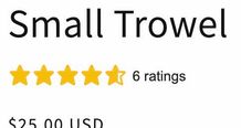
- Star rating widget
Displays your current star rating for a particular product, and is most often added beneath your product’s name.
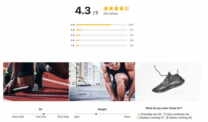
- Review summary widget
Shows a chart breaking down all the ratings a product has received, user images submitted with reviews, and the most common customer feedback. It’s usually added near the bottom of a product page.
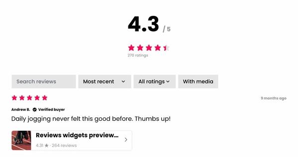
- Review list widget
Displays a list of all published reviews and customer questions along with a search bar, filters, a Write a Review button, and an Ask a Question button. It’s most often added immediately below the review summary widget.

- Product reviews widget
A combination of the reviews summary and review list widgets above. If you add the product reviews widget to your site, you don’t need to add the review list and review summary widgets separately. - Featured review carousel widget
Displays selected reviews from any of your products. This can be featured on your homepage, on a standalone reviews page, or anywhere else on your site. You can select the reviews that are featured in this widget. If available, customer-submitted images accompany each review; your product images are used if no image was submitted alongside the review.

- The SEO / All reviews widget displays all your reviews across all products on a single page. Use this widget to improve your SEO and provide a single place for potential customers to see what your current customers love. This widget is most often added to a standalone Reviews page on your site.
These widgets are fully customizable, meaning you can choose your brand fonts and colors, as well as hand-select reviews to highlight in the featured review carousel.
Select a language for reviews widgets and submission pages
By default, all Klaviyo reviews content is in English. To select a different language:
- Navigate to the Reviews tab in Klaviyo.
- Click Reviews settings.

- Select General.

- In the Select language menu, choose your language.
Updating your language for Klaviyo reviews applies to:
- Review submission page
- Onsite widgets
- Star rating widget
- Review summary widget
- Review list widget
- Product reviews widget
- Featured review carousel widget
You cannot update the language setting for just one widget; all widgets must use the same language. All widgets and the submission page are updated immediately, including those already live on your site.
Updating your language for Klaviyo reviews does not apply to any other Klaviyo features (e.g., custom questions, flows, sign-up forms, preference pages, the content of customer-submitted reviews, etc.). These must be manually translated and edited.
Hide review widgets until a product has received reviews
These instructions apply to the star rating widget and review list widget.
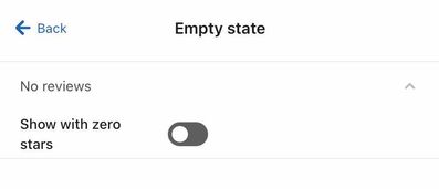
By default, a product with no reviews will show 0/5 stars and a message indicating that no reviews have been submitted yet. If you’d prefer to hide the widget until you receive reviews, follow these steps:
- Open the Reviews tab in Klaviyo.
- Select Reviews settings.
- Click Onsite widgets.
- Select Product reviews or Star rating.
- Open the Empty state menu.
- Toggle the Show with zero stars setting off.
Change widget appearance
Follow these steps to adjust the style (e.g., fonts, colors, and more) for any reviews widget.
- Open the Reviews tab in Klaviyo.
- Select Reviews settings.
- Click Onsite widgets.
- Choose the widget you’d like to edit.
- Click Layout & style.
- Adjust the widget’s appearance as desired, including fonts, colors, and spacing.
Changing a setting in one review widget (e.g., button color) does not impact that setting for other widgets, with the exception of the SEO / All reviews widget. This widget inherits all settings from the product reviews widget. To customize the appearance of the SEO / All reviews widget but not the product reviews widget, you must use custom CSS.
Available review style settings
Open each dropdown menu to learn more about the style options available for that category.
Product reviews widget
In the Layout & style section of the product reviews style settings, you can adjust the following settings:
- Margin
Adjust the space at the top, bottom, left, and/or right of the widget. - Primary background color
Toggle this setting on to add a background color for the full widget area. - Secondary background color
Edit the color for certain widget elements like histogram bars. - Accent color
Edit the color used for various accents, including the selection on a range question and verified reviewer badges. - Corner radius
Apply rounded corners to the entire product review widget area. Note that this is only visible if you add a primary background color. - Division lines
Add optional lines between each review. - Primary font
Choose Inherit from site to use your existing site font, or select a font. The Primary font setting applies to all widget fonts except:- The #/5 label in the Customer reviews section.
- The timestamp on each review.
- The label text in the star histogram.
- The placeholder text in the search field.
- Secondary font
Choose Inherit from site to use your existing site font, or select a font. The Secondary font setting applies to the star histogram, search field, the timestamp for each review, and the #/5 label in the Customer reviews section. - Font size, weight, and color
Adjust the size, weight, and color for the primary and secondary fonts, respectively. - Button settings
- Color
Button color. - Corner radius
The roundness of button corners. Set to 0 for no rounding. - Border
A colored border around the button. - Specify hover color
If buttons should change color on hover, enable this setting. - Padding
Padding within each button, surrounding the button text. Adding padding will make the button appear larger. - Font, font size, font weight, font color
The font used for the widget buttons.
- Color
- Rating settings
- Filled color
The color of selected stars (e.g., if a product is rated 4/5 stars, the first 4 stars use this color). - Empty color
The color of non-selected stars (e.g., if a product is rated 4/5 stars, the 5th star uses this color). - Border
An optional colored border surrounding all stars. - Spacing
The space between each star. - Shape
Choose alternate rating styles, like sharp stars, rounded hearts, and more. - Size
- Summary
The size of the stars within the review summary. - Review
The size of the stars within each customer review.
- Summary
- Filled color
- Filters settings
Filters settings apply to the search field and review filters.- Background color
The background color of the filter buttons and search bar. - Active stroke width, color
The width and color of the border indicating an active (i.e., selected) filter option. (Minimum 1.) - Corner radius
The rounding of corners on the search field. For no rounding, select 0 px. - Search icon
Toggle the magnifying glass search icon on or off.
- Background color
- Images settings
- Summary images corner radius
Rounding on the selection of summary images in the review summary. - Review images corner radius
Rounding on each image within individual reviews. - Review images size
The size of images included with individual reviews.
- Summary images corner radius
Featured reviews carousel
In the Layout section of the featured reviews carousel style settings, you can adjust the following settings:
- Section headline
Add a label, Customer reviews, to this widget. - Carousel type
Choose whether the carousel should display images, or only text. - Max reviews per page
Choose how many featured reviews to display per page. - Text limit
Choose how many lines of text to include in each review preview. - Margin
Adjust the space at the top, bottom, left, and/or right of the widget. - Text alignment
Whether text should be left, right, or center aligned. - Card items
Toggle on or off the option to display a review's date, author, and verification badge.
In the Style section of the featured reviews carousel style settings, you can adjust the following settings:
- Section headline font settings
Font, font color, and font size for the section headline. Note that Section headline must be enabled under Layout for this setting to apply to your widget. - Image height
Edit the size of the image included with the review preview. - Corner radius
Modify the corner rounding on each featured review tile. - Card color
Add a background color of each review tile. - Shadow
Add or remove a shadow from the cards. - Border
Add or remove a border from the cards. - Rating style settings
- Filled color
The color of selected stars (e.g., if a product is rated 4/5 stars, the first 4 stars use this color). - Empty color
The color of non-selected stars (e.g., if a product is rated 4/5 stars, the 5th star uses this color). - Border
An optional colored border surrounding all stars. - Spacing
The space between each star. - Size
The size of the stars within each customer review. - Shape
Choose alternate rating styles, like sharp stars, rounded hearts, and more.
- Filled color
- Review headline font settings
Choose Inherit from site to use your existing site font, or select a font and font size, weight, and color. - Review body font settings
Choose Inherit from site to use your existing site font, or select a font and font size, weight, and color. - Date and name labels font settings
Choose Inherit from site to use your existing site font, or select a font and font size, weight, and color.
Star rating
- Margin
Adjust the space at the top, bottom, left, and/or right of the widget. - Rating style settings
- Filled color
The color of selected stars (e.g., if a product is rated 4/5 stars, the first 4 stars use this color). - Empty color
The color of unfilled (i.e., non-selected) stars (e.g., if a product is rated 4/5 stars, the 5th star uses this color). - Border
An optional colored border surrounding all stars. - Spacing
The space between each star. - Size
The size of the stars within each customer review. - Shape
Choose alternate rating styles, like sharp stars, rounded hearts, and more.
- Filled color
- Primary font
Edit the font used for the text # ratings. Choose Inherit from site to use your existing site font, or select a font. - Font size, weight, and color
Adjust the size, weight, and color for the # ratings text.
Disable or enable review filters and actions
Allow your customers to filter reviews by rating, media (i.e., whether reviews contain images), or their answers to custom questions. This can help potential customers find the reviews most relevant to them.
- Navigate to the Reviews tab in Klaviyo.
- Click Reviews settings.
- Select Onsite widgets.
- Select Product reviews widget.
- Select Review list.
- To show or hide the Q&A button and tab, or the Write a review button, toggle that selection on or off in the Actions card.
- To remove or add the filters section in your review list widget, disable or enable the Filters toggle.
- Check or uncheck any of these settings to determine which filter options appear: Search bar, Sorting (recent, highest, lowest), Rating, Media, Custom questions.
About most relevant filtering
The Most relevant filter highlights the reviews users are most likely to find helpful. When selected, reviews will appear in this order:
- Reviews with text, images, or custom questions submitted from the visitor's country
- Reviews without any content (i.e., rating-only reviews) submitted from the visitor's country
- Reviews with text, images, or custom questions submitted from other countries
- Reviews without any content (i.e., rating-only reviews) submitted from other countries
Within each category, reviews are ordered by submission date, with the most recent appearing first.
Choose whether to feature product images in your reviews summary
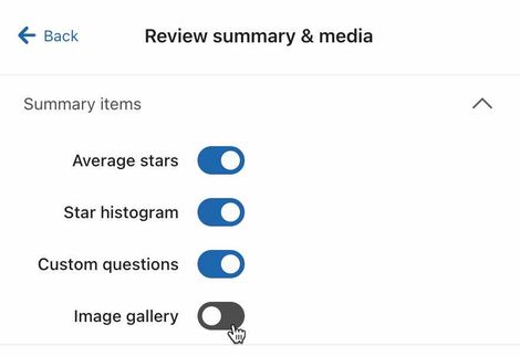
Review summaries include an optional gallery of customer-submitted product images. To enable or disable this gallery:
- Navigate to the Reviews tab in Klaviyo.
- Click Reviews settings.
- Select Onsite widgets.
- Select the Product reviews widget.
- Select Review summary & media.
- Toggle the Image gallery setting off or on.
Hide items from the reviews list
These instructions apply to the review list widget.
You can hide elements from your reviews list (e.g., review author, store reply, timestamp) if desired. To do so:
- Open the Reviews tab in Klaviyo.
- Select Reviews settings.
- Click Onsite widgets.
- Choose Product reviews.
- Click Review list.
- Toggle off any elements you want to hide.
If you disable Star rating, Media, and Custom questions from the review list, Review filters setting options will disappear. In order for a site visitor to filter their search, at least one filter criteria (star rating, media, or custom questions) must be visible in the review list.
Select reviews to display in the featured reviews carousel
Featured reviews will appear in the featured reviews carousel. To choose which reviews to feature:
- Navigate to the Reviews tab.
- Select All reviews.
- Next to a review you’d like to feature, click Feature.

- Repeat as desired. We recommend selecting at least 3-5 reviews to highlight.
Additional resources
- How to install Klaviyo Reviews on Shopify 2.0 themes
Learn how to install Klaviyo Reviews on your Shopify 2.0 store by installing the app and adding reviews widgets.
- How to install Klaviyo Reviews on Shopify (vintage themes and headless)
Learn how to install Klaviyo Reviews with a vintage Shopify theme or headless architecture. This process involves copying several code snippets and pasting them into your site’s code.
- How to install Klaviyo Reviews for WooCommerce
Learn how to install Klaviyo Reviews on your WooCommerce store and add reviews widgets. To learn about all the steps required to get started, head to Getting started with Klaviyo Reviews.