How to optimize popup and flyout forms for mobile
You will learn
Learn how to design your mobile sign-up forms with Klaviyo's best practices in mind so you can ensure your popup and flyout forms are optimized for mobile visitors.
Online shoppers are increasingly using their mobile devices to discover new stores, browse products, and make purchases, so it’s more important than ever to make sure your website looks as good on mobile as it does on desktops, and that includes your sign-up forms.
Before you begin
In Klaviyo, you can create forms that show on all devices (meaning they're visible on desktop and mobile devices), or you can create mobile-only forms that only show on mobile devices.
If your form is set to show on all devices, Klaviyo automatically optimizes some elements, such as font sizes and images, to improve it's appearance for shoppers on mobile devices; although, this guide will cover additional best practices to keep in mind. Use the view selector in the top right corner of the form builder to switch between desktop and mobile views as you build your form. The desktop icon will show what the form looks like for desktop shoppers, while the mobile icon shows what mobile shoppers see.
This guide will cover best practices for creating popup and flyout forms that appear on mobile devices. There are helpful regardless of if your form shows on all devices or mobile only. For a more in depth overview about sign-up forms specifically on mobile devices, head to basics: mobile form design.
General form best practices
Many of the best practices for desktop forms apply to mobile devices as well:
- Keep it short and sweet: consider a multi-step form if you have a lot of fields.
- If your form collects SMS consent, collect email on the first step, followed by SMS on the second step with Smart Opt-in so visitors on mobile devices can subscribe in the easiest method.
- Make sure it’s easy to close, so visitors don’t get frustrated and leave your site.
- Using a form teaser gives shoppers the ability to close and reopen the form as desired.
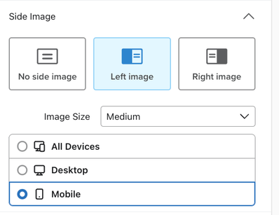
- If your form is set to display on all devices (meaning desktop and mobile shoppers will all see it) and includes a side image, leave the side image to show on Mobile only.
- Use concise labels for each of your input fields (e.g., email address, phone number, etc.) that fit on a single line so shoppers can easily see what information you're asking for.
SEO and mobile forms
It’s important to consider mobile SEO best practices, particularly when creating forms on your homepage or other landing pages. Forms that appear on common organic search landing pages shouldn’t cover up your site’s content or disrupt a visitor’s experience; otherwise, the page may be penalized by search algorithms. Learn more about intrusive interstitials and SEO.
To avoid this:
- In the Targeting and behaviors tab, set your form's timing to Based on rules, then set a longer time delay (e.g., when a visitor is exiting the page).
- Add a teaser that displays Before displaying form.
Optimizing popups
A popup form appears in the middle of a shopper's screen, often covering much of the page and hindering their ability to interact with other elements of the page while the form is open. This makes popups more disruptive, but also higher-converting.
To optimize how popups function on mobile devices:
- Disable the form from closing when a mobile shopper clicks outside the form's area to decrease accidental form closures.
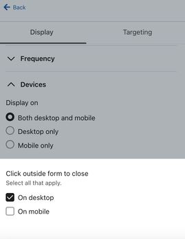
- Navigate to Targeting and Behaviors.
- Scroll down to Devices.
- Under Click outside form to close, disable the Mobile switch.
- Make sure your form's close icon (the X button) is large enough, even on a small screen like a mobile device.
- Click on the close icon in the form preview to adjust its size.
- Test how the form looks on your own mobile device to ensure it's easy to find and click.
For example, the close icon in the form on the left may be hard to click on a mobile device. However, the close icon in the form on the right is larger and easy to find.

- Visually separate your popup from the rest of your site, using an overlay color, a drop shadow, or both.
- Navigate to the Styles tab.
- In the Form Background section, set the Overlay Color to use a semi-opaque overlay to draw focus to your form and dim your site's content while the form is open.
- Configure a Drop Shadow to provide subtle shading around your form to separate it from the surrounding content.
- Adjust the margins of your form so it looks more like a popup form on mobile devices and doesn't run edge-to-edge.
- In the Styles tab, scroll down the Form Styles.
- Increase the Left/Right margin based on how it looks in the preview.
These settings will be reflected in both the desktop and mobile versions of your form.
Optimizing flyouts
When a flyout form appears, mobile visitors are still able to interact with your site behind the form, unless Mobile Overlay is turned on. They can choose to close the form, fill it out, or leave it open as they continue browsing. In general, this makes flyouts less intrusive than popups.
To optimize your flyout form for a mobile device:
- Set your form to fly out from the top or bottom of the screen.
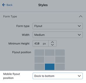
- Navigate to the Styles section.
- Select Mobile Flyout Position, then choose either Dock to Bottom or Dock to Top.
When this setting is selected, your form will fly out from the top or bottom of the screen and cover a portion of the screen from edge to edge.
- Visually separate your flyout form from the rest of your site using mobile overlay, a drop shadow, or both.
- Navigate to the Styles tab.
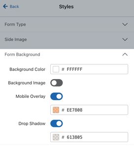
- Scroll to the Form Background settings.
- Turn on Mobile Overlay so mobile shoppers cannot click any other elements on your site until they fill out or close the form. Note that Mobile overlay will not appear when the flyout form is viewed on a desktop.
- Turn on Drop Shadow to provide subtle shading around your form to separate it from the surrounding content. Note that Drop shadow settings affect both the mobile and desktop versions of your form.
Next steps
Once you've optimized your forms for mobile devices, try A/B testing your form designs to better understand your site visitors' preferences.
Additional resources
- Getting started with sign-up forms
- Understanding form dismissal settings
- Basics: mobile form design
- How to use popup forms to collect SMS consent