Dark mode email design best practices
You will learn
Learn about dark mode, a device setting some users turn on to darken their displays. This setting impacts how emails are displayed. Dark mode is an end user setting that is selected at the device level, and Klaviyo does not have direct control over how dark mode is implemented on each device.
Why do people use dark mode?
Dark mode has become popular because it is believed to have a variety of benefits. Users may choose dark mode to:
- Minimize eye strain.
- Support healthier sleep habits.
- Extend a device’s battery life.
- Improve accessibility.
According to Litmus, the number of people viewing emails in dark mode increased from 28% in 2021 to 34% in 2022.
Dark mode and your branding
Dark mode impacts your email branding by adjusting the HTML used to render it in the inbox. These adjustments can be as small as inverting colors in text-only emails (while leaving HTML emails unchanged), or as substantial as adjusting every color in your fully-designed email template.
If you don’t consider dark mode when designing your emails, it can result in hard-to-read text, colors that don’t align with your brand styles, and more.
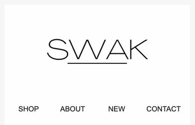
Consider SWAK Cosmetics’ logo. On a white background, it looks great.

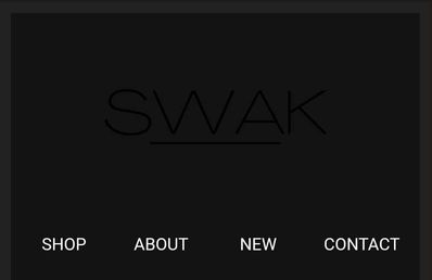
But when viewed on a dark mode device, it is impossible to read.

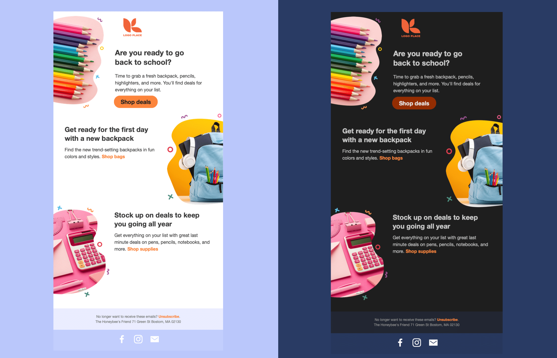
Note the changes in this email header between light and dark mode. The email background color, text color, and link bar color all were inverted.
Devices and operating systems that offer dark mode
The specifics of dark mode changes vary between devices and operating systems. Litmus offers a resource on the devices that offer dark mode and how they treat HTML emails.
In general, inboxes fall into 1 of 2 categories: those that make minimal or no changes, and those that invert email colors.
Minimal changes
Some inboxes, like Apple Mail for desktop, don’t make changes to your email content directly (unless you include dark mode metatags). In this inbox, the only change you’ll see between a message in dark or light mode is the color behind your sender information.

Color inversion
Other inboxes, like Outlook on desktop, partially invert your colors. This means some lighter colors are swapped out for darker hues, and some darker colors are swapped with lighter ones (e.g., dark text that was previously on a light background). The end result is an email that’s notably darker than the original.

Mitigation strategies
There are several strategies for maintaining your branding while optimizing for light and dark mode. Choose the one that best aligns with your team’s capacity and branding needs.
Develop designs with light and dark mode in mind
If you use Klaviyo’s drag-and-drop editor to send your emails, this strategy is best. Develop your email templates while keeping in mind what changes they’ll undergo on dark mode devices:
- Use logos and images that look great on light and dark backgrounds, like this one for Bola’s baked goods.

- Or add a light-colored shadow to a dark logo with a transparent background, so it stands out in dark mode.

- Alternatively, use image files that include background colors, rather than using a transparent background. If you choose this option, make sure your image completely fills the space it takes up (e.g., 600px wide for full-width images).

- Use text wherever possible, rather than using images that contain text. This allows full color inversion (plus, it’s better for accessibility).
Custom code dark and light versions
If you have a developer team that can custom-code your HTML emails from scratch, you can provide CSS that detects whether a viewer is using dark or light mode and adjust the design accordingly. This can override certain dark mode defaults in some inboxes, so you have more control.
Every inbox, device, and OS is different, so you’ll need to consider a wide variety of email recipients when designing dark and light mode versions of an email.
You can use @media (prefers-color-scheme: dark) and [data-ogsc] to target dark mode users specifically in your email’s code. Learn more about which email clients support these tags and what code to use in your own designs.
Use image-only emails
We don’t recommend using image-only emails for a variety of reasons:
- Without alt text, your email can look suspicious to inboxes and land in the spam folder.
- Image-only emails aren’t an accessibility best practice, as they are challenging for many people and screen readers to read.
- Using image-only emails to force a light-mode appearance is circumventing your subscribers’ preferences.
However, many brands use this strategy, so it’s worth mentioning here. Image-only emails don’t rely on HTML for colors, fonts, spacing, and more. This means they can’t be inverted, so inboxes will display an email that generally aligns with your original design.
Additional resources
- Guide to the email template editor
Learn about Klaviyo’s drag-and-drop email template editor, including how to use template styles and configure each block type.
- Accessibility in emails and forms best practice reference
Learn how to make your emails and sign-up forms more accessible. When designing your emails and signup forms, you’ll want to make sure your designs are accessible to all of your recipients.
- Get started with email design