Understanding mobile email optimization
You will learn
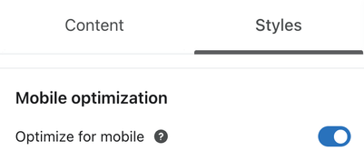
Learn about the default mobile optimization settings Klaviyo offers for emails, as well as tools for customizing how your message appears across devices. You can also choose to disable all mobile optimizations by navigating to the Styles tab of your email template.
General mobile optimization options
If you choose to enable mobile optimizations, certain adjustments will be made automatically to optimize your email's appearance when viewed on a mobile device.
If you would prefer your email not be optimized for mobile devices, disable optimizations in the mobile section of your template's Styles tab.
There are a number of other settings that allow you to make adjustments specifically for mobile viewing, including:
- Adjust content margins
- Adjust text and heading sizes on mobile
- Adjust text and heading spacing on mobile
- Adjust block padding on mobile
Header/Link Bar layout on mobile
For any header/link block, scroll down to the Mobile layout menu within the Styles tab to select a mobile layout. The default is Stack all, and you can change this to suit your needs.
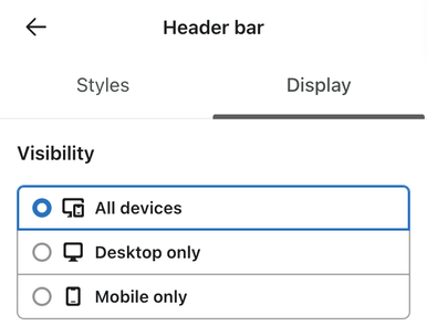
Hide on mobile or desktop
You can select if you would like a block to appear on mobile, desktop, or both. This can be customized for any block by navigating to the Display Options tab for a block.
Stretch image option
For an image block, you can choose to stretch an image to the full width of the frame when viewed on mobile. You will see this option in the Styles tab for any image block within the Block settings. Toggle Full width on mobile on or off.
Columns stack on mobile
Stacking columns (created using the Columns layout or Split block options) on mobile devices allows for larger text and images that are easier to read on a small screen. If you'd prefer your columns appear side-by-side on mobile, disable this setting in that section's Styles tab. If you do, the columns will remain side-by-side, but will be resized to fit on a mobile screen.
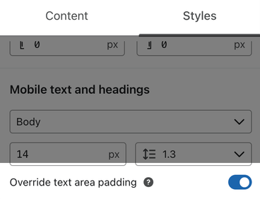
Text block padding on mobile
By default, all text blocks have at least 18px of padding on mobile. To remove this padding:
- Open the Styles menu.
- Scroll to the Mobile text and headings section.
- Turn off the Override text area padding toggle.
Email client support for mobile optimization
Many email apps have varying levels of support for mobile optimizations.
If you are concerned about how your email design will render across different email clients and devices, using a third-party email testing tool can help.
We recommend exploring the use of a tool like Litmus, which offers a free trial as well as monthly paid plans. You can also search for free alternatives that allow you to test and preview how your emails will look when viewed by recipients using different email clients and devices.
Determine how many subscribers are opening on mobile
In the Deliverability tab of a given campaign, scroll down to the Performance by Email Client section to see a breakdown of how many recipients opened your email on a mobile versus desktop browser. This can give you an indication of how your audience is interacting with your emails. You can also segment based on this information by adding a filter to the condition What someone has done (or not done) > Opened Email.

Additional resources
- How to optimize popup and flyout forms for mobile
Learn how to design your mobile sign-up forms with Klaviyo's best practices in mind so you can ensure your popup and flyout forms are optimized for mobile visitors.
- Getting started with SMS and MMS for the first time